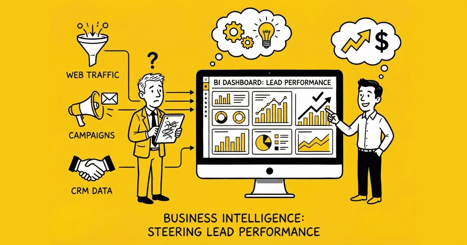
Most lead generation businesses collect mountains of data but struggle to turn it into decisions. A well-designed BI dashboard changes that equation, revealing which sources drive profit, which buyers deserve investment, and where money disappears between click and cash.
Your lead generation business probably tracks hundreds of data points across a dozen platforms. Google Ads reports click costs. Your landing pages measure conversion rates. The distribution platform logs buyer acceptance. Your CRM tracks downstream outcomes. And your accounting software eventually reconciles what you actually collected.
But here is the problem: these systems do not talk to each other. The result is a fragmented picture where operators optimize for metrics that feel good rather than metrics that predict profitability.
A Forrester study found that data-driven businesses grow more than 30% faster than their competitors. Yet in lead generation, many practitioners drown in dashboards while starving for insight. They can tell you yesterday’s lead volume to the decimal. They cannot tell you which traffic source actually produces net-positive leads after accounting for returns, fraud, and payment timing.
Business intelligence dashboards solve this problem by unifying data from disparate systems into coherent views designed for specific decisions. When built correctly, a BI dashboard answers the question every operator needs answered: given what I know right now, what should I do next? For the metrics that matter most, see our guide on calculating true cost per lead.
This guide covers how to design, build, and operate BI dashboards specifically for lead generation businesses. We will walk through the metrics that matter, the visualization approaches that work, the platform options worth considering, and the implementation patterns that separate actionable dashboards from expensive wallpaper.
Why Lead Generation Businesses Need Specialized BI
Generic business intelligence tools work for generic businesses. Lead generation is not generic.
The lead economy operates on compressed timelines, complex multi-party relationships, and economics that shift hourly. A lead captured at 9 AM might sell by 9:02 AM, get returned by 9:15 AM, or sit unsold until it ages into worthlessness. Standard BI approaches designed for monthly sales cycles and simple customer relationships miss the granularity that lead operations demand.
The Multi-System Data Problem
A typical lead generation operation runs data through six to ten disconnected systems:
Traffic platforms (Google Ads, Meta, TikTok, native networks) track spend, clicks, and platform-reported conversions. Each uses different attribution windows, different naming conventions, and different APIs.
Landing page and form systems (Unbounce, custom pages, native lead forms) capture submission data, field-level information, and initial validation results. Some track consent; most track at least basic conversion events.
Validation services (Jornaya, TrustedForm, phone verification, email verification) provide quality signals and compliance documentation. Each returns different data structures with different latency.
Lead distribution platforms (boberdoo, LeadsPedia, Phonexa, custom systems) manage routing, buyer matching, pricing, and delivery. This is where leads become revenue – or fail to.
CRM and contact systems track downstream outcomes when your business contacts leads directly. Sales stage progression, contact attempts, and conversion outcomes live here.
Accounting and finance systems (QuickBooks, Xero, ERP platforms) eventually record actual cash collected, refunds issued, and chargebacks processed.
Each system tells part of the story. None tells the whole story. The operator who cannot connect traffic spend to validated leads to sold leads to collected cash is optimizing blind spots.
The Time Sensitivity Challenge
Lead value decays measurably over time. Research consistently shows that leads contacted within five minutes convert at rates up to 10x higher than those contacted after 30 minutes. A lead that was worth $50 at 9:00 AM might be worth $30 by 9:30 AM and unsaleable by afternoon.
This time sensitivity means lead generation dashboards require update frequencies that most BI systems are not designed to deliver. Checking yesterday’s performance at tomorrow’s meeting is not analysis. It is archaeology. Our guide on speed-to-lead and response time explains why timing data matters so much.
Effective lead generation BI operates on three time horizons simultaneously:
Real-time (seconds to minutes): Processing queue depths, system uptime, immediate quality alerts Near-real-time (hours): Source performance, buyer acceptance rates, daily pacing Periodic (days to weeks): Trend analysis, ROI calculation, strategic reallocation
The Attribution Complexity
Unlike e-commerce where a purchase is a purchase, lead generation involves multiple attribution questions:
- Did the traffic source actually drive the lead, or did something else?
- Did the lead validate, or did we waste the acquisition cost?
- Did the lead sell, and if so, at what price to which buyer?
- Did the buyer accept the lead, or return it within the return window?
- Did we actually collect payment, or is the receivable still outstanding?
- If the buyer worked the lead, did it convert for them?
Each stage can change the economic reality of a traffic source. A source that looks profitable at the “lead generated” stage might look catastrophic at the “cash collected” stage if those leads have high return rates and slow-paying buyers.
Core Metrics for Lead Performance Dashboards
Effective dashboards require clear hierarchy. Not all metrics matter equally, and treating them as equal creates noise that obscures signal.
Tier 1: Financial Truth Metrics
These metrics answer the fundamental question: are we making money?
Net Revenue Per Lead (NRPL) measures actual collected revenue per lead generated. Unlike gross revenue per lead, NRPL deducts returns, chargebacks, and uncollected receivables.
Calculation: (Gross Revenue - Returns - Chargebacks - Bad Debt) / Total Leads Generated
Target: 15-20% above your gross CPL to provide buffer for variance. If your average lead costs $45 to generate, target NRPL of $52-55 minimum.
True Cost Per Lead (TCPL) includes all costs, not just media spend. Add creative production, validation fees, technology costs, labor allocation, and compliance overhead.
Calculation: (Media Spend + Validation Costs + Tech Fees + Allocated Labor + Compliance + Creative) / Total Leads
most practitioners understate CPL by 25-40% when they exclude these costs. A lead that appears to cost $32 often truly costs $45-52.
Contribution Margin by Source reveals actual profitability of each traffic source after all variable costs. This is the metric that should drive budget allocation.
Calculation: (NRPL - TCPL) / NRPL expressed as percentage
Target: 30-50% contribution margin for sustainable operations. Below 20% signals structural problems that scale amplifies rather than solves.
Tier 2: Quality Indicators
Quality metrics predict financial outcomes before they hit the P&L.
Validation Pass Rate measures the percentage of submitted leads that pass your validation stack. Industry benchmarks show 75-90% pass rates for well-optimized forms and traffic.
Track by component: phone validation (85-95% pass rate typical), email validation (90-98%), fraud detection (95-99% pass rate, meaning 1-5% flagged as fraud), duplicate detection (92-98% unique).
Buyer Acceptance Rate reflects market judgment on your lead quality. Healthy operations maintain 80-95% acceptance. Below 75% indicates systematic quality problems or targeting mismatches.
Track by buyer: a single buyer with low acceptance might indicate their filters, not your quality. Low acceptance across multiple buyers indicates your quality.
Return Rate is a lagging indicator that confirms quality problems 7-14 days after generation. Industry benchmarks vary by vertical: auto insurance 8-15%, Medicare 12-20%, solar 15-25%, mortgage 10-18%.
Rising return rates from a single source require immediate investigation. Rising returns across all sources indicate systematic degradation – often a form change, validation failure, or traffic quality shift.
Contact Rate measures whether leads answer when called. This matters for operations selling to call-focused buyers or working leads internally. Below 30% contact rate suggests data quality issues (wrong numbers), timing problems (calling when people cannot answer), or intent problems (people who did not really want to be contacted).
Tier 3: Operational Efficiency
Operational metrics reveal execution quality and system health.
Speed to Lead tracks time from submission to first buyer contact attempt. The 391% improvement in contact rates for one-minute response (documented by Velocify research) makes this among the highest-leverage operational metrics. Track median and 90th percentile – averages hide unacceptable outliers that damage buyer relationships.
Sell-Through Rate measures the percentage of generated leads that actually sell. High-performing operations achieve 85-95%. Below 70% indicates routing problems, capacity constraints, or fundamental misalignment between generated leads and buyer demand.
System Uptime matters when downtime means lost leads. Even 99% uptime allows 87 hours of annual downtime – potentially thousands of missed leads during peak periods. Target 99.9% minimum for production systems.
Processing Latency measures time from form submission to lead availability in the distribution system. Sub-second is ideal; anything over 2-3 seconds risks missing speed-sensitive buyer routing rules.
Tier 4: Pipeline and Forecast
Forward-looking metrics predict next week and next month.
Lead Velocity Rate (LVR) tracks month-over-month growth in lead volume. Calculate as (This Month Volume - Last Month Volume) / Last Month Volume. Positive LVR above 10% indicates healthy growth trajectory.
Pipeline Coverage compares expected lead generation against targets. Calculate as Projected Leads Next 30 Days / Monthly Lead Target. Coverage above 1.2 indicates healthy pipeline; below 0.9 signals coming shortfall.
Buyer Capacity Utilization tracks how much of your buyer demand you are filling. If buyers can absorb 10,000 leads monthly and you are delivering 6,000, you have growth headroom. If you are delivering 11,000, you need more buyers or better matching.
Dashboard Architecture: What to Build and for Whom
Different roles need different views. The executive checking business health weekly needs different information than the traffic manager adjusting bids hourly.
Executive Dashboard
Purpose: Assess overall business health in under two minutes. Answer: is the business on track, and where should attention focus if not?
Update frequency: Daily refresh, weekly formal review
Key components:
Revenue vs. Target gauge: Current period revenue against monthly target, with prior period and year-over-year comparisons. Use traffic light indicators (green above 95% of target, yellow 80-95%, red below 80%).
Margin trend line: Rolling 90-day view of contribution margin percentage. Downward trend demands investigation regardless of absolute level.
Volume trajectory: Daily lead volume with 7-day moving average overlaid. Shows whether volume is growing, stable, or declining.
Quality composite: Single metric combining validation rate (30% weight), acceptance rate (40%), and return rate (30%). Green above 75, yellow 60-75, red below 60.
Buyer concentration chart: Pie chart showing revenue distribution across top buyers. If one buyer exceeds 40% of revenue, that is strategic risk worth flagging.
Cash runway indicator: Days of operating expense coverage at current cash and burn rate. Not strictly a lead metric, but belongs on executive dashboards because cash kills businesses faster than strategy.
What to exclude: Source-level detail, hourly patterns, individual campaign performance. Executives need altitude, not granularity.
Operations Dashboard
Purpose: Enable real-time decisions about traffic, routing, and quality. Answer: what needs adjustment right now?
Update frequency: Near-real-time (15-30 minute refresh minimum, real-time preferred)
Key components:
Current hour comparison table: This hour’s volume versus same hour yesterday, same hour last week, and expected baseline. Immediate identification of traffic anomalies before they compound.
Source performance matrix: Sortable table showing each source’s current-day volume, CPL, conversion rate, acceptance rate, and return rate. Enables rapid identification of outperforming and underperforming sources.
Quality alert feed: Chronological list of threshold breaches. Alert when any source’s return rate exceeds 2x baseline, when acceptance rates drop below 75%, when validation failures exceed 5%. Each alert links to drill-down capability.
Processing queue status: Current leads awaiting distribution, processing capacity utilization, estimated time to clear queue. Prevents bottlenecks before they impact delivery speed.
Buyer heatmap: Rows for buyers, columns for hours, cells colored by acceptance rate. Reveals patterns like “Buyer X stops accepting after 6 PM” or “Buyer Y struggles on Monday mornings.”
System health indicators: API response times, error rates, queue depths, integration status for each connected system.
Source Performance Dashboard
Purpose: Enable traffic managers to optimize acquisition spend. Answer: where should budget flow?
Update frequency: Daily for trend analysis, real-time for active optimization
Key components:
Source comparison table: Each traffic source as a row. Columns for 7-day volume, volume trend (arrow indicators), CPL, NRPL, contribution margin, acceptance rate, return rate. Sort by any column to surface outliers.
Margin scatter plot: X-axis shows CPL, Y-axis shows NRPL. Each point represents a source. Sources in upper-left quadrant (low cost, high revenue) deserve investment. Sources in lower-right (high cost, low revenue) are pause candidates. Bubble size represents volume.
Hour-of-day heatmap: Traffic sources as rows, hours as columns, cells colored by conversion rate. Reveals dayparting opportunities: maybe Facebook converts 30% better 6-9 PM than at noon.
Quality degradation trends: Line chart showing rolling 7-day average return rate by source. Catches quality erosion before it impacts aggregate metrics.
Budget pacing bars: Each source shows month-to-date spend versus planned monthly budget with projected end-of-month based on current pace.
Buyer Performance Dashboard
Purpose: Manage buyer relationships and optimize distribution. Answer: which buyers deserve more leads, and which need intervention?
Update frequency: Daily for relationship management, weekly for strategic review
Key components:
Buyer scorecard table: Each buyer as a row. Columns for 30-day volume, revenue, acceptance rate, return rate, average payment days, and composite score.
Return reason analysis: For each buyer, breakdown of return reasons (bad phone, no intent, duplicate, etc.). Patterns reveal whether problems are your quality or their expectations.
Payment performance chart: Days to payment by buyer over time. Lengthening payment cycles signal cash flow risk.
Capacity utilization: Each buyer’s actual volume versus stated capacity. Identifies growth opportunities and constraints.
Revenue concentration trend: How revenue distribution across buyers has changed over 90 days. Increasing concentration increases risk.
Financial Dashboard
Purpose: Connect operational metrics to business outcomes. Answer: are we actually making money?
Update frequency: Weekly, with monthly deep-dive reconciliation
Key components:
True P&L by source: Revenue, all costs, and net margin by traffic source with full cost allocation. This is where pitch-deck economics meet accounting reality.
Cash flow waterfall: Visualization showing revenue generated, returns deducted, payments collected, float outstanding. Reveals timing gaps between earning and collecting.
Margin trend analysis: Contribution margin over time with cost component breakdown. Identifies which costs are rising and compressing margin.
Bad debt aging: Outstanding receivables by age bucket (current, 30-day, 60-day, 90+). Aging receivables become bad debt.
ROI reconciliation: Platform-reported ROI versus actual calculated ROI. The gap often reveals measurement problems worth solving.
Platform Options for Lead Generation BI
The analytics landscape offers options ranging from general-purpose BI platforms to lead-generation-specific tools. Understanding what each category does well (and poorly) prevents expensive missteps.
General-Purpose BI Platforms
Google Looker Studio (formerly Data Studio)
Looker Studio provides free, accessible dashboarding with strong Google ecosystem integration. It connects natively to Google Ads, Google Analytics 4, Google Sheets, and BigQuery.
Strengths: Zero cost, familiar interface for Google users, easy sharing, good for Google-centric metrics.
Limitations: Slow with large datasets, limited data transformation capability, struggles with multi-source blending, no alerting or automation.
Best for: Small operations heavily dependent on Google traffic who need basic visualization without budget for enterprise tools.
Microsoft Power BI
Power BI offers robust desktop authoring with cloud publishing and strong Microsoft ecosystem integration. The free tier covers significant capability; Pro licensing runs approximately $10 per user monthly.
Strengths: Powerful data transformation (Power Query), good visualization library, handles larger datasets than Looker Studio, reasonable learning curve.
Limitations: Less intuitive for non-Microsoft users, mobile experience varies, collaboration requires Pro licensing.
Best for: Operations already invested in Microsoft stack, teams needing more transformation capability than Looker Studio provides.
Tableau
Tableau remains the gold standard for visualization flexibility and handling complex data. Pricing starts around $70 per user monthly for Creator licenses, with cheaper Viewer and Explorer tiers.
Strengths: Best-in-class visualization, handles very large datasets, extensive community and training resources, powerful calculation engine.
Limitations: Expensive at scale, steeper learning curve, requires dedicated resource for non-trivial implementations.
Best for: Larger operations with dedicated analytics resources who need maximum flexibility and handle complex multi-source data.
Metabase
Metabase provides open-source BI with a particularly accessible interface for non-technical users. Self-hosted version is free; cloud version starts at $85 monthly.
Strengths: Intuitive interface, good for teams without dedicated analysts, open-source flexibility, reasonable SQL integration.
Limitations: Visualization options more limited than Tableau, less suitable for very complex analyses.
Best for: Mid-sized operations wanting SQL-accessible BI without enterprise pricing or complexity.
Lead Generation Platform Analytics
Most lead distribution platforms include built-in analytics designed specifically for lead operations.
boberdoo Analytics
boberdoo’s reporting suite tracks lead-level P&L, buyer performance, routing efficiency, and margin analysis. It speaks the language of lead operations natively.
Strengths: Purpose-built for lead generation, no integration required for core metrics, real-time capability, includes ping/post analytics.
Limitations: Data stays within boberdoo ecosystem, limited customization, may lack advanced visualization options.
Best for: boberdoo users who need operational analytics without external tool investment.
LeadsPedia Reporting
LeadsPedia provides similar lead-centric analytics with buyer scorecards, source analysis, and financial reporting built in.
Strengths: Integrated with distribution workflow, includes compliance documentation reporting, supports multi-tenant reporting.
Limitations: Bounded by platform capabilities, less flexibility than general BI tools.
Best for: LeadsPedia users needing comprehensive lead analytics.
Phonexa Analytics
Phonexa’s all-in-one platform includes call analytics, lead distribution metrics, and campaign performance in a unified interface.
Strengths: Combines call and lead analytics, includes attribution modeling, strong for pay-per-call operations.
Limitations: Most valuable for Phonexa ecosystem users, may duplicate capability for multi-platform operations.
Call Analytics Platforms
For operations with significant phone-based lead generation or pay-per-call campaigns.
Ringba
Ringba provides real-time call routing analytics, buyer performance by call quality, duration analysis, and revenue attribution.
Strengths: Purpose-built for pay-per-call, real-time visibility, strong integration with buying platforms.
Limitations: Focused on calls; requires additional tooling for form-based lead analytics.
CallRail
CallRail focuses on marketing attribution for inbound calls, tracking which campaigns drive phone leads with conversation intelligence.
Strengths: Strong attribution, conversation analytics, good for operations routing inbound calls.
Limitations: More marketing-focused than operations-focused, may need supplemental tools for full BI.
Data Warehouse Approaches
Mature operations often centralize data in a warehouse before visualization.
Google BigQuery
BigQuery provides serverless SQL data warehousing with native Google ecosystem integration. Pricing is usage-based, typically $20-100 monthly for lead generation workloads.
Strengths: Scalable, good Google Ads and GA4 integration, reasonable pricing for moderate volumes.
Limitations: Requires SQL capability, needs additional visualization layer, usage costs can surprise at scale.
Snowflake
Snowflake offers cloud-native warehousing with separation of storage and compute. Pricing is consumption-based.
Strengths: Highly scalable, excellent for complex multi-source integration, strong data sharing capabilities.
Limitations: More expensive than BigQuery for typical lead gen volumes, requires more setup.
Amazon Redshift
Redshift provides AWS-native warehousing. Pricing starts around $180 monthly for basic clusters.
Strengths: Strong AWS integration, good for operations already on AWS infrastructure.
Limitations: Less flexible pricing model, requires more administration than serverless options.
Recommended Architecture by Operation Size
Starter Operations (under 5,000 leads monthly): Use your lead distribution platform’s built-in analytics supplemented by Looker Studio for traffic source analysis. Total cost: minimal. Focus on basic metrics before investing in sophisticated tooling.
Growing Operations (5,000-50,000 leads monthly): Implement a data pipeline connecting major systems to BigQuery or equivalent. Build dashboards in Looker Studio or Power BI. Total investment: $200-500 monthly plus 20-40 hours initial setup. This architecture supports growth without rebuilding.
Scaled Operations (50,000+ leads monthly): Invest in proper data infrastructure with dedicated warehouse, ETL tooling (Fivetran, Stitch, or similar), and enterprise BI (Tableau or Looker enterprise). Consider dedicated analytics resource. Total investment: $2,000-10,000 monthly depending on complexity. At this scale, measurement infrastructure is a competitive advantage.
Building Effective Visualizations
The goal of visualization is not to display data but to reveal insight. Effective dashboards make the important obvious and the obvious actionable.
Chart Type Selection
Trend over time: Line charts. Use for volume trends, margin trajectories, quality metrics over time. Include comparison lines (prior period, target) for context.
Part-to-whole relationships: Pie charts for 2-6 categories, stacked bar charts for more. Use for revenue distribution by source, lead disposition breakdown, budget allocation.
Comparison across categories: Bar charts, preferably horizontal for easier label reading. Use for source performance comparison, buyer rankings, vertical-level metrics.
Two-variable relationships: Scatter plots. Use for CPL vs. NRPL analysis, volume vs. margin exploration. Add bubble size for third variable (revenue, lead count).
Distribution and pattern: Heatmaps. Use for hour-by-day patterns, source-by-buyer acceptance matrices, geographic performance.
Current status vs. target: Gauge charts or bullet charts. Use for revenue pacing, capacity utilization, quality composite scores.
Color Usage
Use color to convey meaning, not decoration.
Traffic light system: Green for good/above target, yellow for warning/near threshold, red for problem/below threshold. Apply consistently across dashboards so users develop instant pattern recognition.
Trend direction: Green for positive trends, red for negative, gray for stable. On margin charts, up is green; on return rate charts, up is red (because rising returns are bad).
Category distinction: Use distinct hues for different sources or buyers, but limit to 6-8 colors before charts become unreadable. Group small categories into “Other.”
Sequential data: Use color gradients (light to dark) for heatmaps and concentration visualizations.
Dashboard Layout Principles
Progressive disclosure: Most important information at top-left (where eyes land first). Details and drill-downs below and to the right.
Consistent positioning: Executives should find revenue in the same location on every dashboard. Consistency builds scanning speed.
Information density: Balance between enough information to be useful and so much that nothing stands out. Executive dashboards run 5-7 metrics; operational dashboards can run 15-20 because users have more context.
Whitespace: Group related metrics visually. Use whitespace to separate conceptual sections. Crowded dashboards overwhelm; sparse dashboards waste opportunity.
Mobile consideration: If users access dashboards on phones (common for executives), key metrics must be readable on small screens. Consider separate mobile-optimized views.
Alerting and Exception Highlighting
Dashboards should draw attention to exceptions without requiring users to actively search.
Threshold-based formatting: Cells that exceed thresholds change color automatically. A return rate cell turns red when it exceeds 15%.
Trend arrows: Small indicators showing direction of change. An up arrow next to CPL means costs are rising; a down arrow means they are falling.
Alert banners: Top-of-dashboard notifications for critical issues. “Source X return rate exceeded 20% in past 24 hours” demands immediate visibility.
Sparklines: Tiny inline charts showing recent trend. A sparkline next to a metric reveals whether current value is typical or anomalous without requiring full chart examination.
Implementation Best Practices
Building dashboards is the easy part. Building dashboards that actually get used and drive decisions is harder.
Start with Questions, Not Metrics
Before designing any visualization, document the decisions the dashboard should inform:
- Where should we allocate budget tomorrow?
- Which sources need investigation today?
- Is the business on track for monthly targets?
- Which buyers deserve more investment?
Each question implies specific metrics and time horizons. A dashboard designed around questions produces actionable output. A dashboard designed around available data produces pretty pictures.
Establish Data Governance
Dashboards are only as good as their underlying data. Before building visualizations, ensure:
Definitions are documented and consistent: What exactly counts as a “lead”? Does it include validation failures? Do you count returns in volume? Different definitions produce different numbers that cannot be compared.
Source of truth is established: When Google Ads says you generated 1,000 leads and your CRM says 850, which is correct? Define authoritative sources for each metric.
Update schedules are known: If the marketing dashboard updates hourly but the finance dashboard updates daily, comparing them produces confusion. Document latency for each data source.
Historical data is preserved: You cannot analyze trends without history. Ensure data pipelines preserve time-series data even as systems change.
Build Incrementally
The temptation is to build comprehensive dashboards covering every possible metric. Resist this.
Phase 1: Build the executive dashboard with 5-7 core metrics. Validate that data flows correctly, that definitions match expectations, and that the view actually gets used.
Phase 2: Add the operations dashboard for day-to-day decisions. This is where most value accrues, so invest in real-time or near-real-time capability.
Phase 3: Build specialized views (source performance, buyer performance, financial reconciliation) as needs emerge and data infrastructure matures.
Phase 4: Add advanced capabilities (predictive analytics, automated alerting, anomaly detection) once foundational dashboards prove their value.
Drive Adoption
A dashboard no one uses is wasted effort. Drive adoption through:
Executive sponsorship: When leadership reviews dashboards in meetings, teams pay attention to keeping them accurate.
Integration with workflow: Embed dashboard links in daily standup agendas, Slack channels, and email reports. Reduce friction to access.
Training and documentation: Teach users what metrics mean, how to interpret visualizations, and what actions different readings suggest.
Feedback loops: Ask users what questions they cannot answer, what metrics they ignore, and what views they wish existed. Iterate based on actual usage.
Regular review cadence: Establish recurring meetings explicitly focused on dashboard review. Weekly operations reviews, monthly executive reviews, quarterly deep dives.
Maintain and Evolve
Dashboards require ongoing maintenance as business changes:
Data source changes: When you add a new traffic source or switch lead distribution platforms, update data pipelines and dashboards accordingly.
Metric evolution: As you learn what actually predicts outcomes, adjust which metrics receive dashboard prominence.
Performance tuning: Dashboards that take 30 seconds to load do not get used. Monitor query performance and optimize as data volumes grow.
User feedback integration: Collect feedback systematically. Which views get used most? Which questions remain unanswered? Which metrics cause confusion?
Common Dashboard Mistakes and How to Avoid Them
Mistake 1: Tracking Vanity Metrics
The problem: Dashboards filled with impressive-looking numbers that do not inform decisions. Total website visitors, raw conversion counts, gross revenue without deductions.
The solution: For each metric, ask: “If this changed 20% tomorrow, would I know what action to take?” If not, it does not belong on a primary dashboard. Move vanity metrics to secondary views or eliminate them entirely.
Mistake 2: Over-Aggregating Data
The problem: Blended metrics that hide actionable variation. An overall 12% return rate obscures that Source A runs 5% while Source B runs 25%.
The solution: Maintain aggregate views for executive context, but always provide drill-down to component detail. The aggregate number surfaces the question; the detail answers it.
Mistake 3: Ignoring Latency
The problem: Dashboards that mix data with different freshness without indicating the lag. Real-time volume next to week-old return rates creates false comparisons.
The solution: Display data freshness explicitly. “Volume as of 10:32 AM” next to “Returns through 7 days ago.” Use different visual treatment (perhaps grayed or italicized) for lagging indicators.
Mistake 4: Trusting Platform Data Without Verification
The problem: Accepting ad platform numbers as truth. Facebook says you generated 1,000 leads at $32 CPL. Your actual lead system shows 850 validated leads, making true CPL $37.65.
The solution: Always reconcile platform-reported data against internal systems. Build dashboards from your source of truth, not from platform exports. Display platform numbers as reference, not as authoritative.
Mistake 5: Building Dashboards in Isolation
The problem: Marketing builds traffic dashboards. Sales builds conversion dashboards. Finance builds revenue dashboards. None connect to each other, so no one can trace a dollar spent to a dollar collected.
The solution: Establish common data infrastructure that underlies all dashboards. Even if different teams own different views, the underlying data should connect. A lead’s journey from click through cash should be traceable.
Mistake 6: Neglecting Historical Context
The problem: Dashboards showing current period only. Without historical comparison, users cannot distinguish normal variation from meaningful change.
The solution: Include prior period comparisons (yesterday, last week, last month), year-over-year comparisons where relevant, and target/plan comparisons. A 15% volume drop matters very differently if you are comparing to yesterday versus to last year.
Mistake 7: Creating Dashboard Overload
The problem: Dozens of dashboards created over time, many overlapping, many outdated, users unsure which to trust.
The solution: Maintain a curated catalog of approved dashboards. Archive or delete views no longer in active use. Assign clear owners responsible for each dashboard’s accuracy and relevance.
Frequently Asked Questions
What is a business intelligence dashboard for lead generation?
A business intelligence dashboard for lead generation is a visual interface that consolidates data from multiple sources – traffic platforms, landing pages, validation services, lead distribution systems, CRM, and accounting – to display key performance metrics. The dashboard transforms raw data into actionable insights, showing which traffic sources generate profit, which buyers provide value, and where money disappears between lead capture and cash collection. Unlike generic BI dashboards, lead-specific dashboards account for the unique economics of lead generation: validation rates, buyer acceptance, returns, and payment timing.
What metrics should a lead generation dashboard track?
Core metrics fall into four tiers. Tier 1 financial metrics include Net Revenue Per Lead (after returns and chargebacks), True Cost Per Lead (including all costs, not just media), and Contribution Margin by Source. Tier 2 quality metrics include Validation Pass Rate, Buyer Acceptance Rate, Return Rate, and Contact Rate. Tier 3 operational metrics include Speed to Lead, Sell-Through Rate, System Uptime, and Processing Latency. Tier 4 forward-looking metrics include Lead Velocity Rate and Pipeline Coverage. Most dashboards should prominently feature 5-7 metrics with drill-down capability for the rest.
How often should lead generation dashboards update?
Update frequency depends on dashboard purpose. Executive dashboards need daily refresh with weekly formal review. Operations dashboards require near-real-time updates (15-30 minutes maximum, real-time preferred) because operators make hourly decisions about traffic and routing. Financial dashboards update weekly with monthly reconciliation to accounting actuals. Some metrics like processing queue depth and system uptime need true real-time monitoring with automated alerting when thresholds breach.
What is the best BI platform for lead generation?
The best platform depends on operation size and existing infrastructure. Small operations (under 5,000 leads monthly) can use lead distribution platform analytics supplemented by free tools like Google Looker Studio. Mid-sized operations (5,000-50,000 leads) benefit from a data warehouse (BigQuery or similar) feeding Power BI or Looker Studio, costing $200-500 monthly. Large operations (50,000+ leads) justify enterprise tools like Tableau with dedicated analytics resources, investing $2,000-10,000 monthly. The key is matching investment to scale – sophisticated tooling for small operations creates complexity without proportional value.
How do I connect data from multiple systems into one dashboard?
Data integration typically follows one of three patterns. Direct connectors use built-in integrations (Looker Studio connects directly to Google Ads, for example). ETL/ELT tools (Fivetran, Stitch, Airbyte) extract data from sources, transform it, and load it into a central warehouse. Custom API integrations build pipelines using platform APIs when off-the-shelf connectors do not exist. Most mature operations use a data warehouse (BigQuery, Snowflake, Redshift) as the central repository, with ETL tools feeding data in and BI platforms reading data out for visualization.
What is the difference between platform-reported metrics and actual performance?
Platform-reported metrics reflect what ad platforms like Google Ads and Meta measure using their own tracking and attribution. Actual performance reflects what your internal systems record. The gap – often 15-40% – results from tracking failures (ad blockers, browser restrictions), attribution differences (platform versus internal attribution windows), and definition mismatches (what counts as a “lead” or “conversion”). Always reconcile platform data against internal systems. Build dashboards from your source of truth, using platform data as reference rather than authority.
How do I calculate true cost per lead for my dashboard?
True Cost Per Lead requires allocating all costs, not just media spend. The formula: True CPL = (Media Spend + Creative Production + Validation Fees + Technology Costs + Allocated Labor + Compliance Overhead + Agency Fees) / Total Leads. Most practitioners understate CPL by 25-40% when using media spend alone. A lead appearing to cost $32 based on ad platform data might actually cost $45-52 when fully loaded. For accurate dashboards, build cost allocation methodology and apply it consistently.
What alerts should my lead generation dashboard include?
Priority alerts include: source return rate exceeding 2x baseline (quality problem), buyer acceptance rate dropping below 75% (targeting or quality issue), system uptime degradation (infrastructure problem), processing queue exceeding threshold (capacity issue), and volume deviation exceeding 15-20% from expected baseline (traffic anomaly). Each alert should link to drill-down capability for investigation. Configure alerts to notify appropriate teams (operations for real-time issues, management for strategic concerns) through preferred channels (Slack, email, SMS for critical alerts).
How do I measure ROI on my BI dashboard investment?
ROI measurement compares dashboard investment against decision improvement value. Investment includes platform costs, data infrastructure, implementation time, and ongoing maintenance. Value includes better budget allocation (reducing spend on unprofitable sources), faster problem detection (catching quality issues before they compound), improved negotiation (buyer performance data for contract discussions), and time savings (automated reporting replacing manual analysis). Most well-implemented BI systems deliver positive ROI within 3-6 months. Track specific decisions made differently because of dashboard insights, and estimate the economic impact of those decisions.
Should I build custom dashboards or use pre-built templates?
Start with templates or built-in platform analytics before investing in custom builds. Lead distribution platforms like boberdoo and LeadsPedia include dashboards designed for lead operations. BI platforms offer templates for marketing analytics. Use these starting points, then customize based on your specific needs. Custom development makes sense when standard views do not answer your questions, when you need to integrate proprietary data sources, or when scale requires specialized visualization. The principle: use what exists, customize what is close, build only what is unavoidable.
Key Takeaways
-
Business intelligence dashboards unify fragmented lead generation data. The typical operation runs data through 6-10 disconnected systems. BI dashboards connect traffic spend to validated leads to sold leads to collected cash – the complete journey that determines profitability.
-
Organize metrics in tiers based on decision importance. Tier 1 financial metrics (NRPL, TCPL, contribution margin) answer whether you are making money. Tier 2 quality metrics predict financial outcomes before they hit the P&L. Tier 3 operational metrics reveal execution quality. Tier 4 pipeline metrics forecast the future.
-
Different roles need different dashboard views. Executives need 5-7 strategic metrics with traffic-light indicators for quick health assessment. Operations teams need real-time granular data for hourly decisions. Traffic managers need source-level detail for optimization. Financial teams need reconciliation views connecting operations to accounting.
-
Match platform investment to operation scale. Small operations can use free tools and platform analytics. Mid-sized operations benefit from data warehouses feeding mid-tier BI tools. Large operations justify enterprise platforms with dedicated analytics resources. Over-investing creates complexity; under-investing limits visibility.
-
Build dashboards around questions, not metrics. Start by documenting the decisions dashboards should inform: where to allocate budget, which sources need investigation, whether the business is on track. Design visualizations that answer these questions rather than displaying available data.
-
Reconcile platform data against internal systems. Ad platform numbers are optimistic and incomplete. Always verify against your lead system, CRM, and accounting. The gap between platform-reported and actual performance often reveals measurement problems worth solving.
-
Calculate true costs, not partial costs. True CPL includes media, creative, validation, technology, labor, and compliance overhead. Most practitioners understate costs by 25-40%. Dashboards built on partial costs produce profitable-looking campaigns that actually lose money.
-
Implement alerting for exception detection. Dashboards should draw attention to problems without requiring users to search. Threshold-based formatting, trend indicators, and automated notifications ensure issues surface before they compound.
-
Drive adoption through integration with workflow. A dashboard no one uses wastes investment. Embed dashboards in meetings, Slack channels, and reports. Train users on interpretation. Iterate based on actual usage and feedback.
-
Maintain and evolve dashboards as business changes. Data sources change, metrics evolve, and user needs shift. Assign clear ownership, monitor usage, collect feedback, and update dashboards to remain relevant and accurate.
Sources
- Tableau - Enterprise BI platform referenced for dashboard visualization capabilities and pricing
- Microsoft Power BI - BI platform referenced for mid-market dashboard solutions
- Google Looker Studio - Free BI tool referenced for small operation dashboard needs
- Looker by Google Cloud - Enterprise analytics platform for data exploration and dashboards
- IAB Digital Ad Metrics Glossary - Industry standards for advertising measurement and attribution
Those who build robust analytics capabilities share a common trait: they treat measurement as competitive advantage rather than administrative overhead. The dashboard is not the destination. The decision is the destination. The dashboard is the vehicle that gets you there faster and with more confidence.