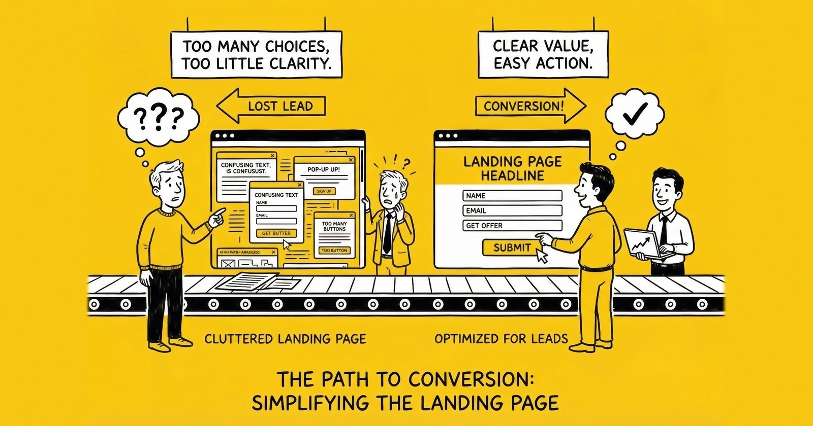
Master the highest-leverage variable in lead generation. These 27 proven tactics transform underperforming landing pages into conversion machines that deliver 2-3x more leads from the same traffic.
You can double your advertising budget. You can triple your traffic sources. You can hire more sales reps. But none of these moves delivers the return-on-effort that landing page optimization provides.
Here’s why: A 1% improvement in conversion rate compounds across every visitor, every traffic source, every dollar spent. If you’re paying $5 per click and converting at 10%, your cost per lead is $50. Improve that conversion rate to 15%, and your CPL drops to $33.33. Same traffic. Same spend. 33% more leads.
Conversion rate is the highest-leverage variable in lead generation economics. A 50% improvement in conversion rate has the same profit impact as a 50% reduction in traffic costs – but optimization is entirely within your control, while traffic costs depend on competitive auction dynamics.
This guide delivers 27 specific tactics organized into five categories. Each tactic includes the what, the why, and the how. No theory. No filler. Just actionable optimization strategies that work across verticals.
Above the Fold Tactics (1-7)
The first screen a visitor sees determines whether they engage or bounce. You have approximately 2.6 seconds to communicate value before attention fractures. These seven tactics maximize that critical first impression.
1. Lead with Outcome-Focused Headlines
Your headline is the single most important element on the page. As David Ogilvy noted in his 1963 classic “Confessions of an Advertising Man,” headlines are read by roughly five times as many people as the body copy. A weak headline wastes the majority of your traffic.
Effective headlines lead with the outcome the visitor wants, not the process they’ll endure. Include a specific number or timeframe when possible, and match the exact language from your ad creative to maintain message consistency.
Consider this transformation: “Get Auto Insurance Quotes Online” becomes “Compare 5 Auto Insurance Rates in 2 Minutes – See How Much You Could Save.” The first headline describes a process. The second promises a specific outcome with a defined time investment. Test headlines relentlessly – they typically drive 20-30% conversion lift when optimized correctly.
2. Crystallize Your Value Proposition in One Sentence
Visitors need to understand what you offer, who it’s for, and why they should care – within three seconds. The value proposition sits below the headline and above the form, following a simple formula: what you do, for whom, plus a unique benefit.
For example: “We connect homeowners with pre-screened solar installers who compete for your project – saving you an average of $4,200 on installation costs.” One sentence. No jargon. A concrete benefit with a specific number that visitors can immediately grasp.
3. Choose Hero Images That Reinforce Intent
Generic stock photos of smiling people holding phones convert worse than no image at all. Your hero image should visually reinforce what the visitor came to accomplish.
The right image varies by vertical. Insurance pages perform best with vehicles, homes, or families – the things being protected. Solar pages benefit from installed panels on rooftops similar to the visitor’s home type. Legal pages require confident professional imagery rather than injury photos. Home services pages thrive with before/after comparisons or work in progress shots.
Apply this test: Cover your headline. Does the image alone communicate what this page is about? If not, the image is decoration, not conversion support.
4. Make the Form Visible Without Scrolling
If visitors can’t see the form, they can’t complete it. On desktop, the form should appear in the right third of the above-fold area. On mobile, it should appear within the first screen scroll.
Track form visibility on initial load – 100% of desktop visitors should see it. Monitor form start rate, the percentage of page visitors who interact with the first form field. If form start rate falls below 30%, visibility is likely the problem.
Many lead generators make the mistake of pushing forms below extensive sales copy. This approach works for complex B2B offers, but for consumer lead generation, form visibility directly correlates with conversion rate.
5. Deploy Trust Signals Strategically
Trust signals reduce friction at the moment of decision. Place them near the form, not buried in the footer.
Effective trust signals for lead generation include security badges from Norton, McAfee, or TRUSTe; industry certifications and licenses; media mentions (“As seen in…”); aggregate customer counts (“Trusted by 2.3 million homeowners”); and real-time activity indicators (“47 people requested quotes in the last hour”).
Placement matters as much as selection. Position security badges immediately below the submit button. Place social proof above or beside the form. Reserve certifications for a horizontal strip below the fold where they reinforce credibility without competing for primary attention.
6. Design Mobile-First, Desktop-Second
Mobile devices now account for over 60% of web traffic globally, and for many lead generation verticals – particularly insurance, solar, and home services – mobile traffic exceeds 70%. Yet most landing pages are still designed on desktop monitors and adapted for mobile as an afterthought. When running Google Ads for lead generation, mobile optimization becomes even more critical since paid traffic demands maximum conversion efficiency.
Mobile-first design demands specific technical requirements: tap targets minimum 48x48 pixels, font size minimum 16px to prevent iOS auto-zoom on form focus, full-width form fields, no horizontal scrolling under any circumstance, and thumb-friendly button placement in the lower third of the screen.
Mobile-First Optimization Specifics
The technical requirements for true mobile-first optimization extend beyond responsive breakpoints. Network-aware loading represents a critical advancement – detecting connection speed via the Network Information API allows pages to serve lighter assets on slower connections. A visitor on 3G should receive compressed images and deferred JavaScript, while 5G visitors can receive richer experiences without penalty.
Touch interaction patterns differ fundamentally from mouse behavior. Hover states that reveal information on desktop become useless on touch devices, requiring alternative disclosure patterns. Sticky form headers that remain visible during scrolling keep the conversion action accessible as visitors consume content. Bottom-sheet form presentations that slide up from the screen edge apply thumb-friendly interaction zones and match mobile UX patterns users encounter in native apps.
Viewport height considerations matter more on mobile than desktop. The visible area above the fold varies dramatically across devices – an iPhone SE shows 60% less content than an iPhone 15 Pro Max. Design for the smallest common viewport (375px width, 667px height) while ensuring larger screens receive appropriately expanded layouts rather than stretched versions of small-screen designs.
Form field optimization for touch requires specific attention. Input fields should expand slightly on focus to indicate active state visually. Auto-advancing between fields after completion reduces tap count – when a ZIP code field accepts 5 digits, auto-focus should shift to the next field automatically. Clear buttons within fields allow single-tap deletion rather than requiring hold-and-select gestures.
Test your landing pages on actual mobile devices, not browser simulators. Load the page on a three-year-old Android phone over 4G. That experience represents your median mobile visitor.
7. Achieve Sub-Three-Second Load Times
Page load speed directly impacts conversion rate. Google research shows that as page load time increases from 1 to 3 seconds, bounce probability increases 32%. At 5 seconds, bounce probability increases 90%.
Speed optimization requires multiple interventions: compress images to WebP format for 30-50% smaller file sizes than JPEG, implement lazy loading for below-fold images, minimize JavaScript execution since every third-party tag costs milliseconds, use a Content Delivery Network for static assets, and enable browser caching with appropriate headers.
Target these benchmarks: Time to First Byte under 200ms, Largest Contentful Paint under 2.5 seconds, and total page weight under 1MB for mobile. Use Google PageSpeed Insights to benchmark current performance and identify specific optimization opportunities.
Form Optimization Tactics (8-14)
The form is where intention converts to action. Every field, every label, every interaction either moves visitors forward or creates friction that stops them. These seven tactics transform forms from conversion barriers into conversion engines.
8. Implement Multi-Step Forms
Multi-step forms consistently outperform single-page forms by a wide margin. Industry testing shows multi-step forms can convert significantly better than their single-page equivalents, with HubSpot and other conversion optimization studies documenting improvements ranging from 50% to over 100% depending on implementation.
The psychology behind multi-step superiority involves four reinforcing mechanisms. Commitment escalation means small initial asks build momentum toward larger asks. Reduced cognitive load allows visitors to focus on one question category at a time. Progress motivation creates completion incentive through visible advancement. Lower abandonment occurs because visitors feel invested after completing early steps.
The implementation framework follows a consistent pattern: Step 1 presents low-friction qualifying questions like ZIP code and service type; Step 2 gathers project or need details; Step 3 collects contact information including phone, email, and name. Start with the easiest questions. Save contact information for the final step after visitors have invested effort in the process.
9. Sequence Fields by Friction Level
Field order matters. Start with low-friction fields – service type, ZIP code, timeline – and progress to higher-friction fields like name, phone, and email.
The psychology behind this sequencing is straightforward: each completed field represents a micro-commitment. These micro-commitments create cognitive consistency pressure – the visitor has already invested effort, so completing the next field feels natural.
The optimal sequence for most lead generation forms begins with service or product type through dropdown or button selection, followed by location using ZIP code only rather than full address, then qualifying details covering project scope, timeline, and existing situation, and finally contact information in the order of phone, email, and name.
Notice that name comes last. It’s the most personal field, so it belongs after rapport has been established through earlier interactions.
10. Display Progress Indicators on Multi-Step Forms
Progress indicators increase completion rates by 10-15% on multi-step forms. Visitors need to know where they are in the process and how much remains.
Effective progress indicator formats include step numbers (“Step 2 of 3”), progress bars showing visual completion percentage, and breadcrumb trails (“Service > Details > Contact”). Show progress on every step, including the first. Use encouraging language like “Almost done” on the final step. Keep the count low – three to four steps maximum.
If your form requires more than four steps, your qualification requirements are likely too aggressive. Test whether all fields are necessary by tracking field-level abandonment.
11. Pre-populate Smart Defaults
Smart defaults reduce friction by pre-selecting the most common response or using available data to populate fields automatically.
Auto-detect and pre-fill ZIP code from IP geolocation while providing an option to change. Pre-select the most common response – “Homeowner” rather than requiring selection. Default timeline to “As soon as possible” if that’s the most common response. Use browser autofill attributes like autocomplete="email" and autocomplete="tel" to leverage saved user data.
Every click saved is friction removed. If 80% of visitors select the same option, make it the default.
12. Validate Inline and in Real-Time
Inline validation catches errors immediately, before the visitor submits and sees a generic error page.
Phone validation should format as the user types while validating length and structure. Email validation checks format and catches common typos, suggesting “gmail.com” when someone types “gmail.con”. ZIP validation confirms entries against an actual ZIP code database. For comprehensive guidance on validating phone numbers and email addresses, implement both format checks and deliverability verification. Required fields should be indicated clearly, but rather than marking optional fields, simply remove them.
User experience principles guide the implementation: validate on blur when the field loses focus, not on every keystroke. Use green checkmarks for valid fields and subtle red for errors. Position error messages immediately below the field. Write error messages that tell users how to fix the problem – “Phone number must be 10 digits” is actionable, while “Please enter a valid phone number” only restates the problem.
13. Trigger Appropriate Mobile Keyboards
On mobile devices, triggering the correct keyboard type eliminates friction and reduces errors.
The HTML input types map to specific keyboards: <input type="tel"> triggers the numeric keyboard with + symbol for phone numbers; <input type="email"> provides a keyboard with @ and .com buttons; <input type="number"> or inputmode="numeric" displays a pure numeric keyboard; and for ZIP codes, use inputmode="numeric" rather than type="number" to avoid increment arrows that confuse users.
This small technical detail has outsized impact on mobile conversion rates. Test your forms on iOS and Android to verify correct keyboard behavior.
14. Optimize Submit Button Copy
“Submit” is the worst possible button copy. It’s generic, passive, and creates no motivation.
Effective button copy uses first-person language (“Get My Quote” not “Get Your Quote”), leads with action (“See My Rates” not “Submit Form”), reinforces value (“Start Saving Today” not “Continue”), and creates urgency where appropriate (“Claim Your Spot”).
High-performing button copy varies by vertical: Insurance pages convert well with “See My Rates” or “Get My Free Quote.” Solar pages benefit from “Calculate My Savings.” Home services pages perform with “Get Matched with Pros.” Legal pages respond to “Get My Free Case Review.”
Test button copy variations – they typically produce 10-20% conversion differences with minimal implementation effort.
Trust and Social Proof Tactics (15-20)
Trust determines whether visitors complete your form. These six tactics build credibility through evidence rather than claims.
15. Feature Authentic Customer Testimonials
Testimonials work when they’re specific and credible. They fail when they’re generic and unattributable.
Strong testimonials include a full name and location (city and state minimum), a specific outcome (“Saved $1,847 on my home insurance” not “Great service”), a photo or better yet a video, and a date or recency indicator. Generic praise from anonymous sources does nothing to build trust.
Placement matters: testimonials belong near the form, ideally adjacent to the submit button. Testimonials are last-mile trust builders – they matter most at the moment of decision.
16. Display Aggregate Social Proof
Numbers communicate credibility at scale. When thousands of people have trusted your service, new visitors feel safer joining them.
Effective aggregate proof includes total customers served (“Join 2.3 million homeowners who saved”), reviews and ratings (“4.8 stars from 12,847 reviews”), industry awards and recognition, and partner network size (“Connected to 847 licensed contractors nationwide”).
Real-time social proof adds urgency: “127 people are comparing quotes right now” or “Sarah from Phoenix just received her estimate.” These dynamic indicators create both trust and a subtle fear of missing out.
17. Address Objections Proactively
Visitors don’t complete forms because of unspoken objections. Address the most common concerns directly on the page.
The objection “Will I get spammed?” deserves the response “We’ll contact you once to confirm your request. Your information is never sold.” Security concerns warrant visible badges plus a brief privacy statement. “What happens next?” requires a clear explanation of the post-submission process. “Is this really free?” should be countered with explicit reassurance: “100% free, no obligation, no credit check.”
Place objection-handling content near friction points. Security assurances belong near the phone number field. Process explanations belong near the submit button.
18. Show Media Logos and Press Mentions
Third-party credibility transfers trust from established brands to your landing page. Display logos in a horizontal strip with “As featured in…” labeling, include recognizable industry publications, keep logos grayscale to avoid visual competition with CTAs, and link to actual coverage when possible.
Even startup lead generators can earn press mentions through industry contributions, data releases, or newsjacking relevant stories. The effort required to earn a few credible mentions pays dividends across every page view.
19. Display Verification and Compliance Badges
In regulated industries, compliance badges serve dual purposes: they build trust and signal legitimacy.
Industry-specific badges vary: Insurance pages feature state licensing badges and carrier partnerships. Solar pages display NABCEP certifications and manufacturer partnerships. Financial pages show BBB accreditation and state licensing. Legal pages include bar association membership and Super Lawyers recognition.
Position compliance badges where they matter – near the form for consumer trust, in the footer for regulatory satisfaction.
20. Guarantee Transparency in Partner Selection
Lead aggregators match visitors with service providers. Visitors want to know how that matching works.
Transparency elements that reduce abandonment include explaining how providers are selected (screened, licensed, rated), specifying how many providers will contact them, describing how they can control the experience through opt-out options and contact preferences, and clarifying what happens to their information regarding privacy and data use.
Transparency reduces form abandonment by addressing the “what happens next” uncertainty that stops visitors mid-process.
Technical Optimization Tactics (21-24)
Technical performance directly impacts conversion rate. These four tactics address the infrastructure that supports (or undermines) your landing page effectiveness.
21. Implement Proper Tracking Architecture
You cannot optimize what you cannot measure. Proper tracking architecture provides the data foundation for all optimization decisions.
Required tracking elements include form start tracking to capture when visitors first interact with the form, field-level analytics to identify which fields cause abandonment, step completion tracking for multi-step forms, submission success tracking for confirmed submissions, and source attribution to map traffic sources to conversions.
Technical implementation typically involves Google Tag Manager for tag deployment, Google Analytics 4 for behavioral analytics, form-specific event tracking for funnel visualization, and cross-device tracking for mobile-to-desktop journeys.
Without proper tracking, optimization becomes guessing. Invest the setup time before running tests.
22. Deploy Server-Side Validation as Backup
Client-side validation improves user experience. Server-side validation ensures data quality.
Server-side validation should include phone verification against carrier databases, email validation through SMTP verification without sending, ZIP code verification to confirm valid and serviceable locations, and duplicate detection to flag repeat submissions within a defined time window.
Client-side validation catches honest mistakes. Server-side validation catches fraud, bots, and data quality issues that impact lead value.
23. Optimize for Core Web Vitals
Google’s Core Web Vitals directly impact search rankings and correlate strongly with conversion rates.
The three Core Web Vitals measure different aspects of user experience. LCP (Largest Contentful Paint) measures how quickly main content loads, with a target of under 2.5 seconds. FID (First Input Delay) measures how quickly the page responds to interaction, targeting under 100ms. CLS (Cumulative Layout Shift) measures visual stability during load, with a target under 0.1.
Common Core Web Vitals issues on landing pages include images without width/height attributes causing layout shift, third-party scripts blocking the main thread and delaying interaction, and large hero images loading slowly and hurting LCP. Use Chrome DevTools or PageSpeed Insights to diagnose and prioritize fixes.
24. Implement Fallback and Error Handling
Technical failures happen. How your page handles them determines whether failures cost you conversions.
Required fallback mechanisms include form submission failure handling that displays a friendly error message with retry option, partial data capture that saves completed fields so visitors don’t restart, offline detection that queues submission when connection returns, and timeout handling with clear messaging if server response is slow.
Test your error states intentionally. Disconnect from the internet mid-submission. Throttle your connection to 3G speeds. See what visitors experience when things go wrong.
AI-Powered Personalization Tactics
Machine learning and AI systems have transformed landing page optimization from manual A/B testing to dynamic, real-time adaptation. Understanding these capabilities – and their practical limitations – separates sophisticated operations from those still relying on static optimization.
Real-Time Content Personalization
AI-powered personalization engines analyze visitor signals in milliseconds to serve customized content variations. Unlike traditional A/B testing that shows random variations, machine learning models predict which content combination will convert each specific visitor based on available signals.
The input signals that drive personalization include traffic source and campaign context, geographic location down to city level, device and browser characteristics, time of day and day of week patterns, and any available first-party data from previous interactions. A visitor arriving from a Facebook ad about home insurance in Phoenix at 7 PM on mobile receives a different headline, hero image, and form configuration than someone arriving from Google search in Chicago at 10 AM on desktop.
Implementation requires significant infrastructure. Personalization platforms like Dynamic Yield, Optimizely, or Mutiny serve as the decision engine. Content management systems must support component-level variation rather than just page-level changes. Real-time data pipelines feed visitor signals to the personalization engine with sub-100ms latency. And sufficient traffic volume – typically 10,000+ monthly visitors per personalization segment – provides the data needed for models to learn effectively.
The economics favor high-traffic operations. Personalization platforms cost $2,000-$15,000 monthly, making them viable only when the conversion lift justifies the expense. Operations with 50,000+ monthly visitors typically see 15-25% conversion improvements that more than cover platform costs. Smaller operations often achieve better ROI from manual optimization and segmented landing pages.
Predictive Form Optimization
AI extends beyond content personalization into form behavior itself. Predictive models can adjust form length, field sequence, and qualification depth based on predicted lead quality and conversion probability.
High-intent visitors identified by behavioral signals – multiple page views, returning visitor, longer time on site – may see shorter forms with fewer qualification fields because their demonstrated interest suggests higher conversion probability. Lower-intent visitors may see more qualification questions upfront, capturing valuable data before potential abandonment while filtering low-quality leads.
Dynamic field ordering represents another AI application. Machine learning models identify which question sequences produce highest completion rates for different visitor segments. Some visitors convert better when asked about timeline first; others respond better to budget questions early. AI systems test thousands of sequence permutations and converge on optimal orderings for each identifiable visitor cluster.
Predictive Lead Scoring at Capture
Advanced implementations score leads in real-time during form completion, adjusting the experience based on predicted lead value. A visitor whose partial form responses suggest high commercial intent might see a premium offer or immediate callback option. One whose responses suggest lower value might complete a standard flow.
This approach requires integration between the landing page, CRM, and lead routing systems. The form passes partial data to a scoring API that returns a quality prediction, which then triggers appropriate variation display. Implementation complexity is substantial, but operations handling high lead volumes find the downstream value – better leads routed to better buyers or sales reps – justifies the investment.
Limitations and Realistic Expectations
AI personalization is not magic. Several constraints limit practical application.
Cold start problems mean new visitors with no behavioral history receive generic experiences. First-time visitors from new traffic sources lack the signals that enable personalization. Model training requires substantial historical data – typically 3-6 months of conversion data with consistent tracking – before predictions become reliable.
Privacy restrictions increasingly limit available signals. iOS users provide minimal cross-site data. Cookieless browsers eliminate visitor recognition. GDPR and CCPA compliance requirements may restrict which data points can feed personalization decisions without explicit consent.
Complexity introduces failure modes. Personalization logic that seems optimal in aggregate can produce poor individual experiences. A visitor who genuinely needs detailed information might receive a streamlined experience because they fit a behavioral pattern associated with quick conversions. Monitoring and override mechanisms prevent personalization from harming edge cases.
Testing and Iteration Tactics (25-27)
Optimization is a continuous process, not a one-time project. These three tactics establish the disciplines that compound improvement over time.
25. Run Proper A/B Tests
A/B testing removes opinion from optimization decisions. Only data determines what works.
Proper A/B testing requires statistical significance at 95% confidence minimum before declaring winners, adequate sample size of typically 1,000+ visitors per variation, single variable isolation to test one change at a time for clear attribution, and full-cycle testing that runs through weekends and week variations.
Prioritize tests by potential impact. Headlines offer 20-30% potential lift. Form length and structure can swing conversion by 10-40%. Button copy and design typically produce 10-20% differences. Trust signal placement generates 5-15% improvement. Hero image or video changes yield 5-15% lift. Understanding which CRO metrics matter most helps you focus testing efforts on the highest-impact areas.
Use tools like VWO, Optimizely, or Convert for test deployment and analysis – Google Optimize has been sunset as of 2023.
26. Analyze Field-Level Abandonment
Multi-step form analytics reveal exactly where visitors drop off. Field-level analysis shows which specific questions cause abandonment.
Examine step-to-step drop-off to identify which transitions lose the most visitors, field abandonment to pinpoint which specific fields cause exits, time-on-field metrics where long dwell time suggests confusion, and error rates to find which validations fail most often.
Common discoveries include phone number fields having highest abandonment (address with privacy messaging), open-text fields having lower completion than selection fields (add options), and required fields that visitors consistently leave blank (reconsider the requirement). Field-level data transforms form optimization from intuition to precision.
27. Establish Continuous Testing Velocity
Optimization compounds. A 5% improvement every month yields a 79% improvement over one year. Establish a testing cadence that treats optimization as ongoing rather than occasional.
Testing velocity targets scale with sophistication: minimum 2 tests per month, target 4-6 tests per month, and advanced operations run continuous testing with automated traffic allocation.
Process requirements support sustained velocity: maintain a prioritized test backlog of hypotheses, document all results including both winners and losers, synthesize learnings to identify patterns across tests, and cross-pollinate by applying successful approaches across landing pages.
The teams that win at conversion optimization are not smarter – they test more frequently and learn faster from results.
Prioritizing Your Optimization Efforts
With 27 tactics available, where do you start? Prioritize based on current gaps and potential impact.
Priority 1: Foundation (Week 1-2)
Begin with the fundamentals that everything else depends on. Get page load speed under 3 seconds. Ensure the mobile experience is functional and frictionless. Make the form visible above fold. Implement basic tracking to measure everything that follows.
Priority 2: Form Optimization (Week 3-4)
With foundations solid, focus on the conversion mechanism itself. Build out multi-step form structure. Add inline validation. Configure smart defaults. Optimize button copy to motivate action.
Priority 3: Trust Building (Week 5-6)
Once the form converts, increase conversion rates through credibility. Position trust signals near the form. Add testimonials with specific outcomes. Write objection handling content. Ensure process transparency so visitors know what happens next.
Priority 4: Testing Infrastructure (Week 7-8)
Prepare for continuous improvement by establishing the testing framework. Deploy an A/B testing tool. Implement field-level analytics. Launch your first headline test. Document the testing process for team consistency.
Priority 5: Continuous Improvement (Ongoing)
Optimization never ends – it compounds. Establish a regular testing cadence of at least 2-4 tests per month. Document and analyze all results. Apply learnings across all pages. Generate new hypotheses from data patterns.
Measuring Success
Track these metrics to quantify optimization impact and guide future priorities.
Primary Conversion Metrics
Conversion rate – submissions divided by unique visitors – serves as the north star metric. Industry benchmarks range from 2-10% depending on vertical and traffic quality. Form start rate measures first field interactions divided by page visitors, with well-optimized pages targeting 30% or higher. Form completion rate tracks submissions divided by form starts, with multi-step forms targeting 60% or better.
Secondary Quality Metrics
Cost per lead divides total traffic cost by submissions. Lead quality score tracks post-submission validation pass rates. Sales qualified rate measures leads that convert to sales opportunities. Revenue per visitor – total revenue divided by unique visitors – captures the complete economic picture.
Technical Performance Metrics
Monitor page load time with a target under 3 seconds, Core Web Vitals scores targeting all green, and mobile usability score targeting 100 in Google Search Console. Build dashboards that display these metrics daily. Optimization decisions require current data.
Frequently Asked Questions
1. What is a good conversion rate for a lead generation landing page?
Conversion rates vary significantly by vertical, traffic source, and offer. General benchmarks: paid search landing pages convert at 2-5%, organic traffic at 3-8%, and highly targeted campaigns at 10-15%. Focus on improving your own baseline rather than chasing industry averages.
2. Should I use video on my landing page?
Video can increase conversion rates when it reinforces the value proposition without delaying page load or distracting from the form. Auto-playing background video hurts more than it helps. Testimonial videos near the form can improve trust. Test video against static alternatives – results vary by audience.
3. How many form fields should I include?
Include only fields that directly impact lead quality or routing. Every additional field reduces conversion rate by 4-7%. For consumer lead generation, 5-8 fields is typical. If you need more qualifying data, use multi-step forms to reduce perceived complexity.
4. What’s the difference between multi-step forms and progressive profiling?
Multi-step forms collect all information in a single session across multiple screens. Progressive profiling collects information over time across multiple sessions or interactions. Multi-step forms work for lead generation where you need immediate qualification. Progressive profiling works for lead nurturing where you build profiles over time.
5. How long should I run an A/B test?
Run tests until you reach 95% statistical significance with at least 100 conversions per variation. For most landing pages, this means 2-4 weeks. Never end tests early based on preliminary results – early leads often differ from later leads in systematic ways.
6. Should my landing page have navigation?
No. Remove all navigation, footer links, and external links from lead generation landing pages. Every link is a potential exit. The only action available should be form completion. Distraction-free design typically improves conversion rates by 10-30%.
7. How do I optimize for mobile without hurting desktop?
Build mobile-first, then enhance for desktop. Use responsive design frameworks that adapt layout based on viewport. Test on actual devices, not just browser simulations. Mobile optimization rarely hurts desktop performance, but desktop-first design frequently hurts mobile conversion.
8. What time should I publish landing pages?
Publication timing matters for SEO content but not for landing pages. Landing pages receive traffic from advertising and campaigns you control. What matters is ensuring pages are fully tested and tracking is verified before campaigns launch.
9. How do I reduce form spam without adding CAPTCHAs?
Implement invisible protections: honeypot fields that humans don’t see but bots fill, time-based validation that rejects instant submissions, phone and email verification APIs, and behavioral analysis that detects non-human patterns. For a deeper dive into bot detection and CAPTCHA alternatives, explore modern solutions that protect forms without sacrificing conversions. Visible CAPTCHAs reduce conversion rates by 3-8%.
10. When should I create a new landing page versus optimizing an existing one?
Optimize existing pages when changes are incremental (headlines, copy, images, form modifications). Create new pages when testing fundamentally different approaches (new value propositions, different page structures, distinct offers). Use A/B testing for incremental changes, new page creation for radical redesigns.
Key Takeaways
-
Conversion rate is the highest-leverage variable in lead generation economics – a 50% improvement in conversion delivers the same profit impact as a 50% reduction in traffic costs.
-
Multi-step forms significantly outperform single-page forms by reducing cognitive load and building commitment through progressive micro-investments.
-
Mobile traffic exceeds 70% in most consumer lead generation verticals – design mobile-first, test on actual devices, and verify tap targets and keyboard behaviors.
-
Page load speed directly impacts conversion – every second of delay increases bounce probability by 32%. Target sub-three-second load times for all landing pages.
-
Form visibility above the fold is non-negotiable. If visitors cannot see the form without scrolling, form start rates drop dramatically.
-
Test continuously. A 5% monthly improvement compounds to 79% annual improvement. Establish a testing velocity of at least 2-4 tests per month.
-
Track field-level abandonment to identify specific friction points. The data reveals exactly where visitors drop off and which questions cause hesitation.
-
Trust signals belong near the form, not in the footer. Place security badges below the submit button and testimonials adjacent to form fields.
-
Remove all navigation and external links from lead generation landing pages. Every link is a potential exit. The only available action should be form completion.
-
Document all test results – winners and losers. Patterns emerge over time that inform future hypotheses and accelerate optimization learning.