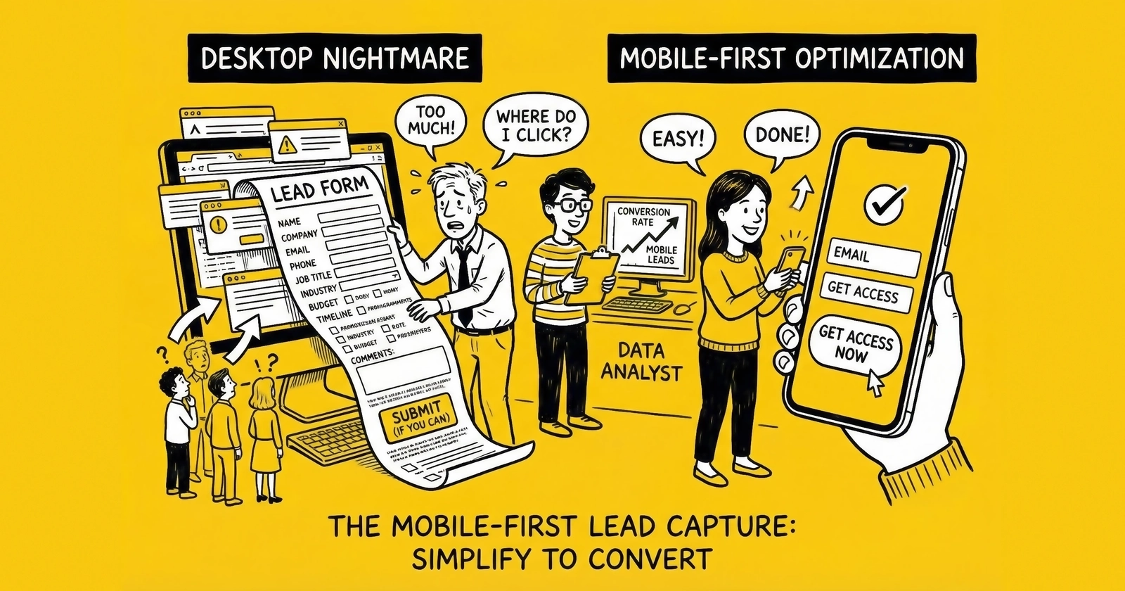
Your desktop-first forms are optimized for the minority. Mobile is where the money moves.
Look at your analytics right now. Not tomorrow. Right now. Find the device breakdown for your lead generation pages.
If you are like most practitioners in insurance, solar, home services, and mortgage, you will see a number between 65% and 80% next to mobile traffic. In verticals targeting consumers under 40, that number climbs past 85%. For payday loans and debt settlement, mobile traffic regularly exceeds 90%.
Now look at your conversion rates by device.
This is where the problem lives. Despite receiving the majority of your traffic, mobile converts 15-30% lower than desktop across most lead generation operations. A page converting at 12% on desktop drops to 9% on mobile. That three-percentage-point gap, applied to 70% of your traffic, represents massive revenue leakage.
The gap exists because most lead generation operations still design for desktop and adapt for mobile. They build forms on 27-inch monitors, test on Chrome DevTools simulations, and call it responsive. The result: forms that technically work on mobile but fail to convert.
Mobile-first lead capture reverses this approach. You design for the thumb, for the small screen, for the distracted commuter holding a phone with one hand. Desktop becomes the adaptation. This article provides the complete framework for mobile-first lead generation, with specific implementation details, benchmarks, and testing protocols.
Mobile Traffic Statistics: The Numbers That Demand Action
The shift to mobile is not a trend – it is the established reality. Understanding the current data eliminates any debate about priority.
Overall Mobile Traffic
Google reports that over 60% of all searches now occur on mobile devices. For lead generation specifically, the numbers run higher because lead gen targets consumers in active shopping mode. Statista data from 2024 shows global mobile traffic at 58.67% of all web traffic. For lead generation landing pages specifically, the number typically runs 10-15 percentage points higher than general web traffic.
Vertical-Specific Data
Different verticals show different mobile penetration. Insurance leads run 70-75% mobile; solar leads 65-70%; mortgage leads 60-70%; home services leads 75-80% (consumers with urgent repair needs search from phones at the moment of need); legal leads 70-80% (consumers in crisis reach for the nearest device); and debt/financial leads 80-90% (lower-income demographics rely primarily on smartphones for internet access).
The Demographic Factor
Mobile traffic percentages increase as target demographic age decreases. Consumers aged 55+ show 50-60% mobile traffic, while consumers aged 18-24 exceed 90% mobile. If your vertical targets younger demographics – student loans, first-time auto insurance, starter life insurance – mobile is nearly the entirety of your traffic.
The Conversion Gap
Despite dominating traffic, mobile conversion rates lag behind desktop. WordStream data shows average mobile landing page conversion rates at 11.2% compared to 12.1% for desktop across industries.
For an operation receiving 100,000 monthly visitors at 70% mobile, closing the mobile conversion gap would generate 630 additional leads per month – 7,560 annually. At $30 per lead, that is $226,800 left on the table each year.
Mobile Form Design Principles
Mobile form design is not about making desktop forms smaller. It requires fundamental reconsideration of how humans interact with handheld touchscreens.
Thumb-Friendly Tap Targets
The average adult thumb has a contact area of approximately 45-57 pixels when tapping a screen. Apple’s Human Interface Guidelines recommend minimum tap targets of 44x44 points. Google’s Material Design specifies 48x48 density-independent pixels.
In practice, this means:
Form fields: Minimum height of 44-48 pixels. Fields with heights of 30-35 pixels – common in desktop-first designs – create tap frustration on mobile. Users accidentally select adjacent fields, triggering error states and abandonment.
Buttons: Minimum size of 48x48 pixels. For primary actions like form submission, use full-width buttons that span the screen. This eliminates the need for precise tap targeting entirely.
Spacing between elements: Minimum 16 pixels between interactive elements. Tighter spacing on desktop improves visual density. On mobile, it creates accidental tap cascades.
Checkbox and radio button sizing: Default browser checkboxes render at approximately 13x13 pixels – far too small for reliable mobile tapping. Use custom styles that expand the touch target to at least 44x44 pixels while keeping the visual checkbox at a reasonable size.
Single-Column Layouts
Multi-column form layouts that work on desktop create chaos on mobile. The fundamental principle: one column, full width, stacked vertically.
Every form element should:
- Span the full width of the screen (with appropriate padding)
- Stack in a single vertical flow
- Require only vertical scrolling, never horizontal
Side-by-side field arrangements (first name/last name on the same row) fail on mobile. The fields become too narrow for comfortable typing. The tap targets become cramped. The visual hierarchy becomes unclear.
Exception: Very short fields like state abbreviations or two-digit inputs can sometimes share a row if the total row height meets tap target requirements and the fields are logically grouped. Test carefully before implementing.
Appropriate Input Types
HTML5 introduced input types that trigger optimized mobile keyboards. Using the wrong input type forces visitors to manually switch keyboards – a small friction that compounds across form fields.
Phone numbers: Use type="tel" to trigger the numeric phone keypad. This is the single most impactful input type for lead generation forms. Phone number is a required field for virtually all lead types, and the numeric keypad reduces entry time by 50% or more compared to the standard QWERTY keyboard.
Email addresses: Use type="email" to trigger a keyboard with the @ symbol and .com shortcut prominently displayed. Most mobile keyboards also reduce space bar width to add dedicated @ and period keys.
ZIP codes: Use type="tel" (not type="number"). The tel input provides a clean numeric keypad. The number input adds increment/decrement spinners that serve no purpose for ZIP codes and create clutter.
Dates: Use type="date" to trigger native date pickers rather than requiring manual date entry. Native date pickers are faster and less error-prone than text entry, though styling options are limited.
Currency amounts: Use type="tel" with pattern validation. The number input can work but has inconsistent mobile behavior across browsers.
Auto-Complete and Autofill
Mobile users hate typing. Every character they must tap is friction. Browser autofill dramatically reduces required input – when you enable it.
Use standardized autocomplete attributes: autocomplete="given-name" for first name, autocomplete="tel" for phone, autocomplete="email" for email. Never use autocomplete="off" on lead capture forms – autofill is friction reduction.
Test autofill behavior on iOS Safari, Chrome for Android, and Samsung Internet. For full addresses, implement Google Places Autocomplete – typing a full address on mobile is extremely high-friction.
Load Speed on Mobile: The 3-Second Rule
Page speed matters more on mobile than desktop. Mobile users are on cellular connections with variable latency, using less powerful processors, often in situations demanding their attention elsewhere. Every additional second of load time costs you conversions.
The Data on Speed and Conversion
Google research establishes clear benchmarks:
- As page load time increases from 1 second to 3 seconds, bounce probability increases by 32%
- As page load time increases from 1 second to 5 seconds, bounce probability increases by 90%
- As page load time increases from 1 second to 10 seconds, bounce probability increases by 123%
For lead generation specifically, Portent found that landing pages loading in 1 second convert at 3x the rate of pages loading in 5 seconds. The difference between a 2-second load and a 4-second load can mean 50% fewer leads from identical traffic.
Target Metrics
Time to First Byte (TTFB): Under 200 milliseconds. This measures server response time before content begins loading. Slow TTFB indicates hosting or backend issues.
First Contentful Paint (FCP): Under 1.8 seconds. This measures when the first visual content appears. Users see a blank screen until FCP; every millisecond feels like an eternity.
Largest Contentful Paint (LCP): Under 2.5 seconds. This measures when the main content finishes loading. For lead forms, this is typically when the form itself becomes visible and interactive.
Time to Interactive (TTI): Under 3.8 seconds. This measures when the page becomes fully interactive – when users can tap fields and submit forms. A page that appears loaded but does not respond to input creates significant friction.
Speed Optimization Tactics
Image optimization: Use WebP format with JPEG fallback. Compress aggressively. Lazy load images below the fold. Consider eliminating decorative images entirely on mobile.
Font and CSS optimization: Use system fonts when possible. If custom fonts are required, use font-display: swap. Inline critical CSS for above-the-fold content. Defer non-critical CSS.
JavaScript reduction: Every kilobyte of JavaScript must be downloaded, parsed, and executed. Remove tracking scripts that do not directly support conversion. Defer non-critical scripts.
Infrastructure: Use CDN for static assets. Avoid cheap shared hosting – it creates TTFB problems that no amount of front-end optimization can fix.
Mobile-Specific Speed Considerations
Mobile devices have less processing power than desktops. Test page speed on actual mobile devices, not just Chrome DevTools throttling. A page that loads in 2 seconds on WiFi may take 4 seconds on LTE and 8 seconds on 3G. Measure your actual visitors’ experience using Real User Monitoring (RUM) through Google Analytics 4 or third-party tools like SpeedCurve.
Mobile-Specific Conversion Tactics
Beyond form design and speed, several tactics specifically address mobile user behavior and expectations.
Sticky Headers and Footers
Mobile screens have limited vertical real estate. Sticky elements that remain visible during scrolling can either help or hurt conversion.
Sticky CTAs work: A sticky footer with a prominent call-to-action button keeps the primary conversion path visible regardless of scroll position. Users never need to scroll back up to find the submit button.
Sticky navigation often hurts: A sticky header consuming 60+ pixels of screen real estate pushes the form below the fold and reduces the content visible during scroll. For single-purpose landing pages, consider eliminating navigation entirely rather than making it sticky.
Implementation: If using a sticky CTA footer, ensure it does not overlap form fields. Add bottom padding to the form container equal to the sticky footer height plus buffer.
Touch-Friendly Selection Controls
For few options (2-4 choices), use visible button groups or radio buttons rather than dropdowns – tapping one visible option is faster than opening a dropdown. For many options (5+ choices), native select elements work well; the full-screen picker is designed for thumb navigation. For very many options (states, countries), implement searchable selects that allow typing to filter.
Progressive Disclosure
Mobile screens cannot display as much information as desktop screens. Progressive disclosure shows only essential information initially, revealing additional content as needed.
FAQ accordions: Rather than displaying all FAQ content on load, show questions only and expand answers on tap. This reduces visual clutter and scroll depth.
Form field explanations: Rather than showing help text for every field, show a help icon that reveals explanation on tap. This keeps forms visually clean while making help available.
Multi-step forms: The ultimate progressive disclosure – show only a few fields at a time, revealing additional steps as users progress. Multi-step forms convert 86% higher than single-page forms partly because they reduce perceived complexity.
Reducing Typing Requirements
Every character a mobile user must type is friction. Use pre-filled defaults based on geo-IP or referral data. Implement smart suggestions for city names, employer names, and vehicle makes/models. Consider camera-based input for fields like VIN numbers. Ensure form fields do not disable voice input – many mobile users prefer dictation.
Click-to-Call vs Form Submit
Mobile users have phones in their hands. They can call immediately without device switching. This creates strategic options for lead capture that do not exist on desktop.
When Click-to-Call Wins
Click-to-call works best for high-urgency verticals (emergency services, time-sensitive legal matters), complex products requiring consultation (life insurance, high-value services), older demographics (users over 55 are more comfortable with phone conversations), and when forms are converting poorly despite optimization efforts.
When Form Submit Wins
Forms win when you need qualification data for lead routing or pricing, when call center capacity is constrained, during off-hours (forms work 24/7), and for lead resale models where form data is essential for routing and value determination.
Hybrid Approaches
The most sophisticated mobile lead generation combines both. Form with click-to-call option uses form completion as the primary path with a secondary “Prefer to talk? Call now” CTA. Form with call scheduling captures qualification data while offering phone convenience. Progressive qualification with live transfer uses forms to qualify, then offers live transfer to close.
Click-to-Call Implementation
Click-to-call buttons should be large, contrasting, and clearly labeled – “Tap to Call Now” is clearer than a phone icon alone. Display the phone number as text alongside the button. Use call tracking numbers (CallRail, Invoca, Marchex) to attribute calls to campaigns. If calls go to voicemail outside business hours, display hours prominently or hide click-to-call during off-hours.
SMS Verification on Mobile
SMS verification adds friction to form completion but can dramatically improve lead quality and reduce fraud. On mobile, SMS verification is particularly seamless because the verification code arrives on the same device being used to complete the form.
Benefits of SMS Verification
Phone number validity: SMS verification confirms the phone number works and is in the consumer’s possession. No more leads with disconnected numbers, landlines entered as mobile, or intentionally fake numbers.
Fraud reduction: Bot farms struggle to verify at scale. Each verification requires an actual phone number that can receive texts. This dramatically reduces fake lead volume.
Contact rate improvement: Verified phone numbers have higher contact rates. The consumer has already engaged with their phone during the lead capture process, increasing the probability they will answer when called.
Lead value increase: Many buyers pay premium prices for SMS-verified leads because of improved contact rates and reduced fraud.
Implementation Best Practices
Request SMS verification after collecting all other form data, immediately before final submission. Tell users why you are verifying – “We’ll text you a 4-digit code to verify your phone number – this ensures you receive your quotes.”
Use 4-digit codes (balancing security with ease of entry). Implement the “one-time-code” autocomplete attribute to enable iOS auto-fill. Allow code resend after 30-60 seconds. Consider voice call verification as a fallback for users who cannot receive SMS.
Impact on Conversion
SMS verification reduces form completion rates by 15-30%, depending on implementation and audience. This reduction must be weighed against quality improvements. If verified leads convert to sales at higher rates due to improved contact rates, the overall economics may favor verification. Calculate through to revenue, not just CPL.
Testing Mobile Separately
Your A/B test results may be lying to you. Tests run across all devices aggregate mobile and desktop behavior – and what works for desktop may fail on mobile, and vice versa.
Why Separate Testing Matters
Consider a test comparing two form layouts:
- Layout A: Multi-step with 4 steps, 3 fields each
- Layout B: Multi-step with 6 steps, 2 fields each
Aggregate results show Layout A winning by 8%. You implement Layout A site-wide.
But drilling into device-specific data reveals:
- Desktop: Layout A wins by 15%
- Mobile: Layout B wins by 5%
The aggregate result was driven by desktop behavior. You just made your mobile experience (70% of traffic) worse by implementing the aggregate winner.
Device-Specific Testing Protocol
Run parallel tests with audience targeting by device. Accept different winners – serve device-specific variations rather than forcing one-size-fits-all. Calculate sample sizes separately; mobile tests require larger samples because mobile conversion rates are typically lower. Test mobile-specific variations (click-to-call placement, sticky footer CTAs, thumb zone optimization) on mobile only. For more on testing methodology, see our guide to A/B testing lead forms.
What to Test Separately
Test form length and step count (mobile users may prefer more steps with fewer fields), button placement (full-width vs. centered, sticky vs. inline), trust signals, click-to-call vs. form submit, and page length (long-form sales pages may work on desktop but lose mobile users).
Progressive Web Apps for Lead Gen
Progressive Web Apps (PWAs) bring app-like experiences to mobile web. For lead generation, PWAs offer several advantages over traditional mobile web pages.
PWA Benefits for Lead Generation
Offline capability: PWAs can cache form content and structure, allowing visitors to begin form completion even with spotty connectivity. Data syncs when connection returns.
Home screen installation: Users can “install” your PWA to their home screen, creating an app-like icon for direct access. This benefits repeat-visit models like insurance quote comparison.
Push notifications: PWAs support push notifications, enabling re-engagement of visitors who did not complete forms. This is a remarketing channel independent of advertising platforms.
Improved performance: PWAs use service workers to cache assets, dramatically improving load time on repeat visits and reducing bandwidth usage.
When PWAs Make Sense
PWAs deliver the most value for quote comparison sites with repeat visitors, lead generation combined with content marketing, and high-consideration purchases with multiple touchpoints.
For single-visit paid traffic landing pages, the PWA overhead may not be justified. PWAs require more sophisticated development – service worker configuration, manifest files, and caching strategies add complexity. iOS Safari also has historically lagged in PWA support. Test thoroughly on both platforms.
Mobile Analytics to Track
Without proper measurement, you cannot optimize. These metrics specifically track mobile lead generation performance.
Core Mobile Metrics
Mobile conversion rate: Track form completions divided by mobile sessions separately from desktop. This is your primary mobile performance indicator.
Mobile bounce rate: The percentage of mobile visitors who leave without interaction. High mobile bounce rates (over 50%) indicate page speed issues, above-the-fold problems, or traffic quality issues.
Mobile form abandonment rate: The percentage of mobile users who start forms but do not complete them. Compare to desktop abandonment to identify mobile-specific friction.
Mobile time on page: How long mobile users spend before converting or abandoning. Very short times suggest page issues; very long times may suggest confusion or difficulty.
Mobile scroll depth: How far down the page mobile users scroll. If your form is below the fold and users do not scroll to reach it, above-the-fold content is failing.
Step-Level Analysis
For multi-step forms, track step completion rates by device:
- Step 1 completion rate (mobile vs. desktop)
- Step 2 completion rate of those who completed Step 1 (mobile vs. desktop)
- And so on through all steps
Identify steps where mobile users drop off at higher rates than desktop users. These are mobile-specific friction points.
Field-Level Analysis
Track field interaction on mobile:
- Time spent on each field
- Error rate by field (validation failures, format corrections)
- Abandonment correlation by field
Fields that cause disproportionate mobile friction – detected through longer time spent or higher errors – are candidates for mobile-specific optimization or removal.
Speed and Segmentation Metrics
Track Core Web Vitals separately for mobile and desktop: Largest Contentful Paint, First Input Delay, and Cumulative Layout Shift. Mobile metrics will typically be worse than desktop due to device and network differences.
If using click-to-call, track click-to-call rate, call completion rate, and call-to-sale conversion rate. Compare click-to-call performance to form submit performance on mobile.
Track metrics by device type and browser – iOS Safari vs. Chrome for Android vs. Samsung Internet. A form that works beautifully on iPhone 15 may fail on Samsung Galaxy A32. Analytics segmentation reveals these differences.
Frequently Asked Questions
What percentage of lead generation traffic is mobile?
Mobile traffic represents 65-80% of lead generation landing page visitors in most verticals. Insurance, solar, home services, mortgage, and legal all see mobile majorities. Verticals targeting younger demographics or lower-income consumers see even higher mobile percentages, sometimes exceeding 90%. Check your own analytics for precise numbers, but design for mobile as your primary experience.
Why do mobile conversion rates lag behind desktop?
Mobile conversion rates run 15-30% lower than desktop because of form friction, slower load times, and the distracted nature of mobile usage. Users complete forms with one thumb while multitasking. Desktop users have full keyboards, larger screens, and typically more focused attention. Closing the conversion gap requires intentional mobile-first design, not desktop adaptation.
What is the minimum size for mobile tap targets?
Apple recommends 44x44 points and Google recommends 48x48 density-independent pixels as minimum tap target sizes. In practice, form fields should be at least 44-48 pixels tall, buttons should be larger (consider full-width), and interactive elements should have at least 16 pixels of spacing between them to prevent accidental taps.
Should I use click-to-call or form submit on mobile?
Use both strategically. Forms capture qualification data needed for lead routing and valuation. Click-to-call serves users who prefer immediate human contact. Consider forms with click-to-call as a secondary option, or forms that lead to scheduled callbacks. Test both approaches with your specific audience and vertical.
How fast should mobile landing pages load?
Target under 3 seconds for full page load on mobile. Largest Contentful Paint should be under 2.5 seconds. Time to Interactive should be under 3.8 seconds. Every additional second beyond these targets increases bounce probability by 32% or more. Use Google PageSpeed Insights and real-user monitoring to track mobile speed.
What input types should I use for mobile forms?
Use type="tel" for phone numbers to trigger numeric keypads. Use type="email" for email addresses to get the @ symbol keyboard. Use type="date" for dates to trigger native date pickers. These input types reduce friction by presenting keyboards optimized for the data being entered.
How do I enable autofill on mobile forms?
Use standard autocomplete attributes: autocomplete="given-name" for first name, autocomplete="tel" for phone, autocomplete="email" for email, and similar. Never disable autofill with autocomplete="off". Test autofill behavior on actual iOS and Android devices to ensure correct population. For more on form design best practices, see our guide to the anatomy of a high-converting lead form.
Should I run separate A/B tests for mobile and desktop?
Yes. Aggregate test results can mask device-specific performance differences. A variation that wins overall may actually hurt mobile performance. Run parallel tests targeting mobile and desktop separately, and accept that optimal experiences may differ across devices.
How does SMS verification affect mobile conversion rates?
SMS verification reduces form completion rates by 15-30% but dramatically improves lead quality by eliminating fake phone numbers and reducing fraud. On mobile, SMS verification is particularly seamless because the code arrives on the same device. Calculate the net impact through to revenue, considering improved contact rates and reduced invalid leads.
What mobile analytics should I track beyond conversion rate?
Track mobile-specific metrics including bounce rate, form abandonment rate, time on page, scroll depth, step completion rates for multi-step forms, field-level interaction data, Core Web Vitals for mobile, and click-to-call metrics if applicable. Segment all metrics by device type and browser to identify platform-specific issues.
Key Takeaways
-
Mobile traffic represents 65-80% of lead generation visitors in most verticals. If you are optimizing for desktop first, you are optimizing for the minority.
-
The mobile conversion gap (typically 15-30% lower than desktop) represents massive revenue leakage. Closing this gap through mobile-first design can increase leads by 10%+ without additional traffic spend.
-
Thumb-friendly design requires minimum 44-48 pixel tap targets, single-column layouts, adequate spacing between elements, and full-width submit buttons. Desktop forms adapted to mobile fail these requirements.
-
Use correct HTML input types –
type="tel"for phones,type="email"for email,type="date"for dates – to trigger optimized mobile keyboards and reduce entry friction. -
Page speed matters more on mobile. Target under 3 seconds for full load. Every additional second increases bounce probability by 32% or more.
-
Consider click-to-call alongside form submit for mobile. Users have phones in hand – remove the friction of device switching for high-urgency verticals.
-
Test mobile separately from desktop. Aggregate A/B test results can hide device-specific performance differences. What wins on desktop may lose on mobile.
-
Track mobile-specific analytics: conversion rate, bounce rate, form abandonment, step completion rates, field interaction, and Core Web Vitals. You cannot optimize what you do not measure.
-
Mobile-first lead capture is not a trend – it is the established reality. Practitioners who design for the thumb, for the small screen, for the distracted commuter holding a phone with one hand, build sustainable competitive advantage.
Your desktop-first competitors are leaving 10-30% of their potential leads on the table through mobile friction. While they debate whether mobile optimization is worth the investment, you can capture the visitors they are losing. The data is unambiguous. The path is clear. The only question is whether you will act on it.