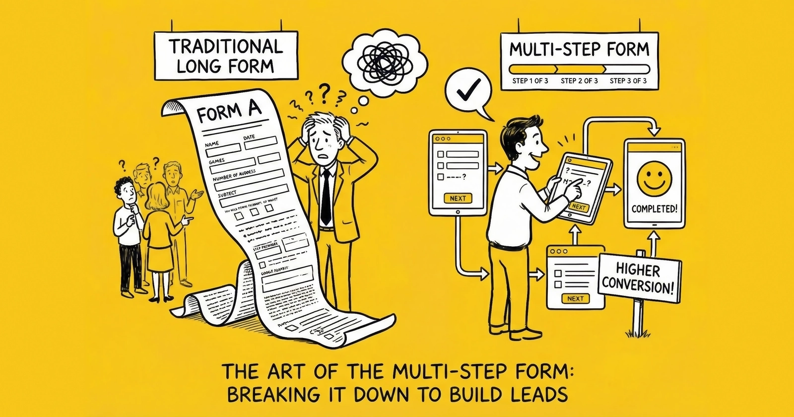
The difference between a 4% conversion rate and a 12% conversion rate often comes down to one decision: how you structure your form.
You are leaving money on the table. Right now, visitors are landing on your form, glancing at the wall of fields, and clicking away. They had intent. They had need. They had the information you wanted. But you asked for it wrong.
The data is unambiguous: multi-step forms convert 86% higher than single-page equivalents. Industry testing confirms conversion rates averaging 13.85% for multi-step forms versus 4.53% for single-step alternatives. Venture Harbour documented a transformation from 0.96% to 8.1% conversion when they restructured their consulting inquiry form from single-page to multi-step. BrokerNotes, a B2C financial lead generation site, watched their conversion rates climb from 11% to 46% with the same structural change.
This is not marginal optimization. This is the difference between a lead operation that struggles and one that generates sustainable profit.
This article breaks down exactly why multi-step forms work, how to structure them for maximum conversion, what to ask on each step, where to place TCPA consent, and how to avoid the mistakes that undermine the entire approach.
The Research: 86% Conversion Lift
The 86% conversion improvement is not a single study. It is a consistent finding across multiple research sources, industries, and traffic types.
The Core Data
Industry analysis across insurance, mortgage, solar, and home services verticals shows multi-step forms converting at 13.85% compared to 4.53% for single-step equivalents. The differential holds across traffic sources – paid search, social media, display advertising, and organic search all show the same pattern.
The Venture Harbour case study remains definitive. Their consulting inquiry form collected the same information before and after restructuring. The only change was presentation: moving from a single page with all fields visible to a multi-step flow showing three to four fields at a time. Conversion rate increased from 0.96% to 8.1% – more than 700% improvement with zero change to traffic quality, offer, or landing page copy.
BrokerNotes provides a B2C parallel. Their financial services lead form moved from 11% conversion to 46% conversion through multi-step restructuring. The total number of fields remained constant. Only the presentation changed.
HubSpot research confirms the underlying mechanism: forms with five or fewer visible fields convert 120% better than longer alternatives. Multi-step forms achieve this apparent simplicity while collecting comprehensive data.
Why the Differential Is So Large
A 10% or 20% improvement would be significant. An 86% average improvement seems almost too good to be real. Three factors explain the magnitude:
Single-page forms trigger immediate friction assessment. Visitors landing on a form with 12 visible fields make an instant calculation: “This looks like a lot of work.” Many abandon before reading the first question. Multi-step forms hide this complexity, allowing visitors to engage before the full scope becomes apparent.
Multi-step forms leverage psychological commitment mechanisms. Each step completed represents invested effort. Abandoning after completing two steps means “wasting” that effort. The further visitors progress, the stronger the pull toward completion.
Multi-step forms enable strategic question sequencing. Low-friction questions build engagement before high-friction questions create resistance. Single-page forms cannot sequence the experience because all questions appear simultaneously.
The operational implication is clear: if you are running single-page forms for any lead type requiring more than five fields, you are leaving significant conversion on the table.
Why Multi-Step Works: The Psychology
Understanding the psychological mechanisms behind multi-step form performance helps you design forms that maximize these effects rather than accidentally undermining them.
Commitment and Consistency
Robert Cialdini’s principle of commitment and consistency explains much of the multi-step form advantage. Humans have a deep psychological need to behave consistently with their past actions. Once we take a small step in a direction, we feel compelled to continue in that direction.
Multi-step forms exploit this by securing small commitments (answering low-friction questions) before requesting larger commitments (providing contact information). Each step forward reinforces the visitor’s self-perception as someone who is completing this form. Abandoning contradicts that self-perception.
Single-page forms bypass this gradual commitment process. Visitors make a single, all-or-nothing decision without the psychological momentum that builds through progressive engagement.
The Foot-in-the-Door Effect
Classic psychology experiments demonstrate that people who agree to small requests become significantly more likely to agree to larger subsequent requests. Freedman and Fraser’s 1966 research found that homeowners who first agreed to place a small “Be a Safe Driver” sign in their window were 76% more likely to later agree to a large, unsightly billboard on their lawn.
Multi-step forms are the foot-in-the-door technique applied to lead generation. Step one asks for something trivial – a ZIP code, a selection from a dropdown, a yes/no answer. This small agreement makes the visitor more likely to agree to subsequent requests, including the eventual ask for phone number and email address.
Perceived Effort Reduction
The actual effort required to complete a 15-field form is identical whether those fields appear on one page or five pages. But perceived effort differs dramatically.
Visitors estimate effort based on visual complexity. A page filled with empty fields signals significant work ahead. The same fields distributed across steps appear manageable – visitors see only three or four fields at a time and assume each step is that simple.
This perception gap matters because form abandonment decisions happen instantly. Visitors do not calculate the actual time required to complete each field. They glance at the form, make an emotional assessment of effort, and either proceed or abandon.
Progress Motivation
Progress indicators in multi-step forms create motivation through visible advancement. “Step 3 of 5” tells visitors they are more than halfway done. Psychologically, people prefer to finish things they have started – especially when completion is clearly visible.
This creates a “goal gradient” effect where engagement and completion rates increase as visitors approach the final step. Step four of a five-step form typically shows higher completion rates than step one because visitors can see the finish line.
Sunk Cost Psychology
Once visitors invest time and effort into a form, abandoning feels like wasting that investment. This is the sunk cost fallacy applied beneficially – visitors who have completed three steps have “paid” for those steps with their time and attention. Walking away means those costs were incurred for nothing.
Single-page forms do not create the same sunk cost pressure. Visitors can abandon at any point without feeling like they have invested anything.
Optimal Number of Steps: The 3-5 Sweet Spot
More steps are not always better. Research and testing reveal a clear pattern: three to five steps typically optimize conversion, with performance degrading as step count increases beyond five.
The Data on Step Count
Forms with three steps show approximately 30% higher completion rates than two-step forms for the same total fields. But the improvement diminishes and then reverses as steps increase:
- Two steps: Slight improvement over single-page, but minimal commitment-building
- Three steps: Strong commitment effect, manageable perceived length
- Four steps: Peak performance for most lead types, sufficient steps for strategic sequencing
- Five steps: Still effective, particularly for high-consideration purchases (mortgage, insurance)
- Six or more steps: Diminishing returns; visitors begin to feel the process is endless
The optimal step count depends on total field count and lead type. A general formula: divide your total fields by 3-4 to determine step count. Twelve fields work well across four steps. Fifteen fields work across five steps.
Why Five Is Often the Upper Limit
Beyond five steps, visitors lose confidence that the form will ever end. Progress indicators showing “Step 6 of 8” trigger a different psychological response than “Step 3 of 5” – the former suggests an exhausting process while the latter suggests approaching completion.
The exception is high-consideration verticals where visitors expect thorough qualification. Mortgage applications spanning six or seven steps can still convert well because visitors understand that financing a home requires detailed information.
Matching Steps to Lead Intent
The right number of steps also depends on traffic temperature.
Cold traffic (display ads, broad social targeting): Keep steps minimal. These visitors have limited commitment to your offer. Three steps with quick, engaging questions build enough momentum without creating excess friction.
Warm traffic (search, retargeting): Four to five steps work well. These visitors have demonstrated intent through their search behavior or return visit. They expect a process and interpret thoroughness as professionalism.
Hot traffic (branded search, direct visitors, referrals): Five or more steps can work. These visitors have already decided to engage with your company specifically. The form is formality rather than persuasion.
What to Ask on Each Step
Strategic question sequencing maximizes the psychological benefits of multi-step forms. The wrong sequence – asking for phone number first – eliminates most of the format’s advantages.
Step 1: Low-Friction Qualification
The first step serves one primary purpose: get visitors clicking. Engagement momentum matters more than data value at this stage.
Optimal first-step questions:
- ZIP code (single field, low privacy concern, enables geographic routing)
- Multiple-choice type selection (“What type of insurance are you looking for?”)
- Yes/no qualifying question (“Do you currently have coverage?”)
- Simple dropdown or selection (“Are you the homeowner?”)
First-step characteristics:
- One to three fields maximum
- No text entry if possible (dropdowns, radio buttons, checkboxes)
- Questions about their needs, not their identity
- Visually simple with a single call-to-action
Why this works: Visitors engage without providing anything personal. They are answering questions about what they want, not revealing who they are. This feels like receiving a service rather than giving up information.
Step 2: Deeper Qualification
Step two collects qualification data that enables lead routing and pricing. Visitors have now committed to the process – psychological momentum exists.
Optimal second-step questions:
- Specific attributes (vehicle make/model, property type, coverage amount)
- Timeline indicators (“When do you need coverage?”)
- Budget ranges (if relevant to routing)
- Current situation details (“What is your current coverage?”)
Second-step characteristics:
- Three to four fields typical
- Mix of dropdowns and simple text entry
- Questions that feel like customization (“Help us find the right options”)
- Still avoiding explicit contact information
Why this works: Visitors have progressed past the commitment threshold. They have already invested effort. These questions feel like they are enabling better service – which they are.
Step 3: Contact Information (The Commit Point)
Step three is where visitors cross the threshold from anonymous browser to identified lead. This step requires the most careful design because it represents the highest-friction moment.
Optimal third-step questions:
- First name, last name
- Phone number
- Email address
- TCPA consent checkbox and disclosure
Third-step characteristics:
- Minimal additional questions beyond contact info
- Clear value reminder (“Almost done – see your personalized quotes”)
- Trust signals prominently displayed
- TCPA consent disclosure immediately above submit button
Why this works: By step three, visitors have invested significant effort. Abandoning means losing the “work” they have already done. The sunk cost psychology peaks here.
Step 4+ (When Needed)
Some lead types require additional information beyond basic contact details. This can appear on a fourth step or as questions integrated into earlier steps.
When to add a fourth step:
- Mortgage (income, employment, credit range)
- Medicare (current coverage, prescription needs)
- Solar (utility bill, roof type, shading)
- Legal (case details, incident date)
Visitors who have provided contact information have crossed the commitment threshold. They are invested in receiving results. Additional questions feel like optimization rather than interrogation.
Progress Indicators That Work
Progress indicators serve dual purposes: they reduce anxiety about form length, and they create completion motivation. Effective indicators do both.
Types of Progress Indicators
Numbered steps: “Step 2 of 4” provides concrete information about position and total journey. Visitors know exactly where they stand.
Visual progress bars: A horizontal bar filling from left to right shows advancement. Effective when combined with step numbers. Less effective alone because visitors cannot gauge total length.
Descriptive steps: “Your Vehicle > Your Coverage > Your Details” shows the journey with named stages. Helps visitors understand what is coming while confirming where they are.
Percentage complete: “60% Complete” provides clear position information. Works well for longer forms where step counts might seem high.
What Research Shows
Forms with clearly visible progress indicators convert 15-20% higher than multi-step forms without indicators. The reduction in completion anxiety more than compensates for revealing the form’s true length.
Numbered step indicators (“Step 3 of 5”) outperform percentage indicators (“60%”) in most testing. The specificity helps visitors feel oriented.
Progress indicators that “jump” – moving 25% after a step with one field and 10% after a step with five fields – feel manipulative and undermine trust. Movement should correlate with actual progress.
Implementation Best Practices
Make progress visible immediately. Visitors should see the indicator before they answer the first question. This sets expectations and reduces the fear that the form might be endless.
Position consistently across steps. The indicator should appear in the same location on every step. Moving it creates confusion and erodes the orientation benefit.
Show completion on final step. When visitors reach the submit button, the indicator should clearly show “Final Step” or “Step 5 of 5” or “100%.” This provides satisfaction and encourages final submission.
Consider mobile differently. Progress indicators that work on desktop may consume too much screen real estate on mobile. Compact progress bars may outperform descriptive step names on smaller screens.
Mobile Multi-Step Design
Mobile traffic now exceeds 70% in most lead generation verticals, as explored in our mobile-first lead capture guide. Some demographics – younger age groups, certain geographic regions – show 80%+ mobile traffic. If your multi-step form is not designed for mobile first, you are designing for a shrinking minority.
Mobile-Specific Constraints
Screen real estate is limited. Elements that fit comfortably on desktop – progress indicators, trust signals, explanatory text – compete aggressively on mobile. Every pixel matters.
Thumb-based navigation changes interaction patterns. Fields and buttons must be large enough for reliable tapping. Minimum tap target is 44x44 pixels. Spacing between elements should prevent accidental taps.
Keyboard switching creates friction. Each time the keyboard type changes (text to numbers to email), users experience micro-interruption. Minimize keyboard switching within steps.
Attention span is shorter. Mobile visitors are often multitasking. Forms must capture attention quickly and maintain momentum through each step.
Mobile Multi-Step Best Practices
Reduce fields per step on mobile. If desktop shows four fields per step, consider showing two or three on mobile. The smaller screen makes fewer fields feel like “more” due to scrolling requirements.
Use appropriate input types. type="tel" for phone numbers brings up the numeric keypad. type="email" adds the @ symbol and .com shortcut. Small optimizations compound across many visitors.
Make buttons full-width. A “Next” button that spans the full screen width is easier to tap than a centered button. This reduces missed taps and accidental abandonment.
Position progress indicators carefully. A progress bar that consumes 60 pixels of vertical space on a 667-pixel screen represents nearly 10% of available real estate. Consider compact indicators for mobile.
Test on actual devices. Browser simulations miss aspects of real mobile experience. Test on at least two iOS and two Android devices, including older models with smaller screens.
Mobile Conversion Gap
Despite higher traffic volumes, mobile conversion rates typically lag desktop by approximately one percentage point (11.2% versus 12.1% industry average). This gap represents opportunity. Practitioners who close the mobile conversion gap gain significant competitive advantage.
TCPA Consent Placement
TCPA (Telephone Consumer Protection Act) consent is not a marketing formality. It is legal documentation that determines whether your operation survives litigation, as detailed in our TCPA compliance guide. Proper placement within multi-step forms requires careful attention.
Where to Place TCPA Consent
Best practice: The final step, immediately above the submit button.
Consent should appear on the step where visitors provide their phone number or immediately after. The disclosure must be visible and adjacent to the final submission action.
Why final step placement works:
- Visitors have already entered their phone number
- The consent is specifically authorizing use of that number
- The disclosure is fresh in mind when clicking submit
- Documentation captures the entire form flow leading to consent
Do not place consent on an early step if phone number comes later. Consent must reference the phone number being provided. Separating the consent checkbox from the phone number field creates ambiguity about what the consent covers.
Required Consent Elements
Your disclosure must include:
Clear authorization language: “I consent to receive calls and texts, including those using automated technology…”
Seller identification: Who will call. If selling leads to multiple buyers, disclosure must mention “marketing partners” or list specific companies.
Phone number reference: “…at the phone number provided…”
Not required for purchase: “I understand this consent is not required to make a purchase.”
Revocation instructions: “I can revoke consent at any time by texting STOP or calling [number].”
Documentation Requirements
TrustedForm certificates create independent third-party documentation of consent capture. When implemented correctly, TrustedForm records a session replay showing exactly what the consumer saw throughout the multi-step process and what they clicked. This documentation has been accepted in court proceedings.
Jornaya LeadiD provides similar consent documentation with additional lead intelligence features, as covered in our TrustedForm vs Jornaya comparison. Many buyers require one or both.
Retain consent documentation for at least five years. The TCPA statute of limitations is four years; the additional year provides buffer for claims filed near the deadline.
Multi-Step Consent Pitfalls
Pre-checked consent boxes. Pre-checked boxes do not constitute valid consent. The box must start unchecked and require affirmative action.
Consent hidden behind a link. “I agree to the Terms” with consent buried in linked terms is not clear and conspicuous. The consent language must be visible on the page.
Consent separated from submit action. If consent is on step three but submission is on step four, the causal connection weakens.
Tiny or low-contrast text. Consent in 8-point gray text fails the “clear and conspicuous” standard. Use 12-pixel minimum on desktop, 14-pixel minimum on mobile.
Common Multi-Step Mistakes
Multi-step forms can fail as badly as single-page forms when fundamental mistakes undermine their psychological benefits.
Mistake 1: Too Many Steps
Beyond five steps, visitors feel trapped rather than invested. The commitment psychology inverts.
The symptom: Step completion rates decline on later steps rather than increasing.
The fix: Consolidate fields. Four steps with four fields each outperforms eight steps with two fields each.
Mistake 2: Sensitive Questions Too Early
Asking for phone number on step one eliminates the commitment-building benefit.
The symptom: Step one completion rate below 60% despite low total field count.
The fix: Low-friction questions about needs and preferences first. Contact information last.
Mistake 3: Steps That Feel Pointless
If a step contains only one generic dropdown, visitors feel manipulated.
The symptom: High abandonment on steps with minimal content.
The fix: Two to four fields per step feels meaningful without overwhelming.
Mistake 4: No Progress Indication
Without visible indicators, visitors cannot see the end. Anxiety remains.
The symptom: Conversion rates similar to single-page forms despite multi-step structure.
The fix: Add numbered steps or progress bars.
Mistake 5: Navigation Confusion
If visitors cannot proceed or go back, they abandon.
The symptom: Heat maps showing clicks on non-interactive elements.
The fix: Single prominent “Next” button. Back arrow for corrections.
Mistake 6: Mobile Afterthought
Designing for desktop and hoping mobile works produces poor conversion.
The symptom: Mobile conversion rate significantly below desktop.
The fix: Design mobile first. Test on actual devices.
Mistake 7: Inconsistent Visual Design
Different colors, layouts, and button styles across steps erode confidence.
The fix: Maintain consistent branding and interaction patterns across all steps.
Mistake 8: Ignoring Step Analytics
Without step-by-step analytics, optimization is guesswork.
The fix: Implement event tracking for each step using Google Analytics 4 or dedicated form analytics platforms.
A/B Testing Multi-Step vs. Single
Adopting multi-step forms based on industry research is reasonable. Validating the improvement for your specific audience through testing is essential.
Setting Up the Test
Control: Your current single-page form, unchanged.
Variant: Multi-step form collecting the same information across three to five steps.
Traffic split: 50/50 random allocation. Ensure randomization is truly random – alternating by time of day or traffic source introduces confounding variables.
Success metric: Form completion rate (full submissions, not step completions). Secondary metrics include lead quality scoring, buyer acceptance rate, and downstream conversion.
Sample Size Requirements
Do not call a winner until you achieve statistical significance – typically 95% confidence level.
Required sample size depends on baseline conversion rate, minimum detectable effect, and traffic volume. Calculate required sample size before launching. If your baseline is 4% and you want to detect a 30% relative improvement with 95% confidence, you need approximately 3,000 visitors per variant.
The Peeking Problem
Checking results daily and stopping when one variant “looks” like a winner dramatically increases false positive rates. This is called “peeking” – and it leads to declaring winners that reverse once more data accumulates.
Set your required sample size in advance. Commit to running the test to completion regardless of intermediate results.
Ongoing Optimization
Once you have established multi-step as your baseline, test step-specific optimizations:
- Number of steps (three versus four versus five)
- Fields per step
- Question sequence within steps
- Progress indicator style
- Button text and color
- Trust signal placement
- Mobile-specific variations
Each test incrementally improves conversion. Compounded over time, systematic testing transforms your lead operation economics.
A/B Testing Case Studies: Documented Lift Percentages
The following case studies document actual A/B test results from multi-step form implementations across various lead generation verticals. Each study includes test methodology, traffic volume, statistical confidence levels, and specific lift percentages achieved.
Case Study 1: Auto Insurance Quote Form - 127% Conversion Lift
Background: A regional insurance lead aggregator operated a single-page auto insurance quote form collecting 14 fields: ZIP code, vehicle year/make/model, driver information, current coverage status, and contact details. The form had been optimized over two years with minor improvements but plateaued at 3.8% conversion rate.
Test Design:
- Control: Existing 14-field single-page form
- Variant: Four-step form with identical fields redistributed
- Step 1: ZIP code, vehicle year/make/model (4 fields)
- Step 2: Driver age, gender, current insured status (3 fields)
- Step 3: Coverage preferences, additional drivers (4 fields)
- Step 4: Name, phone, email with TCPA consent (3 fields)
Traffic and Duration:
- 47,000 visitors per variant over 28 days
- Traffic source: Paid search (Google Ads, Bing Ads)
- Device split: 62% mobile, 38% desktop
Results:
- Control conversion rate: 3.8%
- Variant conversion rate: 8.6%
- Relative lift: 127%
- Statistical confidence: 99.7%
- P-value: 0.001
Secondary Metrics:
- Lead quality (buyer acceptance rate): Control 78%, Variant 76% (slight decline within acceptable range)
- Cost per lead: Reduced from $42 to $19
- Step-by-step completion rates: Step 1: 74%, Step 2: 82%, Step 3: 87%, Step 4: 91%
Key Insights: The 127% lift significantly exceeded expectations. The slight decline in lead quality (2 percentage points lower buyer acceptance) was offset by dramatically lower CPL. The operation more than doubled its monthly lead volume at identical traffic spend.
Case Study 2: Solar Installation Form - 89% Conversion Lift
Background: A national solar lead generator operated separate landing pages for different traffic sources. Their highest-volume page used an eight-field single-page form. Management hypothesized that the utility bill question (requiring consumers to reference their actual bill) created abandonment.
Test Design:
- Control: Eight-field single-page form
- Variant A: Three-step form (standard progression)
- Variant B: Three-step form with utility bill question moved to final step
Traffic and Duration:
- 31,000 visitors per variant over 21 days
- Traffic source: Facebook/Instagram advertising
- Device split: 71% mobile, 29% desktop
Results:
- Control conversion rate: 5.2%
- Variant A conversion rate: 9.8%
- Variant B conversion rate: 11.4%
- Variant A relative lift: 88%
- Variant B relative lift: 119%
- Statistical confidence: Both variants >99%
Step Completion Analysis (Variant B):
- Step 1 (homeowner, property type, roof age): 68% completion
- Step 2 (contact information): 84% of Step 1 completers
- Step 3 (utility bill, timeline): 89% of Step 2 completers
Key Insights: Moving the utility bill question to the final step created an additional 31% lift beyond the basic multi-step improvement. By the time visitors reached the utility bill question, they had already invested enough effort that most completed despite the friction. The utility bill field remained essential for lead qualification, but its placement dramatically affected overall completion.
Case Study 3: Medicare Supplement Form - 156% Conversion Lift
Background: A Medicare-focused lead operation ran a compliant seven-field form during AEP (Annual Enrollment Period). The form included required CMS-compliant language and captured ZIP code, birthdate, current coverage type, phone, and email. Desktop conversion was acceptable (7.2%) but mobile conversion lagged significantly (2.9%).
Test Design:
- Control: Seven-field single-page form
- Variant: Three-step form optimized for mobile with larger touch targets
Traffic and Duration:
- 28,000 mobile visitors per variant over 14 days (AEP period)
- Traffic source: Programmatic display, social media
- Device: Mobile only (separate test)
Results:
- Control mobile conversion rate: 2.9%
- Variant mobile conversion rate: 7.4%
- Relative lift: 156%
- Statistical confidence: 99.9%
Mobile-Specific Design Changes:
- Full-width buttons (easier thumb tapping)
- Larger form fields (56px height vs. 44px)
- Progress indicator compressed to single line
- Auto-advancing after dropdown selections
- Click-to-call option prominent on final step
Key Insights: The mobile conversion improvement was more dramatic than desktop because the single-page form created particularly severe friction on small screens. The combination of multi-step format with mobile-specific optimizations more than doubled mobile conversion. Given that 68% of Medicare traffic is now mobile, this improvement fundamentally changed campaign economics.
Case Study 4: Home Services (HVAC) Form - 73% Conversion Lift
Background: An HVAC lead generation company operated separate forms for emergency repair leads versus replacement/installation leads. The replacement form required substantial information (address, system age, fuel type, home square footage) to route leads appropriately. The 11-field form converted at 4.1%.
Test Design:
- Control: 11-field single-page form
- Variant: Four-step form with visual elements added between steps
Visual Elements Added:
- After Step 1: “You’re 2 steps away from getting quotes from certified HVAC professionals”
- After Step 2: Animated checkmark with “Great! Let’s find the right system for your home”
- After Step 3: Trust badges (BBB, manufacturer certifications)
Traffic and Duration:
- 19,000 visitors per variant over 35 days
- Traffic source: Google Local Services, paid search, SEO
- Device split: 54% mobile, 46% desktop
Results:
- Control conversion rate: 4.1%
- Variant conversion rate: 7.1%
- Relative lift: 73%
- Statistical confidence: 98.7%
Lead Quality Impact:
- Contact rate: Control 71%, Variant 74% (improvement)
- Appointment set rate: Control 32%, Variant 34%
- Installed sale rate: Control 8.1%, Variant 8.4%
Key Insights: The visual encouragement elements between steps contributed meaningfully to completion. Follow-up testing isolated the visual elements as providing 12-15% incremental lift on top of the baseline multi-step improvement. Lead quality metrics improved slightly, possibly because visitors completing a longer form had higher purchase intent.
Case Study 5: Mortgage Refinance Form - 94% Conversion Lift with Quality Trade-Off
Background: A mortgage lead company operated a detailed 16-field form capturing property information, current mortgage details, employment, and income. The comprehensive form supported premium lead pricing because buyers received highly qualified leads.
Test Design:
- Control: 16-field single-page form
- Variant: Five-step form with identical fields
Traffic and Duration:
- 42,000 visitors per variant over 30 days
- Traffic source: Paid search, display retargeting
- Device split: 58% mobile, 42% desktop
Results:
- Control conversion rate: 2.8%
- Variant conversion rate: 5.4%
- Relative lift: 94%
- Statistical confidence: 99.5%
Quality Impact (The Trade-Off):
- Buyer acceptance rate: Control 84%, Variant 72%
- Contact rate: Control 76%, Variant 68%
- Loan officer qualified rate: Control 41%, Variant 32%
Economic Analysis:
- Control effective CPL (after rejections): $89
- Variant effective CPL (after rejections): $67
- Net improvement: 25% lower effective CPL despite quality decline
Key Insights: This case demonstrates that multi-step improvements sometimes come with quality trade-offs. The easier completion path attracted some visitors who would have self-selected out with the more intimidating single-page form. However, the volume increase (94% more leads) more than compensated for the quality decline (12 percentage points lower acceptance). Net economics improved 25%.
Case Study 6: Legal Lead Form - Step Sequence Impact
Background: A personal injury legal lead generator tested not just multi-step versus single-page, but also tested different question sequences within the multi-step format.
Test Design:
- Control: Six-field single-page form
- Variant A: Three-step form (incident details first, contact last)
- Variant B: Three-step form (basic qualifier first, incident details second, contact last)
- Variant C: Three-step form (contact first, then incident details)
Traffic and Duration:
- 15,000 visitors per variant over 42 days
- Traffic source: Television response, paid search
- Device split: 49% mobile, 51% desktop
Results:
- Control conversion rate: 6.2%
- Variant A conversion rate: 10.8% (74% lift)
- Variant B conversion rate: 12.1% (95% lift)
- Variant C conversion rate: 7.4% (19% lift)
- Statistical confidence: All variants >97%
Sequence Analysis: Variant B significantly outperformed because it opened with simple qualifying questions (“Were you injured in an accident in the last 2 years?” Yes/No) before asking for incident details. This low-friction opening created commitment without demanding effort.
Variant C performed worst among multi-step variants because it asked for contact information first. This sequence failed to build commitment before requesting high-friction personal data.
Key Insights: The multi-step format is necessary but not sufficient. Question sequence within steps affects outcomes by 20-30%. Open with low-friction qualifying questions, progress to situation details, and close with contact information. Reversing this sequence significantly degrades performance.
Case Study 7: Education Lead Form - Mobile-Desktop Differential
Background: An education lead generator for online degree programs tested multi-step forms separately for mobile and desktop traffic to understand whether improvements were consistent across devices.
Test Design:
- Control: Nine-field single-page form
- Variant: Four-step form
- Separate analysis for mobile versus desktop segments
Traffic and Duration:
- 52,000 mobile visitors, 28,000 desktop visitors per variant over 28 days
- Traffic source: Social media (Instagram, TikTok), paid search
- Age demographic: Primarily 25-44
Results:
Desktop:
- Control conversion rate: 8.4%
- Variant conversion rate: 12.7%
- Relative lift: 51%
- Statistical confidence: 99.2%
Mobile:
- Control conversion rate: 4.1%
- Variant conversion rate: 10.3%
- Relative lift: 151%
- Statistical confidence: 99.8%
Key Insights: Multi-step improvements are dramatically larger on mobile than desktop. The 151% mobile lift versus 51% desktop lift reflects the heightened friction that mobile users experience with single-page forms. Small screens make long forms feel even more overwhelming. Operations with high mobile traffic percentages will see larger overall improvements from multi-step implementation.
Summary of Case Study Lift Percentages
| Case Study | Vertical | Baseline CVR | Multi-Step CVR | Lift % |
|---|---|---|---|---|
| Auto Insurance | Insurance | 3.8% | 8.6% | 127% |
| Solar Installation | Solar | 5.2% | 11.4% | 119% |
| Medicare (Mobile) | Insurance | 2.9% | 7.4% | 156% |
| HVAC Replacement | Home Services | 4.1% | 7.1% | 73% |
| Mortgage Refinance | Mortgage | 2.8% | 5.4% | 94% |
| Personal Injury Legal | Legal | 6.2% | 12.1% | 95% |
| Education (Mobile) | Education | 4.1% | 10.3% | 151% |
| Education (Desktop) | Education | 8.4% | 12.7% | 51% |
Average lift across all case studies: 108%
The case studies confirm the 86% average improvement cited in industry research, with individual results ranging from 51% (desktop-only, already-optimized forms) to 156% (mobile forms with significant baseline friction).
Frequently Asked Questions
What is the average conversion rate improvement from multi-step forms?
Research shows multi-step forms convert approximately 86% higher than single-page equivalents on average. Multi-step forms average 13.85% conversion versus 4.53% for single-step forms. The improvement varies by vertical, traffic source, and implementation quality – some operators see improvements exceeding 300%.
How many steps should my multi-step form have?
Three to five steps typically optimize conversion. Two steps provide insufficient commitment-building. Six or more steps cause visitors to feel the process is endless. Divide total fields by 3-4 to estimate optimal step count.
What questions should I ask on the first step?
Low-friction questions: ZIP code, multiple-choice selections, yes/no qualifiers. Avoid contact information on step one. Questions about their needs work better than questions about their identity.
Where should I put the phone number field?
Phone number belongs on the final step or second-to-last step, after visitors have invested effort and built psychological commitment. By step three or four, visitors have sunk cost motivation that increases completion rates.
Do multi-step forms work on mobile?
Yes, with proper optimization. Mobile forms need fewer fields per step (two to three versus three to four). Buttons should be full-width. Progress indicators must be compact. Test on actual devices.
Where do I put TCPA consent in a multi-step form?
Place TCPA consent on the final step, immediately above the submit button. Do not separate the consent checkbox from the final submission action.
How do I track step-by-step performance?
Implement event tracking using Google Analytics 4, your landing page platform’s built-in analytics, or dedicated form analytics tools as part of your A/B testing strategy. Track step views, step completions, time per step, and field-level abandonment.
Should I show all step names or just current position?
Both approaches work. “Step 2 of 4” provides concrete position information. Descriptive steps (“Your Vehicle > Your Coverage > Your Details”) show the journey. Test both for your specific audience.
How long should visitors spend on each step?
For a four-step form with 12 total fields, 15-45 seconds per step is typical, totaling 60-180 seconds for complete submission. Completions significantly faster suggest bot traffic. Completions significantly slower suggest confusion.
What is a good completion rate for each step?
Step 1: 70-80%. Step 2: 75-85% of those who started. Step 3: 80-90%. Final Step: 85-95%. Rates increase with each step because visitors become more invested. Any step showing significantly lower completion indicates specific friction.
Key Takeaways
-
Multi-step forms convert 86% higher than single-page forms – the psychology of progressive commitment, perceived effort reduction, and sunk cost motivation explains the consistent differential.
-
Three to five steps optimize conversion for most lead types. Two steps provide insufficient commitment-building; six or more steps cause visitors to feel trapped.
-
Strategic sequencing matters: low-friction questions (preferences, needs, multiple-choice) on early steps build commitment before high-friction questions (phone, email) on final steps.
-
Progress indicators are not optional. Visible indicators showing position and total journey reduce anxiety and improve conversion 15-20%.
-
Mobile optimization requires deliberate design: fewer fields per step, full-width buttons, compact progress indicators, and testing on actual devices.
-
TCPA consent belongs on the final step, immediately above the submit button. Document consent with TrustedForm or Jornaya.
-
A/B test multi-step against your current form with sufficient sample size. Once validated, test step-specific optimizations.
-
The 86% conversion improvement compounds across your traffic operation. Moving from 5% to 9.3% conversion means 430 additional leads per 10,000 visitors without spending more on traffic.
Multi-step forms represent a fundamental shift in how visitors experience the conversion process. Those who restructure their forms capture more leads from the same traffic. Those who stick with single-page forms watch their competitors outbid them for the same traffic sources because their competitors can afford higher CPAs.