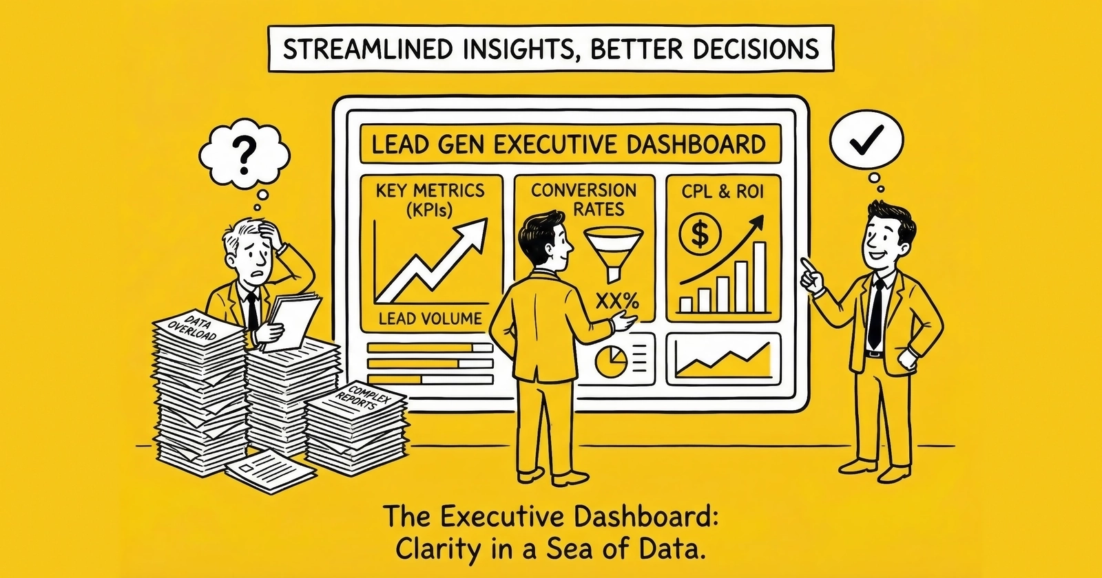
The difference between operators who scale and those who stagnate often comes down to what they see when they open their analytics each morning. Executive dashboards reveal either actionable insight or decorative noise. This guide shows you how to build the former.
Your lead generation business produces data constantly. Every click, every form submission, every buyer acceptance, every return generates a signal. Multiply that by thousands of daily leads across dozens of sources and buyers, and you are swimming in information.
Yet most executives open their dashboards and find themselves no closer to knowing what to do. The numbers are there. The charts are colorful. The data is technically accurate. But the insight that should connect observation to action remains stubbornly absent.
This is the dashboard design problem in lead generation: abundance of data, scarcity of decisions.
According to Forrester research, data-driven businesses grow more than 30% faster than their competitors. But in lead generation, many practitioners track everything while measuring nothing that matters. They drown in metrics without surfacing the insights that drive decisions.
The executives who win this game share a discipline: they build dashboards that answer specific questions, not dashboards that display available data. They design for decision speed, not data completeness. They understand that the goal is not measurement but action.
This guide covers executive dashboard design from first principles. You will learn which metrics belong on executive views versus operational views, how to configure alert thresholds that surface problems before they compound, which visualization approaches communicate effectively versus which create confusion, how to choose between real-time and summary views based on decision needs, and how leading platforms compare for lead generation analytics.
Those who get this right spend less time in dashboards and make better decisions. That is the goal.
The Executive Dashboard Philosophy: Decisions Over Data
Before examining specific metrics or tools, establish the foundational principle: executive dashboards exist to drive decisions, not to display data.
This distinction matters because the temptation runs the other way. Data is available, so you display it. Metrics are interesting, so you include them. Charts look professional, so you add more.
The result is dashboards that take ten minutes to review when they should take ninety seconds. Executives who cannot assess business health quickly stop using dashboards entirely. They make decisions on instinct and incomplete information. The data infrastructure you built becomes expensive wallpaper.
The 90-Second Rule
An effective executive dashboard should answer the question “Is the business healthy, and where should I focus attention?” in under 90 seconds.
This constraint forces hard choices about what to include. If executives need more than two minutes to assess business health, the dashboard is too complex. Simplify relentlessly.
The 90-second rule does not mean executives only spend 90 seconds looking at data. It means the first 90 seconds should reveal whether the business is on track or requires intervention. Deeper investigation happens after that initial assessment, and often in different views designed for analysis rather than monitoring.
Different Audiences, Different Needs
The metrics an executive needs differ fundamentally from what operations teams require.
Executives need strategic context: Are we profitable? Are we growing? Is quality holding? What changed that demands attention?
Operations teams need tactical detail: Which source is underperforming right now? Why is acceptance rate dropping at Buyer X? What happened to conversion in the last hour?
Traffic managers need source-level granularity: Which creative is winning? Should I shift budget? What is the CPL trend by campaign?
Finance teams need reconciliation: Do operational numbers match accounting? What is cash position? Where are receivables aging?
Designing for all audiences simultaneously produces dashboards useful to none. Build separate views for each decision-making context, unified by common data infrastructure but differentiated by purpose.
Executive Metrics That Matter: The Four-Quadrant Framework
Executive dashboards should organize around four categories of metrics, each answering a distinct question about business health.
Quadrant 1: Financial Health
Financial metrics answer the fundamental question: Are we making money?
Revenue vs. Target displays current period revenue against monthly or quarterly targets. Use a gauge chart or simple number with percentage attainment. Include prior period and year-over-year comparisons for context.
The target should be realistic based on historical performance and seasonal patterns. A dashboard showing perpetually missed targets teaches executives to ignore it. A dashboard showing consistently exceeded targets provides no useful signal about variance.
Gross Margin Trend shows rolling 60 or 90-day contribution margin as a line chart. Downward trend demands investigation regardless of absolute level. A business running 25% margin but declining 2% monthly is in more trouble than one stable at 20%.
Industry benchmarks provide context. Healthy lead generation businesses run 40-60% gross margins at the source level. Net margins after all costs typically range from 15-18%. Below 12% signals structural problems that volume cannot solve.
Net Revenue Per Lead (NRPL) measures actual collected revenue per lead after returns, chargebacks, and bad debt. Unlike gross revenue per lead, NRPL reflects economic reality.
Calculate as: (Gross Revenue - Returns - Chargebacks - Bad Debt) / Total Leads Generated
Target NRPL 15-20% above your gross CPL to provide buffer for variance. If leads cost $45 to generate on average, target NRPL of $52-55 minimum.
Cash Flow Indicator tracks days of operating expense coverage at current cash and burn rate. This is not strictly an analytics metric, but belongs on executive dashboards because cash kills businesses faster than strategy.
For operations with net-30 buyer payment terms and net-15 supplier terms, float requirements can exceed $500,000 for moderate volume operations. Executives need visibility into cash position alongside operational metrics.
Quadrant 2: Volume and Growth
Volume metrics answer whether you are generating enough activity to sustain and grow the business.
Lead Volume Trend displays daily lead volume as a line chart with 7-day moving average to smooth noise. Color-code periods where volume exceeded or missed targets by more than 15%.
A sudden 20% drop in daily volume demands immediate investigation. A gradual 5% monthly decline signals longer-term shifts in market conditions or competitive dynamics.
Lead Velocity Rate (LVR) tracks month-over-month percentage change in qualified leads. Calculate as: (Leads This Month - Leads Last Month) / Leads Last Month x 100.
LVR of 15% monthly indicates healthy growth. Negative LVR for two consecutive months signals problems requiring intervention. This metric matters because it predicts future revenue more reliably than current revenue itself.
Source Volume Distribution shows percentage of leads from each major acquisition channel. When a channel suddenly shifts from 25% to 18% of volume without explanation, you have found a problem worth investigating.
Use a simple pie chart or horizontal bar chart. Limit to top 5-7 sources with remaining grouped as “Other.” Too many segments obscure the signal.
Pipeline Coverage compares projected leads over the next 30 days against monthly targets. Calculate as Projected Leads / Monthly Target.
Coverage above 1.2 indicates healthy pipeline. Below 0.9 signals upcoming shortfall requiring intervention. This forward-looking metric prevents surprises.
Quadrant 3: Quality Indicators
Quality metrics separate leads worth pursuing from leads that consume resources without converting.
Quality Composite Score provides single-glance quality health assessment by weighting multiple quality metrics into one number.
Recommended weighting: Buyer Acceptance Rate (40%), Contact Rate (30%), Return Rate inverse (30%).
Display as a single number with traffic light indicator: Green above 75, Yellow 60-75, Red below 60. The composite reveals quality health without requiring executives to evaluate multiple metrics simultaneously.
Return Rate tracks leads rejected by buyers for quality issues. Return rates above 5-7% indicate systematic quality problems. Returns erode margins directly and damage buyer relationships indirectly.
Industry benchmarks vary by vertical: Auto insurance 8-15%, Medicare 12-20%, Solar 15-25%, Mortgage 10-18%, Legal 5-12%.
Buyer Acceptance Rate reflects market judgment on lead quality. Healthy operations maintain 80-95% acceptance. Below 75% indicates systematic quality problems or targeting mismatches.
Track aggregate acceptance for executive view, with drill-down capability to buyer-level detail for investigation.
Contact Rate measures whether leads answer when called. For operations selling to call-focused buyers, contact rates below 30% suggest data quality issues, timing problems, or intent mismatches.
Quadrant 4: Risk and Concentration
Risk metrics identify vulnerabilities that could disrupt the business.
Buyer Concentration displays revenue distribution across your buyer portfolio as a pie chart. If your top buyer represents more than 40% of revenue, that concentration creates strategic risk worth monitoring.
Healthy distribution shows no single buyer exceeding 25-30% of total revenue. Concentration above 50% means one relationship termination could threaten business viability.
Source Concentration shows similar risk on the supply side. Over-dependence on a single traffic source – whether that is one platform, one affiliate partner, or one campaign – creates vulnerability.
When Google represents 70% of lead volume, a policy change or account suspension becomes existential risk rather than operational inconvenience.
System Health Summary provides green/yellow/red indicators for critical infrastructure: Lead distribution platform uptime, validation service availability, buyer integration status.
Even 99% uptime allows 87 hours of annual downtime. During peak traffic periods, an hour of downtime can cost thousands in lost leads.
Visualization Best Practices: Clarity Over Creativity
The goal of visualization is not to display data but to reveal insight. Effective dashboards make the important obvious and the obvious actionable.
Chart Type Selection
Match chart type to the question being answered.
Trend over time: Line charts work best. Use for volume trends, margin trajectories, quality metrics over time. Include comparison lines showing prior period or target for context.
Part-to-whole relationships: Pie charts work for 2-6 categories. Use stacked bar charts for more than six segments. Apply to revenue distribution by source, lead disposition breakdown, budget allocation.
Comparison across categories: Horizontal bar charts enable easier label reading. Use for source performance ranking, buyer comparison, vertical-level metrics.
Two-variable relationships: Scatter plots show correlation. Use for CPL vs. NRPL analysis where you want to identify sources that are high cost with low revenue (candidates for pause) versus low cost with high revenue (investment candidates). Add bubble size for third variable such as volume.
Current status vs. target: Gauge charts or bullet charts communicate progress toward goal. Use for revenue pacing, capacity utilization, quality scores.
Distribution and pattern: Heatmaps reveal patterns across two dimensions. Use for hour-by-day performance, source-by-buyer acceptance matrices, geographic performance variation.
Color Usage
Use color to convey meaning, not decoration.
Traffic light system: Green for above target or healthy, Yellow for warning or near threshold, Red for problem or below threshold. Apply consistently across all dashboards so executives develop instant pattern recognition.
Trend direction: Green for positive trends, Red for negative, Gray for stable. Note that direction interpretation depends on the metric: Rising revenue is green, rising return rate is red.
Category distinction: Use distinct hues for different sources or buyers, but limit to 6-8 colors. Beyond that, charts become unreadable. Group small categories into “Other” to preserve clarity.
Sequential data: Use color gradients from light to dark for heatmaps and concentration visualizations. Darker values should represent higher magnitude.
Information Density
Executive dashboards should display 5-7 primary metrics. Operations dashboards can display 15-20 because users have more context to interpret detail.
Balance exists between enough information to be useful and so much that nothing stands out. When everything is highlighted, nothing is highlighted.
Whitespace groups related metrics visually. Use spacing to separate conceptual sections. Crowded dashboards overwhelm; sparse dashboards waste opportunity.
Mobile Consideration
Executives increasingly access dashboards on phones during travel or off-hours. Key metrics must be readable on small screens.
Consider separate mobile-optimized views for critical KPIs. A dashboard designed for 27-inch monitors becomes unusable on a phone screen. Design for the smallest screen your executives will use.
Alert Thresholds: When to Sound the Alarm
Dashboards should draw attention to exceptions without requiring executives to actively search. Threshold-based alerting separates normal variance from meaningful deviation.
Threshold Configuration by Metric Type
Volume metrics: Alert when deviation exceeds 15-20% from expected baseline. Daily volume 25% below same day last week warrants investigation. Brief spikes may reflect marketing campaigns; sustained drops indicate problems.
Quality metrics: Alert when return rates exceed 2x historical baseline, acceptance rates drop below 75%, or validation failure rates exceed 5%. Quality degradation compounds quickly and damages buyer relationships.
Financial metrics: Alert when margin drops more than 5 percentage points below target, when CPL exceeds budget by more than 20%, or when NRPL falls below CPL (meaning you are losing money on each lead).
Operational metrics: Alert on system uptime below 99.5%, processing latency exceeding 3 seconds, or error rates above 2%.
Alert Delivery Mechanisms
Not all alerts belong in dashboards. Critical issues need push notification.
Configure alert delivery by severity:
Critical alerts (revenue at risk, system down) should push to SMS and Slack/Teams immediately, regardless of time of day.
High alerts (quality threshold breached, significant volume deviation) should push to email and collaboration tools during business hours.
Medium alerts (trending concerns, minor threshold breaches) should appear in dashboard with visual highlighting for next login.
Low alerts (informational, tracking variance) should log for weekly review without active notification.
Over-alerting creates noise that teaches executives to ignore notifications. Under-alerting allows problems to compound. Calibrate thresholds based on actual business impact.
Alert Fatigue Prevention
The most dangerous alert state is when executives stop reading alerts because too many false positives have trained them to ignore the system.
Prevent alert fatigue through several practices:
Tune thresholds quarterly based on actual variance patterns. If an alert fires daily without requiring action, the threshold is too sensitive.
Require root cause documentation for each critical alert. This creates feedback loop showing which alerts generate investigation versus which are ignored.
Sunset alerts that have not driven action in 90 days. Unused alerts consume attention without providing value.
Group related alerts to prevent notification avalanche. If three sources simultaneously breach quality thresholds, send one grouped alert rather than three separate notifications.
Real-Time vs. Summary Views: Matching Speed to Decision Cadence
Not all metrics need real-time updates. Matching data freshness to decision speed prevents both stale information and unnecessary complexity.
When Real-Time Matters
Real-time data (seconds to minutes latency) is essential for:
Processing queue depth affects lead delivery speed. If leads queue faster than they process, delivery delays damage buyer relationships.
System health monitoring requires immediate visibility. API failures, integration errors, and platform outages need detection within seconds.
Intraday campaign performance during active optimization. When traffic managers adjust bids hourly, they need current-hour data to make decisions.
Live transfer operations where call routing happens in real-time. Any latency in visibility affects operational decisions.
When Near-Real-Time Suffices
Near-real-time data (15-60 minute latency) works for:
Source-level performance for daily optimization. Traffic managers reviewing source performance need current-day data, but 30-minute latency is acceptable.
Buyer acceptance patterns for routing adjustments. Understanding which buyers accept leads in current period helps routing optimization.
Quality alert detection for trending issues. Return rates calculated hourly catch problems before they become crises.
When Summary Views Are Appropriate
Summary data (daily, weekly, monthly aggregation) is appropriate for:
Strategic trend analysis examining month-over-month patterns. Weekly summaries smooth noise and reveal underlying trends.
Financial reconciliation comparing operational metrics to accounting. Monthly alignment ensures data consistency.
Executive health check reviewing overall business trajectory. Daily or weekly summaries provide appropriate granularity for strategic decisions.
Buyer relationship review assessing partnership health. 30-day rolling metrics show relationship trajectory without false signals from daily variance.
The Cost of Real-Time
Real-time data infrastructure costs more and requires more maintenance. Before building real-time capability, verify that decision speed justifies the investment.
A dashboard updating every second that executives check once daily wastes resources. A dashboard updating daily for operations making hourly decisions creates competitive disadvantage.
Match refresh frequency to the fastest decision the dashboard should support.
Platform Comparison for Lead Generation Analytics
The analytics landscape offers options ranging from general-purpose BI platforms to industry-specific lead distribution analytics. Understanding each category’s strengths prevents both capability gaps and expensive redundancy.
General-Purpose Business Intelligence Platforms
Google Looker Studio (formerly Data Studio)
Looker Studio provides free, accessible dashboarding with strong Google ecosystem integration. It connects natively to Google Ads, Google Analytics 4, Google Sheets, and BigQuery.
Strengths: Zero cost for most use cases, familiar interface for Google users, easy sharing via links, good for Google-centric metrics.
Limitations: Slow performance with large datasets (often 30+ seconds to load complex dashboards), limited data transformation capability, struggles with multi-source blending beyond simple joins, no alerting or automation.
Best for: Small operations dependent on Google traffic who need basic visualization without budget for enterprise tools. Works well as starter analytics before graduating to more sophisticated platforms.
Pricing: Free for most features. Enterprise features via paid Looker platform.
Microsoft Power BI
Power BI offers robust desktop authoring with cloud publishing and strong Microsoft ecosystem integration.
Strengths: Powerful data transformation via Power Query, good visualization library, handles larger datasets than Looker Studio, reasonable learning curve for Microsoft-familiar users, strong Excel integration.
Limitations: Less intuitive for non-Microsoft users, collaboration requires Pro licensing, mobile experience inconsistent, limited native ad platform connectors.
Best for: Operations already invested in Microsoft stack, teams needing more transformation capability than Looker Studio provides, businesses with significant Excel-based workflows.
Pricing: Free tier covers significant capability. Pro licensing runs approximately $10 per user monthly. Premium capacity starts at $4,995 monthly.
Tableau
Tableau remains the gold standard for visualization flexibility and handling complex data.
Strengths: Best-in-class visualization customization, handles very large datasets efficiently, extensive community and training resources, powerful calculation engine, strong geographic visualization.
Limitations: Expensive at scale, steeper learning curve than alternatives, requires dedicated resource for non-trivial implementations, overkill for simpler use cases.
Best for: Larger operations with dedicated analytics resources who need maximum flexibility and handle complex multi-source data. Appropriate when visualization requirements exceed what simpler tools can deliver.
Pricing: Creator licenses approximately $70 per user monthly. Explorer and Viewer tiers available at lower price points. Volume discounts available.
Metabase
Metabase provides open-source BI with particularly accessible interface for non-technical users.
Strengths: Intuitive question-based interface, good for teams without dedicated analysts, open-source flexibility, reasonable SQL integration, fast implementation.
Limitations: Visualization options more limited than Tableau, less suitable for very complex analyses, smaller ecosystem than major platforms.
Best for: Mid-sized operations wanting SQL-accessible BI without enterprise pricing or complexity. Teams where non-technical users need to create their own queries.
Pricing: Self-hosted version free. Cloud version starts at $85 monthly.
Lead Generation Platform Analytics
Most lead distribution platforms include built-in analytics designed specifically for lead operations.
boberdoo Analytics
boberdoo’s reporting suite tracks lead-level P&L, buyer performance, routing efficiency, and margin analysis.
Strengths: Purpose-built for lead generation with metrics pre-calculated for industry-standard KPIs, no integration required for core metrics, real-time capability, includes ping/post analytics, buyer and source level reporting.
Limitations: Data stays within boberdoo ecosystem, limited customization of visualization, may lack advanced analysis options.
Best for: boberdoo users who need operational analytics without external tool investment. Provides solid foundation for day-to-day operations.
LeadsPedia Reporting
LeadsPedia provides lead-centric analytics with buyer scorecards, source analysis, and financial reporting.
Strengths: Integrated with distribution workflow, includes compliance documentation reporting, supports multi-tenant reporting, granular filtering by source, buyer, vertical, and time period.
Limitations: Bounded by platform capabilities, less flexibility than general BI tools.
Best for: LeadsPedia users needing comprehensive lead analytics with strong compliance visibility.
Phonexa Analytics
Phonexa’s all-in-one platform includes call analytics, lead distribution metrics, and campaign performance.
Strengths: Combines call and lead analytics in unified interface, includes attribution modeling, strong for pay-per-call operations, integrated across multiple channels.
Limitations: Most valuable for Phonexa ecosystem users, may duplicate capability for multi-platform operations.
Best for: Operations running significant pay-per-call campaigns alongside form-based lead generation.
Call Tracking Analytics
For operations with significant phone-based lead generation.
Ringba
Ringba provides real-time call routing analytics, buyer performance by call quality, duration analysis, and revenue attribution.
Strengths: Purpose-built for pay-per-call, real-time visibility into call routing, strong integration with buying platforms, detailed call-level analytics including recording access.
Limitations: Focused on calls; requires additional tooling for form-based lead analytics.
Pricing: Volume-based pricing starting around $100 monthly for smaller operations.
CallRail
CallRail focuses on marketing attribution for inbound calls, tracking which campaigns drive phone leads.
Strengths: Strong attribution modeling, conversation intelligence with transcription and keyword detection, good for operations routing inbound calls, integrates with major CRM and marketing platforms.
Limitations: More marketing-focused than operations-focused, may need supplemental tools for full BI.
Pricing: Starts at $45 monthly for basic call tracking, higher tiers for analytics features.
Data Warehouse Approaches
Mature operations often centralize data in a warehouse before visualization.
Google BigQuery
BigQuery provides serverless SQL data warehousing with native Google ecosystem integration.
Strengths: Scalable without infrastructure management, good Google Ads and GA4 integration, reasonable pricing for moderate volumes, fast query performance on large datasets.
Limitations: Requires SQL capability, needs additional visualization layer, usage costs can surprise at high query volumes.
Pricing: Usage-based, typically $20-100 monthly for lead generation workloads depending on data volume and query frequency.
Snowflake
Snowflake offers cloud-native warehousing with separation of storage and compute.
Strengths: Highly scalable, excellent for complex multi-source integration, strong data sharing capabilities for partner collaboration, good performance on analytical queries.
Limitations: More expensive than BigQuery for typical lead gen volumes, requires more setup and configuration.
Pricing: Consumption-based, typically higher than BigQuery for equivalent workloads.
Recommended Architecture by Operation Size
Starter Operations (under 5,000 leads monthly): Use your lead distribution platform’s built-in analytics supplemented by Looker Studio for traffic source analysis. Total cost: minimal. Focus on basic metrics before investing in sophisticated tooling.
Growing Operations (5,000-50,000 leads monthly): Implement a data pipeline connecting major systems to BigQuery or equivalent warehouse. Build dashboards in Looker Studio or Power BI. Total investment: $200-500 monthly plus 20-40 hours initial setup.
Scaled Operations (50,000+ leads monthly): Invest in proper data infrastructure with dedicated warehouse, ETL tooling (Fivetran, Stitch, or similar), and enterprise BI (Tableau or Looker enterprise). Consider dedicated analytics resource. Total investment: $2,000-10,000 monthly depending on complexity.
Executive Dashboard Configuration: A Working Example
Theory is useful. Practical implementation is what operators need. Here is how an effective executive dashboard should be configured.
Layout Structure
Arrange the dashboard in reading order: top-left receives highest priority, followed by top-right, then bottom-left, then bottom-right.
Top Row (60% of screen height):
- Left: Revenue vs. Target gauge (single most important financial metric)
- Center: Lead Volume Trend (7-day moving average)
- Right: Quality Composite Score (traffic light indicator)
Bottom Row (40% of screen height):
- Left: Gross Margin Trend (90-day line chart)
- Center: Buyer Concentration (pie chart, max 5 segments)
- Right: Alert Summary (count of outstanding issues by severity)
Specific Metric Configurations
Revenue vs. Target Gauge
- Display: Current month revenue as percentage of monthly target
- Color: Green above 95%, Yellow 80-95%, Red below 80%
- Context: Show prior month actual and year-over-year comparison as small text below gauge
- Refresh: Daily
Lead Volume Trend
- Display: Line chart showing daily volume for past 90 days
- Overlay: 7-day moving average as secondary line
- Color: Highlight periods where volume exceeded or missed targets by 15%+
- Context: Show current day compared to same day last week
- Refresh: Daily or near-real-time depending on operation
Quality Composite Score
- Calculation: (Buyer Acceptance Rate x 0.40) + (Contact Rate x 0.30) + ((100 - Return Rate) x 0.30)
- Display: Single number 0-100 with traffic light background
- Color: Green 75+, Yellow 60-74, Red below 60
- Refresh: Daily (return rate data often lags 7-14 days)
Gross Margin Trend
- Display: Line chart showing contribution margin percentage over 90 days
- Overlay: Target margin as horizontal reference line
- Color: Red shading when margin drops below target
- Context: Annotation for major changes (new source, buyer terms change)
- Refresh: Weekly
Buyer Concentration
- Display: Pie chart showing revenue distribution across top 5 buyers, remainder as “Other”
- Color: Warning indicator if any buyer exceeds 40% of total
- Context: Show 90-day trend in concentration (increasing vs. decreasing risk)
- Refresh: Weekly
Alert Summary
- Display: Count of outstanding alerts by severity level
- Color: Red for critical, Orange for high, Yellow for medium
- Interaction: Click to expand to alert detail view
- Refresh: Real-time
Interactivity
Executive dashboards should provide drill-down capability without requiring executives to navigate multiple tools.
Configure click-through from each metric to relevant detail view:
- Revenue gauge clicks through to source-level revenue breakdown
- Volume trend clicks through to source-level volume analysis
- Quality score clicks through to buyer-level quality metrics
- Margin trend clicks through to cost breakdown by category
This preserves the 90-second assessment while enabling deeper investigation when needed.
Reporting Cadence: When to Look at What
Data has a shelf life. Information that would drive action today becomes historical curiosity tomorrow. Effective reporting cadences match decision speed to data freshness.
Daily Review (15 Minutes Maximum)
Focus on operational stability and immediate anomalies. The goal is catching problems within 24 hours of emergence.
Check yesterday’s volume against expected baselines. Significant deviations (plus or minus 15-20%) demand immediate investigation.
Review quality indicators: Did return rates spike? Did acceptance rates drop unexpectedly?
Examine system health: Any delivery failures, processing errors, or capacity warnings?
Daily review should take 15 minutes maximum. Build automated alerts for threshold breaches so the review becomes confirmation rather than discovery.
Weekly Analysis (30-60 Minutes)
Weekly analysis provides enough data to identify trends while remaining actionable. This is where tactical adjustments happen: shifting budget between sources, adjusting quality thresholds, modifying routing rules.
Conduct weekly reviews on a consistent day. Monday mornings work well, allowing review of prior full week with time to implement changes before the new week ramps.
Examine week-over-week trends in volume, quality, and financial metrics. Identify sources outperforming or underperforming plan. Review buyer acceptance patterns and relationship health indicators.
Weekly analysis should produce documented action items. If Source X underperformed margin targets by 12%, what is the planned response? Without assigned actions and accountability, weekly meetings become status updates rather than decision forums.
Monthly Deep Dives (90 Minutes to Half Day)
Monthly reviews enable strategic analysis requiring larger data sets. This is where you evaluate channel ROI, assess longer-term trends, and make material investment decisions.
Reconcile operational metrics with financial actuals. Marketing’s lead counts should tie to Finance’s revenue recognition. Discrepancies reveal measurement issues worth resolving.
Analyze cohort performance. How do leads generated three months ago compare to current month in lifetime value? This long-view analysis is impossible with daily or weekly data.
Challenge assumptions. Are the sources you consider “high quality” actually delivering proportionally better outcomes? Are the buyers you prioritize actually more profitable than alternatives?
Quarterly Strategy (Half Day to Full Day)
Quarterly reviews connect operational performance to business strategy. This is planning, not analysis.
Review quarterly performance against annual targets. Assess progress toward strategic goals: market expansion, new source development, buyer diversification.
Update forecasts and budgets based on actual performance rather than original assumptions. A source that consistently delivers 120% of expected volume and 105% of expected margin deserves increased investment. One that consistently disappoints at 75% of plan should be cut or replaced.
Evaluate competitive positioning. Are market dynamics shifting in ways requiring strategic response?
Common Dashboard Mistakes and How to Avoid Them
Mistake 1: Vanity Metrics Over Actionable Metrics
The problem: Dashboards filled with impressive-looking numbers that do not inform decisions. Total website visitors, raw conversion counts, gross revenue without deductions.
The solution: For each metric, ask “If this changed 20% tomorrow, would I know what action to take?” If not, it does not belong on a primary dashboard.
Mistake 2: Platform Data Without Verification
The problem: Accepting ad platform numbers as truth. Facebook says you generated 1,000 leads at $32 CPL. Your actual lead system shows 850 validated leads, making true CPL $37.65.
Platform-reported data is optimistic. Vendors have incentives to report favorable numbers.
The solution: Always reconcile platform data against internal systems. Build dashboards from your source of truth, not from platform exports. The delta between platform reports and actual results often reveals measurement gaps, fraud, or attribution errors.
Mistake 3: Missing Historical Context
The problem: Dashboards showing current period only. Without historical comparison, executives cannot distinguish normal variation from meaningful change.
A 15% volume drop matters very differently if you are comparing to yesterday (possibly just variance) versus comparing to same day last year (potentially serious trend).
The solution: Include prior period comparisons (yesterday, last week, last month), year-over-year comparisons where relevant, and target/plan comparisons.
Mistake 4: Data Silos Preventing Unified View
The problem: Marketing tracks leads in Google Analytics. Sales tracks conversions in the CRM. Finance tracks revenue in QuickBooks. Operations tracks quality in the lead distribution platform. Nobody has a unified view connecting cost to lead to revenue to margin.
The solution: Build data infrastructure that connects systems. API integrations, data warehouses, or middleware platforms that unify disparate sources. Single-lead-level visibility connecting every dollar spent to every dollar earned.
Mistake 5: Over-Aggregating Data
The problem: Blended metrics that hide actionable variation. An overall 12% return rate obscures that Source A runs 5% while Source B runs 25%.
The solution: Maintain aggregate views for executive context, but always provide drill-down to component detail. The aggregate surfaces the question; the detail answers it.
Mistake 6: Dashboard Proliferation
The problem: Dozens of dashboards created over time, many overlapping, many outdated, users unsure which to trust.
The solution: Maintain a curated catalog of approved dashboards. Archive or delete views no longer in active use. Assign clear owners responsible for each dashboard’s accuracy and relevance.
Frequently Asked Questions
What metrics should be on an executive dashboard for lead generation?
Executive dashboards for lead generation should focus on 5-7 metrics across four categories: financial health (revenue vs. target, gross margin trend), volume and growth (lead volume trend, lead velocity rate), quality indicators (quality composite score combining acceptance rate, contact rate, and return rate), and risk indicators (buyer concentration, source concentration). The dashboard should answer whether the business is profitable, growing, and stable within 90 seconds. Operational details like source-level performance and hourly patterns belong on separate dashboards for operations teams, not executive views.
How often should lead generation dashboards be updated?
Update frequency should match decision speed. Executive dashboards need daily refresh with weekly formal review. Operations dashboards require near-real-time updates (15-30 minute refresh minimum) because operators make hourly decisions about traffic and routing. Financial dashboards update weekly with monthly reconciliation to accounting actuals. Some metrics like processing queue depth and system uptime need true real-time monitoring. Updating dashboards more frequently than decisions can be made wastes resources; updating less frequently than needed creates stale data that leads to poor decisions.
What is the difference between Looker Studio and Tableau for lead generation analytics?
Looker Studio (formerly Google Data Studio) provides free basic dashboarding with strong Google ecosystem integration, suitable for smaller operations dependent on Google traffic. Tableau offers more powerful visualization, handles larger datasets efficiently, and provides greater customization, but costs approximately $70 per user monthly and has a steeper learning curve. For lead generation specifically, Looker Studio works well for operations under 5,000 monthly leads with primarily Google traffic. Tableau becomes worthwhile for operations exceeding 50,000 monthly leads with complex multi-source data requiring sophisticated analysis.
How do I calculate a quality composite score for lead generation?
A quality composite score combines multiple quality metrics into a single number for executive visibility. Recommended formula: (Buyer Acceptance Rate x 0.40) + (Contact Rate x 0.30) + ((100 - Return Rate) x 0.30). This weights buyer acceptance most heavily because it reflects market judgment on quality, includes contact rate as a measure of data quality and consumer intent, and incorporates return rate inversely since higher returns indicate lower quality. Display the score on a 0-100 scale with traffic light indicators: Green above 75, Yellow 60-74, Red below 60.
What alert thresholds should I set for lead generation dashboards?
Set alert thresholds based on metric type and business impact. For volume metrics, alert when deviation exceeds 15-20% from expected baseline. For quality metrics, alert when return rates exceed 2x historical baseline, buyer acceptance drops below 75%, or validation failure exceeds 5%. For financial metrics, alert when margin drops more than 5 percentage points below target or when CPL exceeds budget by 20%. For operational metrics, alert on uptime below 99.5% or error rates above 2%. Tune thresholds quarterly based on actual variance patterns to prevent alert fatigue while still catching genuine problems.
Should I use real-time or summary dashboards for lead generation?
Use real-time dashboards for metrics requiring immediate action: processing queue depth, system uptime, live transfer operations, and intraday campaign optimization during active bidding. Use summary dashboards (daily, weekly, or monthly) for strategic analysis: trend identification, ROI calculation, buyer relationship health, and executive health checks. The rule is matching data freshness to decision speed. Real-time infrastructure costs more and requires more maintenance. Only build real-time capability when decisions actually happen in real-time. Most executive dashboards work well with daily updates.
How do I prevent dashboard overload in lead generation operations?
Prevent dashboard overload through several practices. First, apply the 90-second rule: if executives need more than 90 seconds to assess business health, the dashboard is too complex. Second, build separate views for different audiences (executive, operations, traffic management, finance) rather than trying to serve everyone with one dashboard. Third, limit executive dashboards to 5-7 metrics maximum. Fourth, maintain a curated catalog of approved dashboards and archive unused views. Fifth, assign clear ownership for each dashboard. Sixth, require that each metric answer the question “If this changed 20% tomorrow, would I know what action to take?”
What is the best BI platform for lead generation companies?
The best platform depends on operation size and infrastructure. Small operations (under 5,000 leads monthly) should use lead distribution platform analytics supplemented by Looker Studio. Growing operations (5,000-50,000 leads) benefit from a data warehouse like BigQuery feeding Power BI or Looker Studio, costing $200-500 monthly. Large operations (50,000+ leads) justify enterprise tools like Tableau with dedicated analytics resources. The key is matching investment to scale. Start with platform-native analytics, graduate to general BI when those limits are reached, and invest in enterprise tools when complexity and volume justify the cost.
How do I measure ROI on dashboard and analytics investment?
Measure dashboard ROI by comparing investment (platform costs, data infrastructure, implementation time, maintenance) against decision improvement value. Value comes from better budget allocation (reducing spend on unprofitable sources), faster problem detection (catching quality issues before they compound), improved negotiation (buyer performance data for contract discussions), and time savings (automated reporting replacing manual analysis). Track specific decisions made differently because of dashboard insights. Most well-implemented analytics systems deliver positive ROI within 3-6 months through better source selection and faster quality issue detection.
How do I get executives to actually use dashboards?
Drive executive dashboard adoption through several practices. Executive sponsorship matters most: when leadership reviews dashboards in meetings, teams pay attention to accuracy. Integration with workflow reduces friction: embed dashboard links in daily standup agendas, Slack channels, and email reports. Training builds confidence: teach executives what metrics mean and what actions different readings suggest. Regular review cadence creates habit: establish recurring meetings explicitly focused on dashboard review. Feedback loops drive improvement: ask executives what questions remain unanswered and what views would be more useful. The best dashboard is one that gets opened daily because it answers questions executives actually have.
Key Takeaways
Executive dashboards exist to drive decisions, not display data. Apply the 90-second rule: if executives cannot assess business health within 90 seconds, the dashboard is too complex. Simplify relentlessly until the important is obvious.
Organize executive metrics around four quadrants: financial health (revenue, margin, NRPL), volume and growth (lead velocity, pipeline coverage), quality indicators (composite score, return rate, acceptance rate), and risk concentration (buyer and source dependency).
Different audiences need different views. Executives need strategic context with 5-7 metrics. Operations teams need tactical detail with 15-20 metrics. Traffic managers need source-level granularity. Build separate dashboards for each decision-making context rather than one dashboard that serves no one well.
Match data freshness to decision speed. Real-time monitoring for processing queues and system health. Near-real-time for daily operational decisions. Summary views for strategic analysis. Building real-time capability where daily updates would suffice wastes resources.
Configure alert thresholds to surface exceptions without creating noise. Alert on 15-20% volume deviation, 2x return rate increase, acceptance below 75%, and system uptime below 99.5%. Tune thresholds quarterly based on actual variance to prevent alert fatigue.
Platform selection should match operation scale. Free and platform-native tools for small operations. Mid-tier BI tools with data warehouse for growing operations. Enterprise platforms with dedicated analytics resources for scaled operations. Over-investing creates complexity; under-investing limits visibility.
Reconcile platform-reported metrics against internal systems. The gap between what ad platforms report and what actually happened often reveals measurement problems, fraud, or attribution errors worth solving.
Establish reporting cadence that matches decision rhythms. Daily spot-checks for anomalies (15 minutes). Weekly analysis for tactical adjustments (30-60 minutes). Monthly deep dives for strategic decisions (half day). Quarterly planning for resource allocation (full day).
Those who win are not those with the most sophisticated dashboards. They are those who build dashboards that answer the questions that matter, deliver insights when decisions need to be made, and connect data to action seamlessly.
Sources
- Forrester Research - Verifies that data-driven businesses grow more than 30% faster than competitors
- Google Looker Studio - Free dashboard platform with Google ecosystem integration for lead generation analytics
- Tableau Resources - Enterprise BI platform documentation and visualization best practices
- Metabase - Open-source business intelligence platform for self-service analytics
- Google BigQuery - Cloud data warehouse platform for lead generation data consolidation
- Google Analytics 4 Documentation - Official GA4 implementation guide for engagement rate and conversion tracking
The goal is not measurement. The goal is action. Dashboards that drive decisions build businesses. Dashboards that display data decorate walls. Build the former, not the latter.