The form is where money is made or lost. Everything else is just traffic.
You spent $50,000 driving traffic this month. Your landing pages look sharp. Your value proposition resonates. And yet, your conversion rate sits at 3.8% – leaving 96.2% of your visitors walking away without becoming leads.
The form killed them.
The data confirms this is an industry-wide challenge: 81% of people have abandoned a form after starting it, with 34% of form starters failing to complete. The primary causes reveal exactly what is killing your conversions – security concerns (29%), form length (27%), unnecessary questions (10%), and intrusive advertisements (11%). Understanding these abandonment drivers is the first step toward fixing them.
Most lead generation professionals obsess over traffic acquisition, landing page design, and buyer relationships. They treat the form as an afterthought – a necessary data collection exercise between the headline and the thank-you page. This is a fundamental misunderstanding of how the lead economy actually works.
The form is the conversion mechanism. It transforms traffic into tradeable assets. Every field, every progress indicator, every word of consent language either accelerates that transformation or creates friction that stops it. A 2-percentage-point improvement in form conversion rate can transform a losing campaign into a profitable operation without spending another dollar on traffic.
This article breaks down every element of high-converting lead forms, with specific data on what works, what fails, and why. By the end, you will understand exactly how to build forms that convert visitors into leads – and leads into revenue. For the statistical framework behind form testing, see our A/B testing lead forms guide.
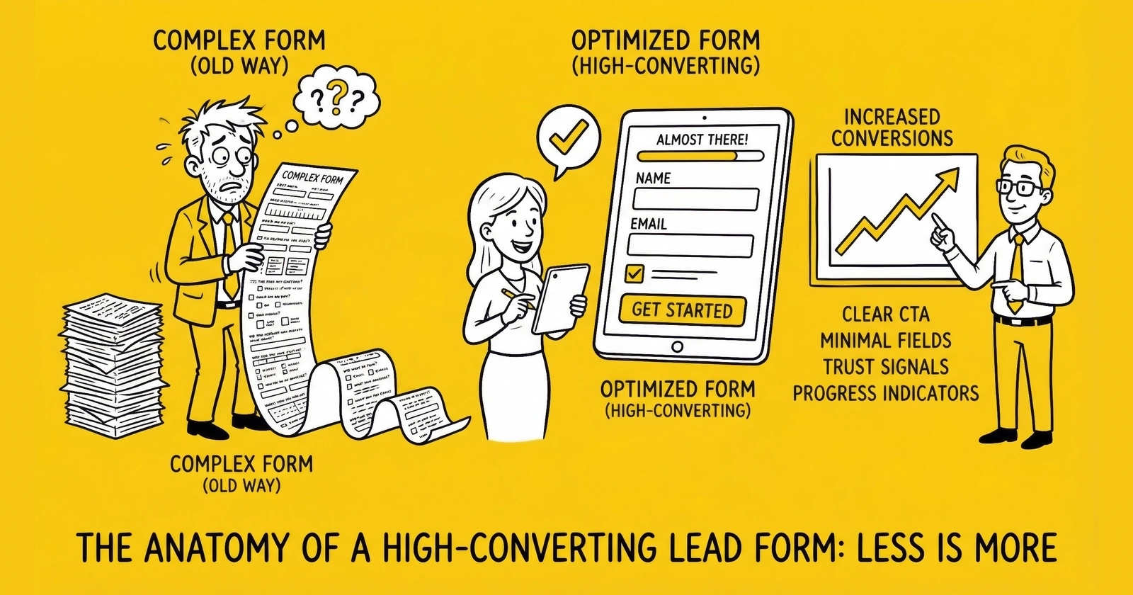
Why Multi-Step Forms Convert 86% Better Than Single-Page Forms
Here is a counterintuitive truth that changed how the industry approaches form design: asking more questions in the right format increases conversions.
Industry research shows multi-step forms deliver conversion rates 86% higher than single-page equivalents. The data is consistent across verticals. Venture Harbour converted their consulting inquiry form from a traditional single-page format to a multi-step structure and watched their conversion rate jump from 0.96% to 8.1% – an increase exceeding 700%. BrokerNotes, a B2C financial lead generation site, saw conversion rates climb from 11% to 46% with multi-step forms.
Why does asking more questions lead to more completions? The answer lies in psychology.
Progressive Commitment
Multi-step forms leverage the foot-in-the-door principle. Once visitors invest effort answering initial questions, they become psychologically invested in completing the process. Abandoning means “wasting” the effort already expended. Each step forward increases the psychological cost of walking away.
Reduced Visual Intimidation
A form with 15 visible fields triggers immediate resistance. The same 15 fields spread across five steps with three fields each appears manageable. The total effort is identical – the perceived effort is dramatically lower.
Optimized Question Ordering
Multi-step forms allow strategic question sequencing. Start with low-friction questions that engage visitors (“What type of coverage are you looking for?”). Save sensitive questions – email, phone number – for later steps when commitment is established. This sequencing is impossible with single-page forms where everything appears at once.
Sunk Cost Psychology
Progress indicators showing “Step 3 of 5” create implicit commitment. Visitors who have completed 60% of a form are reluctant to abandon – they are closer to the finish than the start. The completion psychology kicks in, driving higher conversion rates even when the remaining questions are more sensitive.
The mechanics matter as much as the psychology. Research from HubSpot found that forms with five or fewer visible fields convert 120% better than longer alternatives. Multi-step forms achieve this apparent simplicity while collecting comprehensive data.
Essential Form Elements
Every high-converting lead form contains specific elements working in concert. Miss any of these, and conversion rates suffer.
Headline and Value Proposition
The form headline is not optional decoration. It is the final piece of persuasion before the visitor commits to providing information.
Effective form headlines answer one question: “What do I get for filling this out?”
Weak headline: “Get Started”
Strong headline: “Compare rates from 25 top carriers in 90 seconds. 87% of users save an average of $423 annually.”
The strong version specifies the number of options, provides a time commitment, and offers a quantified benefit with social proof. Visitors know exactly what they will receive and why it matters.
For multi-step forms, each step should have its own micro-headline reinforcing progress and value. “Step 2: Tell us about your vehicle” orients the visitor and confirms they are on the right path.
Progress Indicators
Progress indicators serve two functions: they reduce anxiety about form length, and they leverage completion psychology.
The most effective progress indicators show both current position and total steps. “Step 3 of 5” outperforms simple progress bars because it provides concrete information about the journey.
Visual progress bars work when they show meaningful advancement. A bar that appears to move 10% after every single field feels manipulative. A bar that shows three clear stages (Your Needs > Your Information > Confirm Details) feels honest.
For multi-step forms, research suggests step completion rates follow a predictable pattern:
- Step 1 (ZIP code or basic qualifier): 70-80% proceed
- Step 2 (Lead type or category selection): 75-85% of those who started proceed
- Step 3 (Qualifying attributes): 80-90% proceed
- Step 4 (Contact information): 85-95% proceed
The pattern is consistent: once visitors invest initial effort, completion rates increase with each subsequent step.
Field Sequence Psychology
Not all form fields carry equal friction. Strategic ordering minimizes early abandonment and maximizes completion rates.
Low-friction fields include:
- Multiple-choice selections
- Yes/no questions
- Dropdown menus
- Range sliders
- Questions about preferences or needs
These fields feel conversational and require minimal typing. They engage visitors without triggering privacy concerns.
High-friction fields include:
- Email addresses
- Phone numbers
- Street addresses
- Social Security numbers
- Open-ended text fields
These fields trigger privacy concerns and require effort to complete accurately. They belong at the end of the form sequence, not the beginning.
Strategic ordering follows these principles:
- Place low-friction questions first to build engagement
- Group related questions together
- Save high-friction questions for later steps
- End with contact information when commitment is highest
Research on insurance lead forms confirms this pattern: forms asking vehicle information before personal information outperform forms that lead with contact details. Questions about coverage needs feel consultative; immediate requests for contact information feel salesy.
Trust Signals
Trust operates in layers. Different visitors need different levels of reassurance before converting. First-time visitors from cold traffic need more trust signals than returning visitors from retargeting campaigns.
Immediate trust signals should be visible within the form area:
- Security badges (SSL, TRUSTe, Norton Secured)
- Brand logos of carriers or service providers
- “As Seen In” media mentions
- Privacy commitment statements
Reinforcing trust signals support the conversion decision:
- Testimonials adjacent to the form
- Ratings and review counts
- Specific numbers (“500,000+ quotes delivered”)
- Industry certifications
Research suggests 92% of consumers read testimonials when considering providing information, and testimonials placed near lead forms increase submission rates by up to 50%. Placement matters – testimonials directly adjacent to the form reinforce the conversion decision at the critical moment.
Privacy reassurance is increasingly important. A brief statement like “We never sell your email to third parties” or “Your information is encrypted and secure” addresses objections before they form.
TCPA Consent Disclosure
TCPA compliance is not optional – it is existential. TCPA violations carry statutory damages of $500 to $1,500 per occurrence. With thousands of leads generated monthly, non-compliant forms represent million-dollar liability exposure. See our comprehensive TCPA compliance guide for lead generators for complete requirements.
Required consent elements include:
Clear consent language explaining what the consumer agrees to – specifically, that they consent to receive calls and/or texts, potentially using automated technology, at the number provided.
Seller identification disclosing who may contact the consumer. If leads will be sold to multiple buyers, consumers must know they may receive communications from “marketing partners” or specifically named companies.
Revocation rights explaining that consumers can revoke consent at any time.
Clear and conspicuous placement. Consent language must not be buried in fine print or hidden behind unclear links. The disclosure should be visible without scrolling where feasible.
Checkbox requirements. Pre-checked boxes do not constitute valid consent for TCPA purposes. Consumers must take an affirmative action – checking an unchecked box – to indicate consent.
The consent disclosure must be immediately adjacent to the checkbox. Separating the checkbox from its explanatory text creates ambiguity about what consent covers – ambiguity that plaintiff attorneys will exploit.
Font size matters legally. Disclosure text in tiny font or low-contrast colors fails the “clear and conspicuous” standard. Use 12-pixel minimum on desktop, 14-pixel minimum on mobile.
Submit Button Optimization
The submit button is the final friction point between a visitor and a lead. Small optimizations here compound across your entire traffic operation.
Button text matters. “Submit” is generic and passive. “Get My Free Quotes” is specific and benefit-oriented. Test variations – the difference can be 10-30% in click rates.
Button color should contrast with the form background. This is not about orange versus green – it is about visual prominence. The button should be the most visually distinct element in the form area.
Button size should accommodate mobile taps. Minimum tap target is 44x44 pixels. Larger buttons (full-width on mobile) reduce friction for thumb-based navigation.
Loading states provide feedback. When clicked, the button should immediately indicate processing. Uncertainty about whether the click registered leads to multiple submissions and frustrated visitors.
Field-by-Field Optimization
Every field has a measurable impact on conversion rate. Here is how to optimize field selection and implementation.
Essential Fields vs. Nice-to-Have Fields
The fundamental trade-off: more fields improve lead quality and buyer acceptance but reduce conversion rate. Every field beyond the minimum carries a measurable cost.
Essential fields for most lead types:
- Name (first and last, or combined)
- Phone number
- Email address
- 2-3 qualifying questions specific to vertical
Fields that often reduce conversion without proportional quality benefit:
- Full street address (when ZIP code suffices)
- Date of birth (unless required for qualification)
- Gender (rarely relevant to lead routing)
- Income ranges (sensitive; use employment status instead)
Research on email-and-phone-only forms shows conversion rates around 10.15% – significantly higher than forms requesting additional demographic information like birthdate or gender, which drop to 5-6% conversion rates.
Field Implementation Best Practices
Phone number fields should accept multiple formats. Do not reject leads because visitors entered (555) 555-5555 instead of 555-555-5555. Parse and normalize on the backend.
Email validation should catch obvious errors (missing @ symbol, common domain misspellings) without rejecting unusual but valid addresses. For comprehensive validation strategies, see our guide to lead validation for phone, email, and address.
ZIP code fields enable geographic routing without requiring full addresses. For most lead types, ZIP code provides sufficient geographic precision at much lower friction than street address.
Dropdown menus outperform open text fields for categorical data. “What type of insurance are you interested in?” with five options converts better than a text field asking the same question.
Date pickers should default to reasonable values. For birth dates, do not make visitors scroll from 2024 – default to a date 35-40 years ago and allow easy adjustment.
Conditional Logic
Smart forms display fields based on previous answers. This reduces perceived form length and improves data relevance.
Example: An auto insurance form asks “Do you currently have auto insurance?” If yes, subsequent questions about current coverage appear. If no, those questions are skipped and different questions about coverage needs appear.
Conditional logic creates personalized form experiences. Visitors see only relevant questions, reducing friction while improving data quality.
Implementation requires JavaScript or form platform features. Most modern form builders (Gravity Forms, Typeform, Unbounce) support conditional logic natively.
Mobile Form Design
The data is unambiguous: mobile visitors now account for over 70% of landing page traffic in most verticals. Some verticals – particularly those targeting younger demographics – see 80%+ mobile traffic.
If your form is not designed for mobile first, you are optimizing for a shrinking minority.
Mobile-First Requirements
Thumb-friendly interaction. Mobile users tap rather than click. Form fields need adequate spacing (minimum 16px between fields). Buttons need sufficient tap targets (minimum 44x44 pixels). The most common actions should be reachable with one hand – no stretching to the top of the screen.
Reduced cognitive load. Smaller screens mean less visible content. Every element competes more fiercely for attention. Mobile forms should be ruthlessly simplified compared to desktop versions. Consider showing even fewer fields per step on mobile.
Input type optimization. Use appropriate input types for mobile keyboards:
type="tel"for phone numbers (shows numeric keypad)type="email"for email addresses (shows @ symbol and .com shortcut)type="number"for numeric inputs
Click-to-call prominence. For lead types that convert to phone calls, click-to-call buttons should be prominent on mobile. Mobile visitors are already on a device that makes calls – reduce the friction.
Mobile Conversion Gap
Despite higher traffic volumes, mobile conversion rates lag desktop: 11.2% average conversion rate on mobile versus 12.1% on desktop. This gap represents opportunity. Practitioners who close the mobile conversion gap gain significant competitive advantage.
Common mobile conversion killers:
- Forms that require horizontal scrolling
- Buttons positioned too close to text fields (accidental taps)
- Forms that do not work with mobile autofill
- Progress indicators that consume too much screen real estate
- Trust signals that push the form below the fold
Mobile Testing Requirements
Test your forms on actual mobile devices – not just browser simulations. Test on both iOS and Android. Test on older devices with smaller screens. Test on slow network connections (3G simulation).
Form completion that works smoothly on a new iPhone may fail completely on a three-year-old Android device. Your traffic includes both.
Form Length vs Conversion Rate: The Data
The relationship between form length and conversion is not linear. The data tells a more nuanced story.
Baseline finding: Forms with five or fewer visible fields convert 120% better than longer alternatives.
But context matters:
For high-intent visitors (coming from specific long-tail keywords), longer forms with more qualification questions often perform better. These visitors expect a thorough process and interpret short forms as potentially sketchy.
For low-intent visitors (broad awareness campaigns), shorter forms with minimal friction convert better. These visitors are earlier in their journey and will abandon at any resistance.
Multi-step form data shows:
- Average conversion rate for multi-step forms: 13.85%
- Average conversion rate for single-step forms: 4.53%
- Multi-step forms convert approximately 86% higher
Form length optimization by vertical:
Insurance: Multi-step forms with 12-18 total fields across 3-5 steps perform well. Visitors expect a quote process and interpret thoroughness as accuracy.
Mortgage: Multi-step forms with 15-25 fields across 4-6 steps. Mortgage is a complex purchase; visitors expect detailed qualification. See our mortgage lead generation guide for vertical-specific strategies.
Solar: Multi-step forms with 8-12 fields across 3-4 steps. Homeowner qualification and project readiness require some depth without overwhelming. Our solar lead generation guide covers qualification best practices.
Legal: Short forms with 4-6 fields. Legal visitors are often in crisis; keep friction minimal and let attorneys gather details during consultation.
The optimization path:
- Start with minimal fields
- Test adding qualifying questions
- Measure impact on both conversion rate AND lead quality
- Find the point where additional fields reduce downstream value more than they improve it
Consent Language That Holds Up in Court
The consent language on your forms is not marketing copy – it is legal documentation. When TCPA litigation arrives (and it will), your consent language is your primary defense.
Required Elements
Following the FCC’s requirements for prior express written consent, your disclosure must include:
Authorization language: Clear statement that the consumer authorizes calls and/or texts using automated technology.
Seller identification: Who will be calling. If multiple parties may contact the consumer, this must be disclosed. “Our marketing partners” is acceptable but less defensible than naming specific companies.
Phone number confirmation: The consent must reference the specific phone number provided.
Revocation statement: How the consumer can withdraw consent.
Not a condition of purchase: The consent cannot be required to complete a transaction. This must be clearly stated.
Example Compliant Disclosure
“By clicking ‘Get My Quotes,’ I provide my signature expressly consenting to receive marketing calls and texts from [Company Name] and our network of insurance partners at the phone number provided, including calls using automated technology. I understand this consent is not required to make a purchase. I can revoke consent at any time by calling [phone number] or replying STOP to any text message.”
Documentation Requirements
Consent without documentation is consent you cannot prove. In TCPA litigation, the burden of proof rests with the caller – if you cannot prove consent existed at the time of the call, courts will presume non-compliance.
TrustedForm certificates create independent third-party documentation of the consent capture event. When a lead is generated, TrustedForm records a session replay showing exactly what the consumer saw and what they clicked. This documentation has been accepted by courts as evidence of consent.
Jornaya LeadiD provides alternative consent documentation with additional lead intelligence features.
Many sophisticated lead buyers now require either TrustedForm certificates or Jornaya LeadiDs as a condition of purchasing leads. Implementing both maximizes buyer compatibility and provides redundant documentation.
Retention requirements: Keep consent documentation for at least four years (the TCPA statute of limitations) plus a buffer. Industry best practice is five years or longer.
A/B Testing Your Forms
Conversion optimization is not about copying “best practices.” It is about discovering what works for your specific audience, offer, and traffic sources through systematic experimentation.
What to Test First
Prioritize tests by potential impact multiplied by probability of success divided by effort required.
High-priority tests (test these first):
- Single-step vs. multi-step format
- Number of visible fields per step
- Question sequence (low-friction first vs. high-value first)
- Submit button text and color
- Form headline and value proposition
Medium-priority tests:
- Progress indicator style
- Trust signal selection and placement
- Field labels (above field vs. inline)
- Error message presentation
- Mobile-specific optimizations
Lower-priority tests (test after fundamentals are optimized):
- Field border styling
- Background colors
- Font choices
- Placeholder text variations
Statistical Significance Requirements
The biggest mistake in A/B testing is declaring winners before results achieve statistical significance. A test showing Variant B converting 15% better than Control sounds exciting – but if the sample size is insufficient, that result will reverse with more data.
Statistical significance means the observed difference is unlikely to be due to random chance. Industry standard is 95% confidence – meaning there is only a 5% probability the result is random noise.
Sample size requirements depend on:
- Baseline conversion rate (lower-converting pages need larger samples)
- Minimum detectable effect (smaller improvements require larger samples)
- Traffic volume (low-traffic pages may require weeks or months)
Before launching any test, calculate required sample size. Free calculators exist – search “A/B test sample size calculator.” Running tests without pre-calculated sample sizes leads to premature conclusions and false positives.
The peeking problem: Running a test until one variant appears to be winning, then stopping, is called “peeking” – and it dramatically inflates false positive rates. Set your required sample size in advance and commit to running the test to completion regardless of intermediate results.
Expected Success Rate
Research suggests only about one in eight A/B tests produces statistically significant results. That means seven tests will “fail” – but those failures narrow the search space and inform future hypotheses.
The goal is not winning every test. It is learning systematically. Failed tests teach as much as successful ones.
Form Analytics to Track
What gets measured gets improved. These metrics tell you exactly where your forms are succeeding and failing.
Essential Metrics
Form Completion Rate: Total form submissions divided by unique form views. This is your primary conversion metric.
- Target: Varies by vertical and traffic source (5-15% for cold traffic, 15-30% for warm traffic)
- Danger zone: Below 3% signals fundamental form problems
Step Completion Rate (for multi-step forms): Percentage of visitors who complete each step after starting the previous step.
- Expected pattern: First step 70-80%, increasing to 85-95% for final steps
- Danger signal: Any step showing significantly lower completion than expected indicates specific friction at that point
Field Abandonment Rate: Which fields correlate with form abandonment.
- Track: Time spent on each field, fields where visitors abandon
- High abandonment on specific fields suggests those fields need optimization or removal
Time to Completion: How long visitors take to complete the form.
- Too fast (under 8 seconds for complex forms): Suggests bot traffic or fraudulent submissions
- Too slow (significantly above average): Suggests confusion or difficulty
- Optimal: Varies by form complexity, but 60-180 seconds is typical for multi-step forms
Drop-Off Analysis
Beyond aggregate metrics, analyze exactly where visitors abandon.
Step-by-step drop-off shows which steps in your multi-step form lose the most visitors. If Step 3 consistently loses 40% of visitors when other steps lose only 15%, something is wrong with Step 3.
Field-level drop-off identifies specific fields causing problems. If visitors consistently abandon after reaching the phone number field, that field needs optimization – different label, better explanation of why you need it, or repositioning in the sequence.
Device-specific drop-off reveals mobile versus desktop differences. If mobile visitors abandon at twice the rate of desktop visitors at the same step, your mobile experience has specific issues.
Implementation
Google Analytics 4 event tracking can capture form interaction data. Most landing page platforms (Unbounce, Instapage, Leadpages) provide built-in form analytics. Heat mapping tools (Hotjar, Crazy Egg) show exactly how visitors interact with forms – where they hesitate, where they abandon.
For serious optimization, implement session recording for a sample of visitors. Watching actual users struggle with your form reveals issues that aggregate data cannot surface.
Frequently Asked Questions
How many fields should my lead form have?
Research shows forms with five or fewer visible fields convert 120% better than longer alternatives. However, multi-step forms allow you to collect 12-20 fields across multiple steps while maintaining the psychological simplicity of showing only 3-4 fields at once. The optimal number depends on your vertical and traffic quality – test to find your specific sweet spot.
Should I use single-step or multi-step forms?
Multi-step forms convert approximately 86% higher than single-step forms across most lead generation verticals. The exceptions are extremely simple lead types (newsletter signups) or crisis-driven leads (emergency services) where minimal friction is paramount. For most lead types – insurance, mortgage, solar, home services – multi-step forms outperform.
What order should I put my form fields in?
Start with low-friction questions (preferences, needs, multiple-choice selections) and save high-friction questions (phone number, email, address) for later steps. This sequence builds psychological commitment before asking for sensitive information. Questions about what the visitor wants feel consultative; immediate requests for contact information feel salesy.
How do I write TCPA-compliant consent language?
Your consent disclosure must include: clear authorization for calls/texts using automated technology, identification of who will contact the consumer, reference to the specific phone number, statement that consent is not required for purchase, and instructions for revoking consent. Implement TrustedForm or Jornaya to create independent documentation of consent capture.
What should my submit button say?
Replace generic “Submit” with benefit-oriented language that reminds visitors what they receive. “Get My Free Quotes,” “See My Options,” or “Compare Rates Now” outperform generic submit buttons. Test variations – the difference can be 10-30% in click rates.
How do I optimize forms for mobile?
Design mobile-first with thumb-friendly tap targets (minimum 44x44 pixels), appropriate input types (tel for phone, email for email), adequate spacing between fields (minimum 16px), and full-width buttons. Test on actual mobile devices, not just browser simulations. Consider showing fewer fields per step on mobile than desktop.
What is a good form conversion rate?
This varies significantly by vertical, traffic source, and traffic temperature. Cold traffic (display ads, social) typically converts 3-8%. Warm traffic (search, retargeting) converts 10-20%. Hot traffic (branded search, direct) can convert 25%+. Compare your rates to your own historical performance rather than generic benchmarks.
How long should visitors spend on my form?
Time to completion varies by form complexity. For multi-step forms with 10-15 fields, 60-180 seconds is typical. Completions significantly faster than average (under 8-10 seconds for complex forms) suggest bot traffic or fraudulent submissions. Completions significantly slower suggest confusion or difficulty.
Should I require email AND phone number?
For most lead types, yes – both email and phone are essential for lead monetization and buyer acceptance. The sequence matters: phone number typically comes after email in the optimal flow, as email feels slightly less sensitive to most visitors.
How do I reduce form abandonment?
Implement multi-step formats to reduce perceived length. Remove unnecessary fields. Improve field labels and error messages. Add trust signals near the form. Ensure mobile experience is seamless. Use progress indicators that show meaningful advancement. Test systematically to identify specific friction points.
Key Takeaways
-
Multi-step forms convert 86% higher than single-page forms – the psychology of progressive commitment and reduced visual intimidation explains the difference.
-
Mobile traffic now exceeds 70% in most verticals, yet mobile conversion rates lag desktop by nearly a full percentage point. Close this gap for competitive advantage.
-
Field sequence matters: start with low-friction questions (preferences, needs) and save high-friction questions (phone, email) for later steps when commitment is established.
-
TCPA consent is not a marketing checkbox – it is legal documentation. Implement clear disclosures, unchecked checkboxes, and third-party verification (TrustedForm or Jornaya) to create defensible consent records.
-
Only one in eight A/B tests produces statistically significant results. Build testing into your ongoing operations and commit to systematic experimentation.
-
Form analytics should track step completion rates, field abandonment rates, time to completion, and device-specific drop-off. What gets measured gets improved.
-
The form is where money is made or lost. Every optimization compounds across your entire traffic operation. A 2-percentage-point improvement in form conversion transforms your unit economics without spending another dollar on traffic.
Sources
- Baymard Institute Cart Abandonment Research - Primary research on form abandonment rates and e-commerce conversion benchmarks (81% average abandonment rate)
- Nielsen Norman Group Form Design Guidelines - Usability research on form field layout, labels, and user experience optimization
- Unbounce Conversion Benchmark Report - Industry data on landing page and form conversion rates across verticals
- Google Mobile Page Speed Data - Research on mobile conversion impact from page load times
- ActiveProspect TrustedForm - Technical documentation for TCPA consent certification and verification
The difference between profitable lead generation and expensive traffic experiments often comes down to form optimization. Those who treat their forms as conversion engines – rather than data collection exercises – build sustainable businesses. The ones who copy competitors and hope for the best watch their margins disappear into abandonment.