Subscription retention math is the discipline that separates businesses that compound from businesses that quietly bleed – and most operators read the wrong number.
Why Subscription Retention Math Is the Most Underrated Discipline
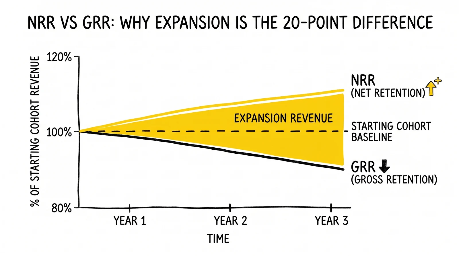
The financial difference between a subscription business with 90% gross revenue retention and one with 110% net revenue retention is not 20 percentage points. Compounded over five years, the second business is roughly 2.4 times larger than the first at identical new-logo acquisition. That gap – which exists entirely inside the existing customer base – is the most consequential lever in subscription economics, and the one operators most consistently misread.
Retention math is underrated because it appears simple. Anyone can compute a churn rate. Most billing platforms expose a default retention dashboard. The hard part is not arithmetic but interpretation: knowing which number actually predicts business outcomes, recognizing the cohort patterns hidden inside aggregate trends, and understanding why two companies reporting identical churn rates can have radically different valuations.
Public market behavior makes the stakes explicit. Public SaaS companies reporting net revenue retention above 130% historically traded at 15x to 20x forward revenue during the 2021 cycle, while companies below 100% traded at 3x to 5x – a five-fold valuation difference driven by a single retention metric. Multiples compressed sharply after 2022, and 2024-2026 forward multiples for high-NRR public SaaS now cluster in the 10x to 15x range, but the relative gap between high- and low-NRR companies remains. Private companies face the same dynamic in fundraising, where investors increasingly anchor term sheets to NRR cohorts before they look at growth rate or efficiency.
The mathematics of retention also defines the boundary between sustainable and structurally broken businesses. A company growing 40% year-over-year while losing 30% of revenue from existing customers is fundamentally different from one growing 30% with 110% NRR – even though the first looks faster. The first runs a leaky bucket that requires ever-larger acquisition spend to maintain top-line growth; the second compounds. Bain & Company’s foundational research established that a 5% increase in customer retention can boost profits by 25% to 95%, and that ratio holds because retention compounds while acquisition stays linear.
Subscription operators who treat retention as a customer success problem rather than a financial discipline routinely miss the diagnostic patterns that matter. A 5% monthly churn rate is not just 5%. Behind that aggregate sit cohort curves with vastly different shapes, churn types with vastly different remediation paths, and expansion mechanics that can transform the same gross retention number into wildly different net outcomes. The rest of this analysis works through those layers in order.
NRR vs GRR: Formulas and Worked Examples
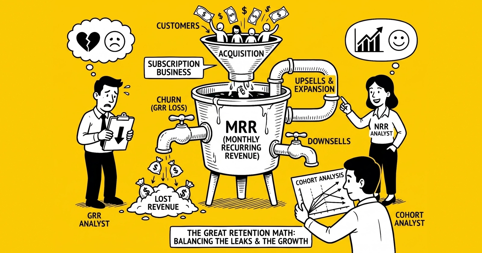
The two foundational subscription metrics – Net Revenue Retention (NRR) and Gross Revenue Retention (GRR) – measure related but distinct phenomena. Reading them together reveals the structure of a subscription business; reading either in isolation produces consistent strategic errors.
Gross Revenue Retention measures the percentage of recurring revenue retained from existing customers, excluding any expansion. The formula:
GRR = (Starting MRR – Churned MRR – Downgrade MRR) / Starting MRR × 100GRR mathematically caps at 100%. It cannot exceed the starting revenue base because it counts only revenue lost, never revenue gained from existing customers. A GRR of 85% means 15% of existing recurring revenue evaporated through cancellations and downgrades during the period.
Net Revenue Retention measures the same retention base but adds expansion revenue back in. The formula:
NRR = (Starting MRR – Churned MRR – Downgrade MRR + Expansion MRR) / Starting MRR × 100NRR has no ceiling. A company can retain 85% of its existing revenue, expand the surviving cohort by 30%, and report 115% NRR. The gap between GRR and NRR is the expansion engine – the additional revenue extracted from customers who stayed.
A worked example clarifies how these numbers interact in production. Consider a B2B SaaS company starting the quarter with $1,000,000 in monthly recurring revenue distributed across 200 customers averaging $5,000 each. During the quarter:
- 12 customers cancel entirely, removing $60,000 in MRR (6% gross churn)
- 8 customers downgrade plans, removing $20,000 in MRR
- 30 customers expand seats or upgrade plans, adding $130,000 in MRR
Applying the formulas:
GRR = ($1,000,000 - $60,000 - $20,000) / $1,000,000 = 92%
NRR = ($1,000,000 - $60,000 - $20,000 + $130,000) / $1,000,000 = 105%
This company retains 92% of its base revenue and expands the surviving cohort enough to reach 105% net retention. The 13-percentage-point gap between GRR and NRR is the expansion contribution.
The worked example below shows three companies with identical GRR but different expansion mechanics, producing radically different NRR outcomes.
| Company | Starting MRR | Churn | Downgrade | Expansion | GRR | NRR |
|---|---|---|---|---|---|---|
| Alpha (no expansion) | $1,000,000 | $80,000 | $20,000 | $0 | 90% | 90% |
| Beta (modest expansion) | $1,000,000 | $80,000 | $20,000 | $80,000 | 90% | 98% |
| Gamma (consumption pricing) | $1,000,000 | $80,000 | $20,000 | $200,000 | 90% | 110% |
Source: hypothetical worked examples illustrating GRR/NRR construction. Real-world parallels: Alpha resembles a single-tier consumer SaaS without seat expansion; Gamma resembles consumption-priced infrastructure SaaS like Snowflake or Datadog where customer success drives organic usage growth.
The three companies have identical retention behavior in their existing base – same churn, same downgrade – yet Gamma generates 22% more recurring revenue in the period than Alpha. Compounded over time, Gamma’s economics produce a fundamentally different business: one where customer success and product expansion drive growth without proportional sales spend. Alpha is structurally dependent on new-logo acquisition for any growth at all.
GRR signals the quality of the existing customer base. NRR signals whether the business has built mechanisms – pricing structure, product expansion, customer success motion – that turn that base into a growth engine. Reading them together is essential; reading either alone produces blind spots that compound expensively.
Three Cohort Patterns: Smile, J, and Dead-End
Aggregate retention metrics smooth over the cohort dynamics that actually predict business trajectory. Two companies reporting identical 90% GRR can have radically different futures depending on the shape of their cohort curves. Operators who diagnose retention at the aggregate level routinely miss the underlying pattern until it surfaces as a valuation problem during fundraising or a margin problem during a downturn.
A cohort retention curve plots the percentage of a customer group still active across time periods after acquisition. Customers acquired in the same month form a cohort; the cohort’s retention is tracked monthly thereafter. The shape of that curve, not the aggregate retention rate, reveals the retention dynamics of the business. Three patterns show up consistently in production data: the smile, the J-curve, and the dead-end.
The Smile Curve
The smile curve drops sharply in the early months as casual users and poor-fit customers churn, flattens through the middle as the core base stabilizes, and turns upward in later periods as expansion revenue per surviving cohort outpaces remaining churn. This is the rarest and most valuable pattern in subscription economics.
Smile curves emerge in businesses with strong network effects or expansion mechanics. Slack’s early cohorts displayed this shape because dormant users reactivated when colleagues joined; the data accumulating in Notion or Evernote became more valuable to retained users over time, pulling them deeper into the product. In B2B SaaS, seat-based pricing combined with successful customer onboarding can produce a smile because surviving accounts grow seats faster than lost accounts shrink the base.
A true smile is a strong product-market fit signal because it implies the value proposition strengthens with tenure. Dormant users return, accounts expand, and the surviving cohort’s revenue eventually exceeds its starting value. Sequoia Capital’s published retention research treats the smile as the canonical healthy pattern; Andreessen Horowitz’s recent AI retention benchmarks identify smile cohorts as the structural distinction between AI-native products with durable economics and those that decay like traditional consumer apps.
The J-Curve (Hockey Stick)
The J-curve drops fast in the early months and then flattens into a stable plateau, never recovering but never collapsing either. This is the most common healthy pattern in subscription businesses. The early drop reflects customer acquisition that brings in some poor-fit users; the plateau reflects the durable core base that finds enough value to stay indefinitely.
A J-curve at 70% indicates that 70% of the cohort persists indefinitely after the early shake-out – a fundamentally healthy business even though 30% churned. A J-curve at 30% indicates a core that exists but is small relative to acquisition volume, suggesting either acquisition quality issues or weak product fit for most users.
The flatness of the plateau matters as much as its level. A plateau that gradually slopes downward is masking continued churn that aggregate metrics may not flag. A truly flat plateau indicates the surviving base churns at near-zero, which is the structural condition for high LTV.
The Dead-End Curve
The dead-end curve trends toward zero over time. Every cohort eventually disappears. No matter how much acquisition spend the business deploys, the customer base does not compound – it cycles through users at a rate that prevents any net accumulation.
Dead-end curves indicate that the product fails to deliver durable value. Users sign up, derive some short-term benefit, and leave. The economics of dead-end businesses force them into permanent acquisition treadmills where every dollar of growth requires a corresponding dollar of acquisition spend, with no compounding from the existing base. Most consumer subscription apps without strong utility – single-purpose mobile apps, fad-driven content services – display this pattern.
The diagnostic principle: aggregate retention rates lie. A 5% monthly churn rate looks the same in a J-curve business at month 12 as in a dead-end business at month 3. The cohort triangle reveals which pattern the business actually has, and only the cohort triangle does. Operators who do not maintain a cohort view of retention are flying blind on the most important metric in subscription economics. The mechanics of cohort construction and interpretation are covered in detail in the cohort analysis for lead quality guide.
Expansion Revenue: The 90% GRR vs 110% NRR Difference
The single largest valuation lever in subscription economics is the gap between gross and net revenue retention. A company with 90% GRR and 110% NRR is not 20% better than a company with 90% GRR and 90% NRR – it is structurally different, with growth dynamics that compound rather than require constant replacement.
Consider two B2B SaaS companies, both starting at $10 million ARR, both retaining 90% of base revenue annually. Company A has no expansion mechanism; Company B generates 20% expansion on its retained base. Year over year, with zero new logo acquisition:
- Year 1: Company A = $9.0M, Company B = $11.0M
- Year 2: Company A = $8.1M, Company B = $12.1M
- Year 3: Company A = $7.3M, Company B = $13.3M
- Year 5: Company A = $5.9M, Company B = $16.1M
Company B grows at 10% annually with no new logos. Company A shrinks at 10%. The mechanical difference: Company B’s surviving customers each generate more revenue over time, while Company A’s surviving customers stay flat. Compounded over five years, Company B is 2.7 times the size of Company A despite identical retention behavior in the existing base.
Three expansion mechanisms produce this gap reliably in production. Each works differently and demands different operational investment.
Seat-based expansion is the dominant pattern in B2B SaaS sold per user. Salesforce, Zoom, Notion, and Atlassian all rely heavily on seat growth within existing customers. The mechanism: a customer signs up with 10 seats, adds a department, scales to 40 seats over two years. Net retention on that account exceeds 100% mechanically because seats grow faster than they shrink. The operational requirement is that the product expands naturally with team size – features that work for individual users but become essential at team scale create the conditions for seat growth without active selling.
Usage-based pricing ties revenue directly to consumption tied to customer success. Datadog, Snowflake, Twilio, and Stripe all use this model. When the customer’s business succeeds, their consumption grows, and revenue grows with it. The mechanism is mathematically powerful because it eliminates the buying decision from expansion – there is no second sale; growth is automatic when the product creates value. Public companies running consumption-based pricing routinely report NRR above 130%, with Snowflake’s NRR peaking at 178% in Q4 FY22 before compressing to roughly 127% by Q3 FY25 as the customer base matured and consumption growth normalized – a trajectory disclosed in Snowflake’s quarterly investor materials.
Tier upgrades drive expansion when product features are gated behind plan levels customers grow into. The customer signs up at the basic tier for $50 per month, hits a usage ceiling or feature limitation at month 9, and upgrades to the $200 tier. Tier upgrade economics work when the gating is honest – when customers genuinely need the higher tier to extract more value, not when basic functionality is artificially restricted to force upgrades. Honest gating produces durable expansion; manipulative gating produces churn at the moment of forced upgrade.
The fourth mechanism – cross-sell – produces expansion in principle but underperforms the first three in practice. Cross-sell requires a separate buying decision: the customer must evaluate, approve budget for, and adopt a new product. Most subscription businesses overestimate cross-sell because it sounds like an obvious lever, but the conversion rates from cross-sell campaigns rarely match the seat-based or usage-based dynamics that happen passively. The expansion businesses with the highest NRR almost always rely on passive expansion mechanics rather than active cross-sell motions.
The strategic implication: pricing structure determines NRR ceiling. A flat per-account fee with no consumption or seat scaling caps NRR at roughly 100% mechanically. Seat-based pricing creates a ceiling around 120% to 140% in healthy businesses. Consumption-based pricing aligned with customer outcomes can produce NRR above 150%. Operators who want to push retention numbers must redesign pricing, not just optimize customer success – pricing structure is the mathematical foundation expansion sits on. Detailed economic frameworks for evaluating these decisions appear in the recurring revenue lead generation guide.
Churn Types: Voluntary, Involuntary, and Downgrade Recovery
Churn is not a single phenomenon. It is three distinct categories with different causes, different remediation paths, and dramatically different recovery rates. Operators who treat all churn as one bucket and respond with one playbook – usually customer success outreach – leave 30% to 70% of recoverable revenue on the table because they apply the wrong intervention to the wrong type of loss.
Voluntary churn occurs when a customer actively decides to cancel. They log in, click cancel, and leave. The drivers are product fit, pricing, competition, and changes in the customer’s own business. Voluntary churn is the visible category most retention teams focus on. The remediation paths are slow and structural: better onboarding, deeper product engagement, customer success interventions before renewal. The reality of voluntary churn is that by the time a customer reaches the cancel button, the loss has typically already happened – the actual disengagement occurred weeks or months earlier when the customer stopped using the product.
Involuntary churn occurs when a payment fails. The customer did not decide to leave; their card expired, was declined for fraud screening, hit insufficient funds, or failed authorization. The customer may not even know they have churned until they notice the service has stopped working. Recurly’s research compiling 1,500 sites across 19 months found that involuntary churn accounts for roughly 40% to 53% of total subscription churn depending on the dataset and time period analyzed. The average overall churn rate in their dataset is 5.57% – meaning a substantial share of that 5.57% is failed payments, not customer dissatisfaction.
Recurly’s January 2024 industry projection – published as part of the runup to its 2025 State of Subscriptions report – estimated that failed payments could cost subscription companies more than $129 billion in 2025, drawn from analysis of more than 2,200 merchants and 67 million unique subscribers across the Recurly platform. That figure represents recoverable revenue if billing systems retry intelligently. Modern dunning systems using machine learning to optimize retry timing, card update services that proactively refresh stored credentials, and account updater integrations with major card networks routinely recover 30% to 70% of failed payments. The leverage is enormous because the work is operational rather than relational – no customer outreach required, no product changes, just better billing infrastructure.
Downgrade churn is the partial loss of revenue when a customer moves to a lower tier or reduces seat count without canceling entirely. Downgrade churn often goes undermeasured because the customer is technically retained, but the revenue impact can equal or exceed full cancellations in mature subscription businesses. A customer moving from $500 per month to $100 per month loses 80% of that account’s revenue while staying classified as retained.
The diagnostic approach: every subscription business should segment churn into these three categories monthly and treat each as a distinct problem. Voluntary churn requires product and customer success investment. Involuntary churn requires payment recovery infrastructure – Recurly, Stripe Billing, ChartMogul, and Paddle all offer dunning and account updater capabilities, and the ROI on deploying them is typically immediate. Downgrade churn requires pricing structure analysis to understand which gates customers are slipping under and whether the product still creates enough value at the lower tier to justify retention.
The composition shift between these three churn types tells operators where to invest. A business with 80% voluntary churn has a product-market fit problem. A business with 60% involuntary churn has a billing infrastructure problem. A business with rising downgrade churn has a value-delivery or pricing-structure problem. The same aggregate churn rate can have three completely different remediation paths depending on composition.
SaaS Benchmarks 2026: OpenView, Bessemer, Bain, High Alpha
Benchmarks contextualize retention numbers but only when applied to comparable businesses. A 110% NRR is excellent for a small-business SaaS company and below median for an enterprise infrastructure provider. The 2026 benchmark landscape, drawn from High Alpha’s 2025 SaaS Benchmarks Report, Bessemer’s State of the Cloud, and OpenView’s published data, provides percentile bands operators can use to calibrate.
The headline pattern across all three sources: median NRR for public SaaS companies sits around 106% per High Alpha 2025 data, with $100M+ ARR companies reaching roughly 115% and the top quartile clearing 120%. GRR medians cluster around 88% for B2B SaaS with best-in-class above 92%. The gap between GRR and NRR – the expansion contribution – sits at roughly 10 to 15 percentage points at the median, which is the mathematical signature of a healthy subscription business with functioning expansion mechanics.
| Stage / Vertical | Median GRR | Median NRR | Top-Quartile NRR | Source |
|---|---|---|---|---|
| Public SaaS (all) | 88% | 106% | 120% | High Alpha 2025 |
| $100M+ ARR SaaS | 92% | 115% | 125%+ | High Alpha 2025 |
| $1M-$5M ARR SaaS | 88% | 104% | 110% | High Alpha 2025 |
| SMB SaaS | 82% | 100% | 110% | OpenView 2023 |
| Consumption-priced | 90% | 130%+ | 150%+ | Bessemer Cloud Index 2024 |
| Vertical SaaS | 90% | 105% | 115% | High Alpha 2025 |
Sources: High Alpha 2025 SaaS Benchmarks Report (800+ companies, 37% enterprise, 35% mid-market); Bessemer Venture Partners State of the Cloud; OpenView 2023 SaaS Benchmarks. Methodology differences mean cross-source comparisons are directional rather than precise. High Alpha’s 2025 data runs higher than OpenView’s 2023 data across all bands, partly because the SaaS market improved retention discipline between the two reports and partly because High Alpha’s respondent base skews more enterprise-oriented.
The valuation implications of these bands are direct. Public SaaS companies with NRR above 130% historically traded at 15x to 20x forward revenue during the 2021 cycle; 2024-2026 multiples for high-NRR public SaaS have compressed to roughly 10x to 15x. Companies in the median band of 105% to 115% currently trade at roughly 5x to 7x. Companies below 100% trade at 1x to 3x – the market correctly identifies businesses where the existing customer base is shrinking as structurally weaker. Private market valuations follow similar curves but with more variance because investors weigh growth alongside retention.
Bain & Company’s foundational research on retention economics – that a 5% increase in retention produces a 25% to 95% increase in profits – explains why the public market valuation gap is so wide. Retention compounds; acquisition stays linear. A company improving GRR from 85% to 90% does not just retain 5% more revenue; it shifts the entire compounding base of the business permanently. Five years downstream, the economic difference is multiples of the initial retention gain.
The benchmark caveat: averages obscure outliers in both directions. The median enterprise SaaS company with 115% NRR sits next to high performers reporting 145%+ and underperformers below 100%. Operators who use medians as targets converge on average performance; operators who use top-quartile bands as targets and instrument their business to identify the gap-closing levers tend to outperform. Industry-specific retention frameworks for lead-driven verticals, including how acquisition source quality maps to retention outcomes, are detailed in the LTV calculation guide for lead buyers.
Ecommerce Subscription Specifics: Replenishment vs Curation
Ecommerce subscriptions follow different retention dynamics than B2B SaaS, and the model type – replenishment, curation, or access – defines the retention ceiling more than any operational variable. Operators who apply SaaS retention playbooks to ecommerce subscriptions consistently underperform because the underlying behavioral economics differ.
Replenishment subscriptions sell consumables on a recurring delivery schedule. Coffee, supplements, pet food, household goods, beauty staples. The retention dynamic is anchored in usage: customers stay subscribed as long as they continue consuming the product at a rate that matches delivery frequency. Replenishment models retain 50% to 65% of subscribers at six months according to industry data, with monthly churn typically running 7% to 10%. The retention ceiling is set by the rate at which customers’ actual consumption changes – switching coffee brands, finishing a pet’s lifetime, finding a competitor’s product.
Curation subscriptions sell discovery: surprise boxes, monthly samples, curated collections. Beauty boxes, snack subscriptions, clothing services, book of the month. Curation retention is anchored in novelty, which decays mathematically over tenure. Curation models retain 35% to 45% at six months with monthly churn typically running 10% to 15%. The retention curve is steeper than replenishment because the value proposition fundamentally weakens with familiarity – customers who have received 12 surprise boxes know what to expect, and the dopamine of discovery diminishes.
Access subscriptions sell ongoing utility: Amazon Prime, Costco membership, ClassPass. Access models have the lowest churn at 5% to 8% monthly because the value proposition is structural rather than novelty-based. The customer extracts value across many transactions per month, and switching costs are real. Access subscriptions are the closest ecommerce parallel to SaaS retention dynamics because the customer relationship is anchored in cumulative utility rather than discrete deliveries.
Hybrid models combining replenishment with curation elements typically retain 45% to 55% at six months, capturing some of the necessity floor of replenishment without losing the discovery hook of curation. Dollar Shave Club and similar services have used this structure: a core replenishment item paired with rotating curated additions that maintain interest without making the core value proposition novelty-dependent.
The strategic implication for ecommerce operators: model selection determines retention ceiling more than tactics. A pure curation model with 40% six-month retention cannot reach the retention dynamics of a replenishment model through better tactics – the underlying behavioral driver is different. Operators who recognize the model constraint can either accept the retention ceiling and optimize within it, or evolve the product toward replenishment characteristics. Stitch Fix’s evolution toward more frequent shipments and Birchbox’s shift toward Birchbox Plus replenishment options both reflect operators recognizing curation’s structural retention ceiling and adding replenishment mechanics.
The diagnostic for ecommerce subscription operators: cohort by signup month and segment by model adherence. Replenishment cohorts should show flatter J-curves; curation cohorts will show steeper drops with lower plateaus. Aggregate metrics across mixed models obscure the underlying dynamics and produce incorrect intervention priorities. Separate cohort analysis by model type reveals which dynamics are working and which are structurally capped.
90-Day Retention Diagnostic Playbook
The diagnostic framework below structures a 90-day retention investigation across three 30-day phases. The framework applies to any subscription business – SaaS, ecommerce, hybrid – with sufficient data to construct cohort triangles. Operators who skip the diagnostic and jump directly to retention tactics typically waste 6 to 12 months optimizing the wrong layer of the funnel.
Days 1-30: Data Foundation and Baseline
The first 30 days establish the data infrastructure required for any retention analysis. Most subscription businesses discover during this phase that their billing data is not structured in a way that supports cohort analysis without substantial cleaning. ChartMogul, Paddle, Recurly, and Stripe Billing all offer cohort views out of the box; businesses on custom billing infrastructure typically need a focused engineering sprint to produce a usable cohort triangle.
The deliverables for this phase: a clean cohort triangle with monthly cohorts on rows and tenure months on columns, a baseline NRR and GRR calculation for the trailing 12 months, and a churn segmentation by voluntary, involuntary, and downgrade categories. The baseline numbers are the reference point for all subsequent intervention measurement.
The most common discovery during this phase is that the business has been measuring retention incorrectly – usually by computing churn as a single aggregate number without cohort context, often by including expansion in the GRR calculation (which produces a number above 100% that is mathematically meaningless), or by treating downgrades as either full churn or no churn rather than partial loss.
Days 31-60: Driver Isolation and Segmentation
The second 30 days isolate the drivers behind the baseline numbers. The investigation segments retention along three axes: acquisition source, plan tier, and tenure. The goal is to identify which segments are driving aggregate performance up or down, because aggregate-level interventions almost always underperform segment-targeted interventions.
The acquisition source segmentation typically reveals the largest variance. Customers acquired through organic search, paid search, partner referral, and outbound sales often have radically different retention curves. A 5x retention difference between best and worst acquisition channels is common; in lead-driven businesses, the variance can be even larger. The retention dynamics by acquisition source are explored in depth in the analysis of recurring revenue lead generation, which covers how upstream acquisition quality flows through to retention outcomes.
Plan tier segmentation reveals product-market-fit gaps. If basic-tier customers churn at 3x the rate of mid-tier customers, the basic tier is failing to deliver enough value to justify the price even at its lower point – or the basic tier is over-acquiring poor-fit users. Tenure segmentation reveals whether the business has an onboarding problem (high early churn) or a retention problem (steady mid-tenure decay).
Days 61-90: Intervention Prioritization
The final 30 days prioritize interventions by leverage and feasibility. The framework: rank interventions by recoverable revenue divided by implementation cost. Involuntary churn interventions almost always rank highest because they are operational rather than relational – implementing or upgrading dunning systems typically recovers 30% to 70% of failed payments within 60 days, with implementation costs measured in weeks of engineering time rather than quarters of customer success investment.
Onboarding fixes targeting early-tenure churn rank second because the leverage on acquisition spend is enormous. A business losing 40% of customers in the first 90 days is effectively wasting 40% of acquisition spend; reducing that to 25% requires onboarding investment that often pays back within a single quarter.
Expansion plays for stable cohorts rank third – they are valuable but require longer time horizons and depend on pricing structure choices that may take 6 to 12 months to redesign. The intervention framework should sequence quick wins (payment recovery, onboarding fixes) before structural changes (pricing redesign, packaging changes) to compound benefits.
The diagnostic output is a written intervention plan with explicit revenue projections, implementation timelines, and success metrics. The plan should specify which baseline numbers will move, by how much, and on what timeline. Operators who produce a written plan with explicit projections and then track actual versus projected outcomes build retention intuition that compounds across cycles. Operators who run informal “let’s improve retention” initiatives without explicit baselines and projections rarely produce measurable gains because they cannot distinguish intervention impact from underlying drift.
The 90-day diagnostic is a baseline-setting exercise, not a one-time event. Subscription businesses that maintain quarterly cohort reviews – refreshing the cohort triangle, recalculating NRR and GRR, segmenting churn types, and adjusting interventions – build the operational discipline that separates compounding businesses from leaky ones. The math itself is simple. The discipline of looking at it consistently is rare.
Key Takeaways
- Net Revenue Retention measures retention plus expansion; Gross Revenue Retention measures retention without expansion. GRR caps at 100%, NRR has no ceiling. Reading them together reveals the structure of a subscription business; reading either alone produces blind spots.
- The gap between 90% GRR and 110% NRR is mechanically a 2.4x size difference compounded over five years. The expansion engine – not the retention floor – drives valuation.
- Aggregate retention rates lie. A 5% monthly churn rate looks identical in a smile-curve business and a dead-end business; only the cohort triangle reveals which one operators actually have.
- Three cohort patterns dominate production data: smile (rare, expansion-driven, indicates strong PMF), J-curve (most common, healthy when plateau is high), and dead-end (structural product failure that no acquisition spend can fix).
- Pricing structure determines NRR ceiling. Flat-fee pricing caps NRR near 100%. Seat-based pricing reaches 120-140%. Consumption-based pricing aligned with customer outcomes can exceed 150%.
- Involuntary churn – failed payments, expired cards, declined transactions – accounts for roughly 40-53% of total subscription churn per Recurly, depending on dataset and methodology. Recovery infrastructure recaptures 30-70% of failed payments with operational effort, not customer success spend.
- Public SaaS companies above 130% NRR historically traded at 15-20x forward revenue during the 2021 cycle; 2024-2026 multiples have compressed to roughly 10-15x for high-NRR names, with sub-100% NRR companies trading at 1-3x. The relative valuation gap remains directional even when absolute multiples reset.
- Ecommerce subscription model selection determines retention ceiling more than tactics. Replenishment retains 50-65% at six months; curation retains 35-45%; access retains highest at 5-8% monthly churn. Operators must recognize structural ceilings before optimizing within them.
Frequently Asked Questions
What is the difference between NRR and GRR?
Net Revenue Retention measures the percentage of recurring revenue retained from existing customers including expansion, while Gross Revenue Retention strips out expansion to show pure retention against churn and downgrades. GRR caps at 100%; NRR can exceed it. The gap between the two reveals how much of growth comes from existing accounts versus new logos. Best-in-class B2B SaaS runs GRR above 90% with NRR between 110% and 125%.
Is 110% NRR good for a SaaS company?
An NRR of 110% sits above the public SaaS median, which runs around 106% per High Alpha 2025 SaaS Benchmarks data. Companies above $100M ARR cluster near 115%, and the top quartile clears 120%. Below 100% means the existing customer base is shrinking, which forces new logo acquisition to fund both growth and offset churn – a structurally weaker financial profile that public markets historically priced at 3x to 5x revenue versus 15x to 20x for high-NRR companies during the 2021 cycle, with 2024-2026 multiples for high-NRR names compressed to roughly 10x to 15x.
Why does involuntary churn matter so much in subscription businesses?
Involuntary churn – failed payments from expired cards, declined transactions, and authorization errors – accounts for roughly 40% to 53% of total churn in subscription businesses depending on dataset and methodology, per Recurly research compiling 1,500 sites over 19 months. The average overall churn rate sits at 5.57% across industries, meaning a meaningful share of customer loss has nothing to do with product dissatisfaction. Recovery tooling that retries declined cards intelligently routinely recaptures 30% to 70% of failed payments, turning operational hygiene into measurable retention gains.
What does a smile-shaped cohort curve mean?
A smile cohort curve drops in the early months as casual users churn, flattens through the middle as the core base stabilizes, and curves upward in later periods as expansion or reactivation outpaces remaining churn. This pattern signals true product-market fit and is most common in network-effect businesses or platforms with strong expansion mechanics like seat-based SaaS. Notion, Slack, and Evernote have historically displayed this shape. The curve only forms when expansion revenue per surviving cohort exceeds churn drag – a condition most subscription businesses never reach.
How is cohort retention different from churn rate?
Churn rate measures how many customers leave in a given period as a percentage of the starting base, treating retention as a single number. Cohort retention tracks specific groups of customers – usually grouped by signup month – over time, revealing how retention changes as customers age. A flat aggregate churn rate of 5% can mask wildly different cohort behavior: a January cohort retaining 80% at month 12 while a March cohort retains 45% indicates an acquisition quality problem invisible at the aggregate level.
What expansion revenue tactics actually work?
The three highest-leverage expansion mechanics in subscription businesses are seat-based growth in B2B SaaS where contract value scales with team size, usage-based pricing where consumption tied to customer success generates organic upsell, and tier upgrades triggered by feature gates customers grow into. Datadog, Snowflake, and Twilio have used consumption-based pricing to drive NRR above 130% in their high-growth phases, with Snowflake reaching as high as 178% in Q4 FY22 before moderating. Cross-sell of adjacent products lags these three because it requires a separate buying decision rather than passive growth within an existing relationship.
What are realistic retention rates for ecommerce subscriptions?
Replenishment subscriptions like coffee, supplements, and pet food retain 50% to 65% of subscribers at six months because they fulfill recurring needs. Curation models such as beauty boxes and clothing services typically hold 35% to 45% over the same window as novelty fades. Access subscriptions like Amazon Prime or Costco achieve the lowest churn at 5% to 8% monthly. Hybrid models that combine replenishment with curated discovery elements land in the 45% to 55% range – capturing some of the necessity floor without losing the discovery hook.
How long should a subscription retention diagnostic take?
A focused diagnostic takes approximately 90 days from data extraction to remediation kickoff. The first 30 days cover data structuring, cohort triangle construction, and NRR/GRR baseline calculation. Days 31 to 60 isolate churn drivers – voluntary versus involuntary versus downgrade – and segment by acquisition source, plan tier, and tenure. The final 30 days prioritize interventions: payment recovery for involuntary churn, onboarding fixes for early-tenure drop-off, and expansion plays for stable cohorts. Operators who skip diagnosis and jump to tactics typically waste 6 to 12 months optimizing the wrong layer of the funnel.
Sources
- Recurly Research - Churn Rate Benchmarks
- Recurly Research - Subscriber Retention Benchmarks
- Bain & Company - The Value of Online Customer Loyalty
- Bessemer Venture Partners - State of the Cloud 2024
- High Alpha - 2025 SaaS Benchmarks Report
- Sequoia Capital - Retention
- Andreessen Horowitz - Retention Is All You Need
- Paddle - Calculate Retention Rate
- Harvard Business Review - The Value of Keeping the Right Customers
- ChartMogul - SaaS Retention Benchmarks
- Recurly - Failed Payments Could Cost Subscription Companies More Than $129B in 2025 (press release, January 2024)
- Snowflake Investor Relations - Quarterly Results (NRR disclosures)